Avocado or Toast?
Mac or cheese? Soup or crackers? Cereal or milk? Take a moment to imagine one without the other. Does your enjoyment fall short? Some things are just better together.
Aristotle was onto something when he coined the phrase, “The whole is greater than the sum of its parts.” Simply put, he wanted to share that while individual items have significance, their combination creates higher value.
Think about it! You can purchase (as of Jan. 17, 2023 at Target.com) an avocado for $0.89 and a loaf bread for $1.39. That’s $2.28. As of this article, Avocado Toast from our good friends at Mighty Missouri Coffee Co. goes for $5.99. The whole is definitely greater than the sum of its parts in this scenario.

Where Are You Going with This?
Too many companies don’t treat their brand like avocado toast; they fail to assemble a meal and instead focus on parts … like a logo. That works for a while, but what if a company, in addition to a logo, had a specific font, color palette, imagery style, icon, animation and tone of voice?
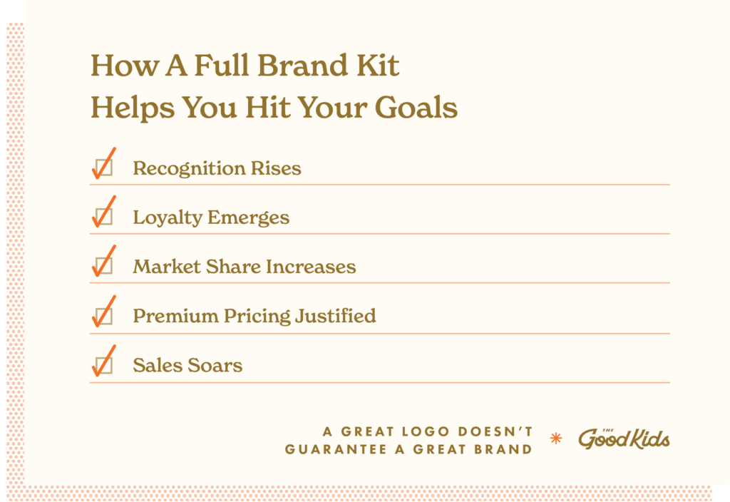
Here’s what would happen:
- Recognition would rise
- Loyalty would emerge
- Market share would increase
- Premium pricing would be justified
- Sales would soar
Just like macaroni is worth more with cheese, your company’s brand is worth more with each brand element you invest in because it creates an immersive experience. Collectively, these assets bring your brand to life!
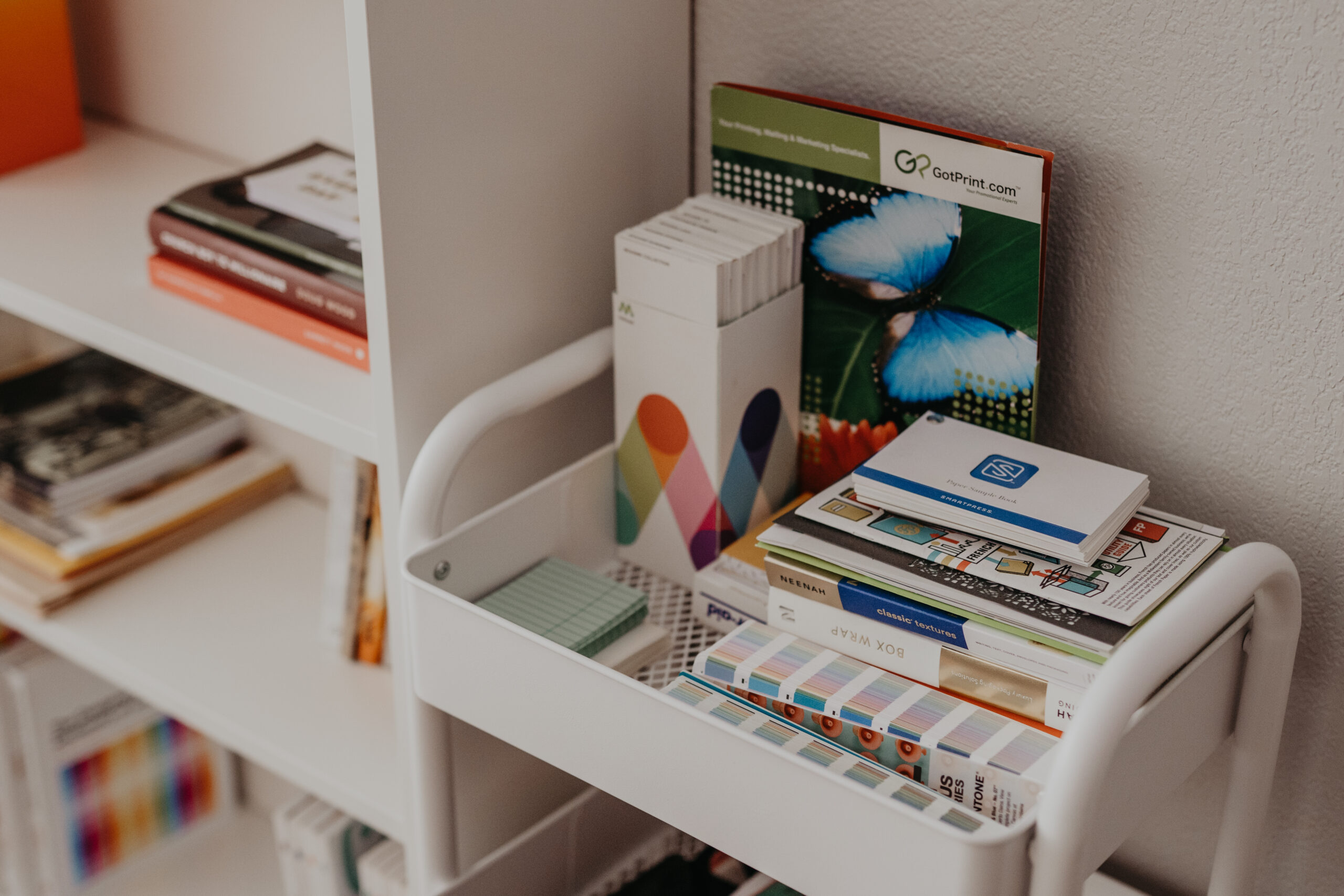
Cook Up a Crave-Worthy Brand
Gathering all the ingredients for a top-notch brand begins with taking inventory of what you already have. Close your eyes and take a visual walk through the aisles of your favorite grocery store. Each item on the shelf creates an opportunity to build a five-star meal.
If you’re like me, your cookbook collection is limited to 5-ingredient meal options. Ha! So let’s start with the basics that every brand should have:
- Logo/Wordmark
- Font Family
- Color Palette
- Imagery Style
- Tone of Voice
1. Logo/Wordmark
If you’re already in business, it’s safe to assume you have this covered. Logo work is what drives most people to reach out to our business. They are either a startup in need of a new piece or an existing brand that wants to update their current mark.
Unfortunately, this is often the beginning and end of a company’s brand assets. Don’t get me wrong, a logo is important —perhaps even the most important piece in your brand portfolio— but it isn’t meant to be the only asset. Rather, it’s the first impression that should lead to greater engagement.
If you do have a logo, consider whether it is supporting your goals by asking yourself a couple questions: Is it effectively communicating the company’s personality, value and stature? Is it drawing the attention and action of ideal customers?
If yes, jump to Font Family.
If not, keep reading!
Signs of A Good Logo
We’re here to help you determine how well your logo is working. With your current logo in mind, make a mental note whether it meets the following must-haves shared by Jacob Cass in his blog post, “Vital Tips for Effective Logo Design.”
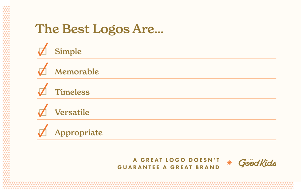
The Best Logos Are…
- Simple
- Memorable
- Timeless
- Versatile
- Appropriate
Let’s consider each element…
Simple
A simple logo only contains what is necessary. Simple logos are easy to recognize, recall and share with others.
There are numerous examples of simple logos from national brands. They include Airbnd, Apple and FedEx. The Good Kids have created its own share of simple logos like Valor Global Online, Trestle Living and Dr. Maria Dwyer.
Memorable
Memorability is akin to simplicity. When memorable, a logo is fast to develop familiarity. People are able to recall specific nuances of the design and can cite the colors used and may even be able to sketch a copy themselves.
While it’s true that advertising may affect memorability, design itself definitely plays a role. Some of the most memorable national logos include Coca-Cola, Amazon and Mercedes.
Unique lettering, limited color and strong icons combine to create a memorable logo. The Good Kids are no stranger to the concept of memorability. Our portfolio includes creative work with sticking power for clients like Frontier Village, The Craftcade and Mighty Missouri Coffee Co.
Timeless
The best logos steer clear of trends and are designed for longevity. A guaranteed way to avoid dating a company’s identity to run fast from hyper-stylized fonts and obscure colors. Instead turn to classic design cues.
Make sure not to confuse timeless with static. Logos can and should change to ensure relevance with the current market. When a logo is timeless, only small modifications are needed to keep it fresh. National examples of timeless logos that still undergo a makeover now and then include Shell, M&Ms and Levi’s.
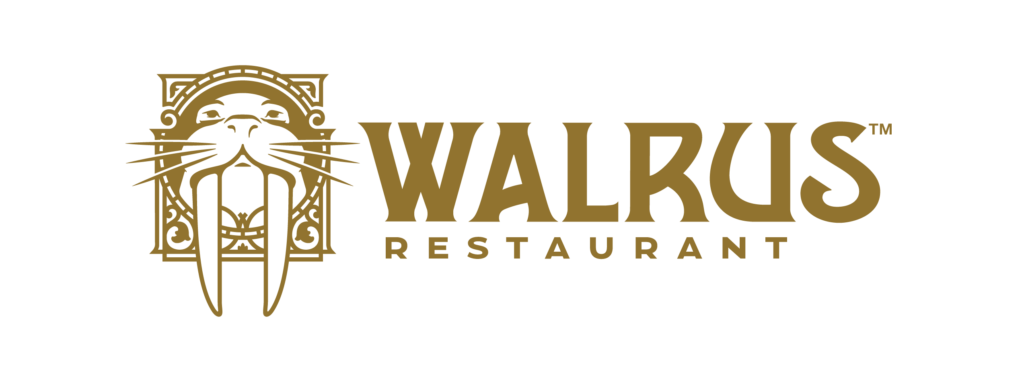
The Good Kids have assisted clients with the evolution of their logo as well. Past work includes The Walrus, Morton Mandan Public Library and Skeels Electric.
Versatile
Versatility is all about usability. The best logos are recognizable in large or small formats, across a multitude of media and include interactions that support all orientations.
To ascertain a logo’s versatility, you should be able to say “Heck ya!” to all of the following scenarios.
- My logo looks great in one color.
- My logo contrasts well on a dark or light background.
- My logo is easy to identify when it’s shrunk to fit on a stamp.
- My logo doesn’t get fuzzy when I blow it up to school bus size.
Some simple logos can navigate all of the scenarios listed while others require the help of secondary graphics. The Good Kids equips all clients with whatever artwork is necessary to ensure versatility. We often craft primary logos, secondary logos, icons and monograms.
Appropriate
There’s a reason the Motion Picture Association developed a film rating system in 1968. Used to help parents decide the appropriateness of a film for their child, the system matches the script and scenes to a series of symbols.
The ability to connect brands with buyers is of equal importance. The best logos use fonts, colors and graphics to indicate the type of person they serve.
Take time to match the style to the intended audience:
The first step to determining the appropriateness of a logo is to know your target audience. Once you know who they are, you can uncover their challenges, desires, motivations and more and create a logo that caters to their specific needs.
If your business is attracting people you’d prefer to shop elsewhere, take a hard look at what message your logo is sending through its use of fonts, colors and graphics.
2. Font Family
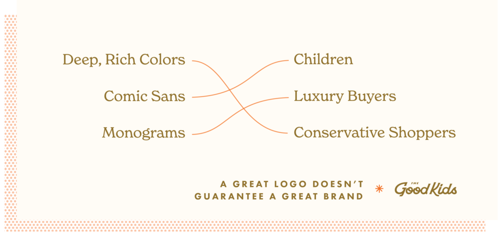
The second asset all brands should include is the font family. Fonts have the unique ability to set consumer expectations. Consider the reference to Comic Sans above. What are some adjectives that come to mind?
I’m guessing you said childish, simple, cheap, and maybe unsophisticated. If you did, you’re not alone. Think about the message a law firm would send if they used that font. It’s important to consider what your type says regardless of the text it spells.
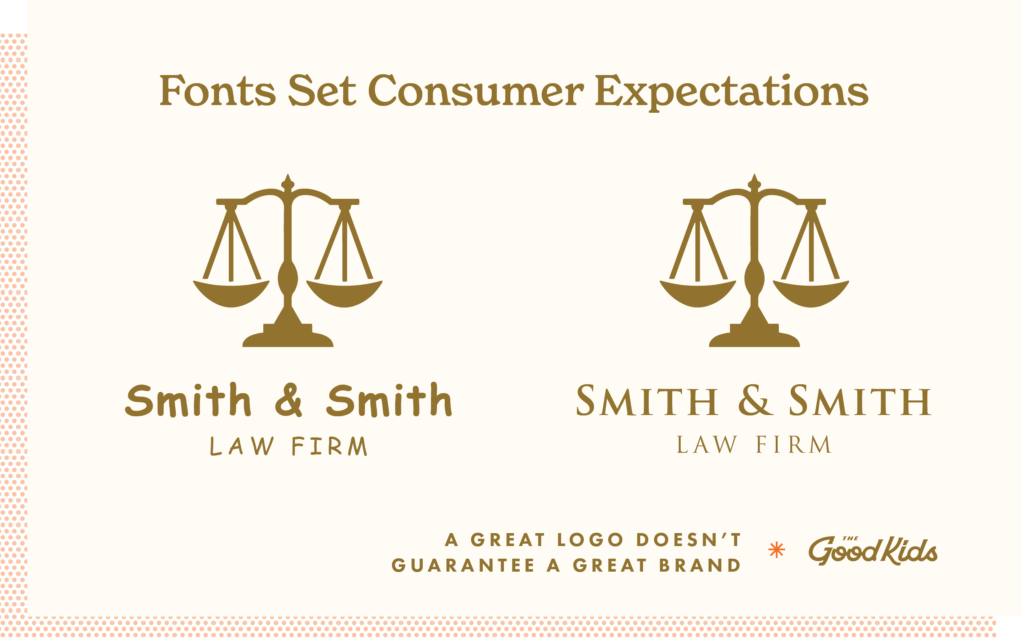
Part of our strategy is to select fonts that communicate your company’s personality from big and bold, to soft and supportive. Typeface sets a tone.
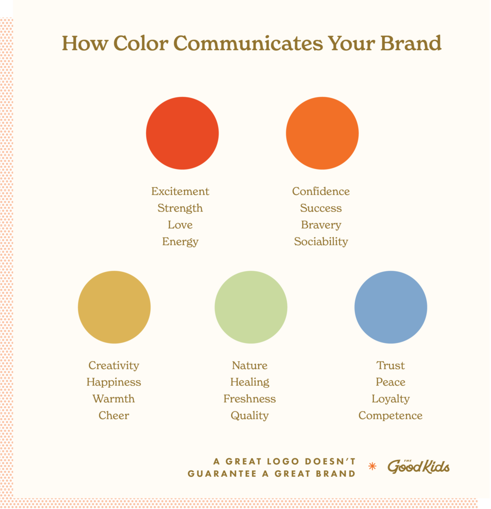
3. Color Palette
Similar to font styles, color speaks volumes. There is extensive research on color theory. Heck, psychiatrists use color therapy to influence patients.
Logos typically include a few colors, which are part of a larger color scheme every company should adhere to. Color can guide or confuse.
Consider a scary movie set in a bright, well-lit room. Or a romantic comedy where all of the scenes are shot in dark, drab and dramatic settings.
Not sure what your colors imply? Here’s a quick reference:
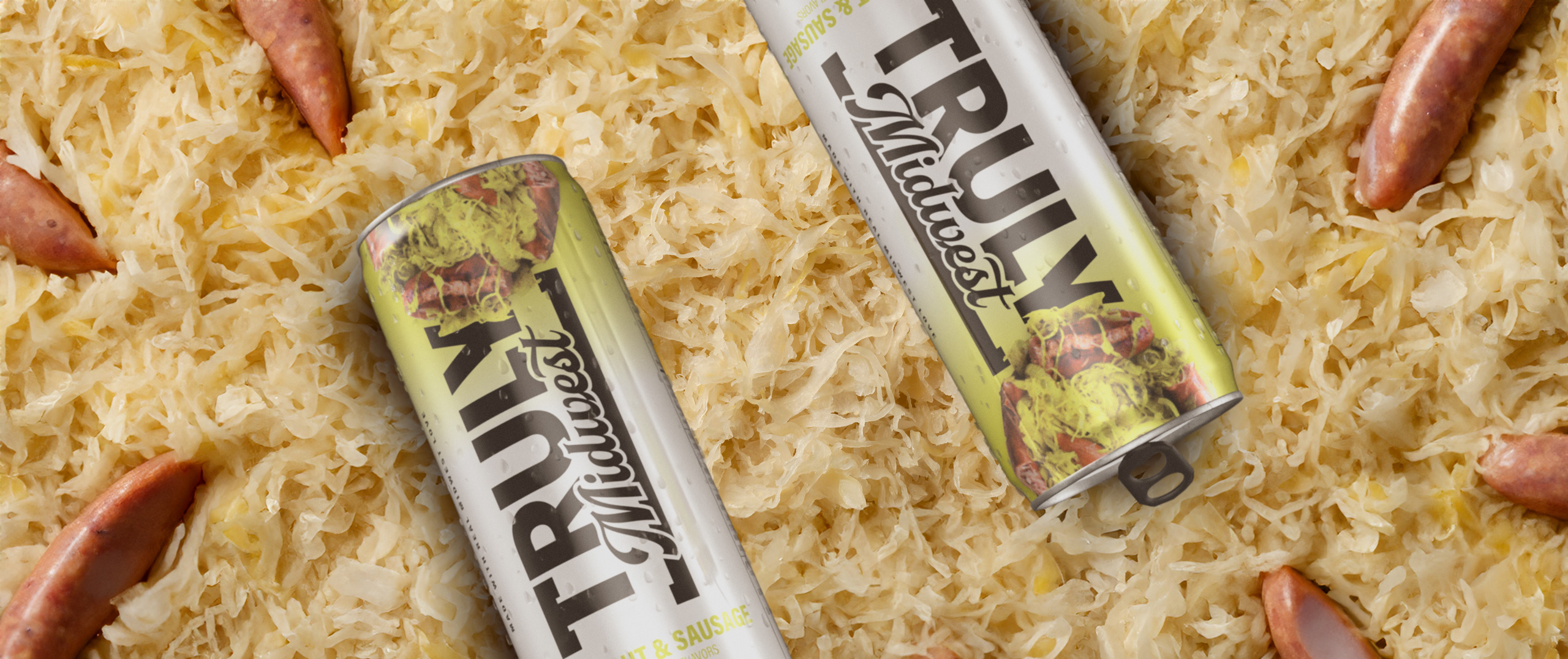
4. Imagery Style
Companies that choose an imagery style and stick with it create better recognition and are able to develop stronger relationships with their customers.
Imagery style includes strategic decisions about the use of:
- Photos/videos
- Illustrations
- Filters
- Subject matter (portrait, candid, fashion, still life, editorial, etc.)
- Infographics
Like fonts and colors, imagery style can suggest a feeling and set expectations. Brand studios like ours will have conversations with clients and suggest a final style that suits their specific needs.
5. Tone of Voice
We’ve talked a lot about how a brand looks (logo, fonts, colors and imagery). Now it’s time to “talk the talk” of a brand.
Tone of voice can drive decisions when it comes down to how you say something. It supports the notion that it’s not just what you say, it’s how you say it that matters.
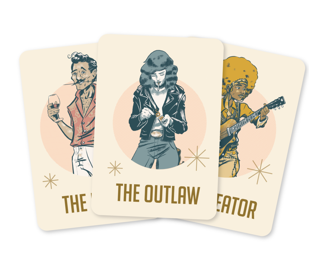
To help clients do this, the Good Kids spend a lot of time with clients to identify their brand archetype that can provide guidance on the personality of speech.
There are 12 universal archetypes. From the Jester and Hero to the Sage and Caregiver, each archetype has a communication style. Once identified, you can use your company’s archetype to help you write messaging for ads, blogs, websites and more.
Curious about archetypes and wondering which personality suits your current company?
Take our quick online quiz!
Your results will include a reference to the tone of voice you should adopt for brand success.
That’s All Good, But Let’s Get to Great
We started with two items that are known to be better together and just shared five elements of a brand that combine to create more influence that just a logo can provide.
- Logo/Wordmark
- Font Family
- Color Palette
- Imagery Style
- Tone of Voice
I do appreciate an easy meal, but can’t deny that a dish served at a five star restaurant beats the pants off my five-ingredient meal. If you want to go from good to great branding, you simply need to add more intentional assets.
We’ll share additional brand assets in a future post. Until then, discover your brand’s strength by taking our Branding 101 Quiz.