Skeels Electric Co. is a legacy electrical contractor located in Bismarck, North Dakota. The company has been “Making it Work Since 1914.” Originally a small appliance company, Skeels transitioned from retail to service as its primary source of business. Skeels has established itself as a trusted resource for large commercial and industrial projects. While multi-million dollar jobs consume much of their time, they always make room on their schedule for residential construction and repair, and are committed to supporting community events and organizations. Always innovating, Skeels is the only contractor of choice for Tesla charging stations in the state.

The Challenge
It’s easy for a successful and long-standing company to get complacent. Fortunately, Skeels’ current generation of owners isn’t content sitting still. According to the client, a rebrand was necessary to refresh the 107-year-old business.
Coming up with a new identity would be easy, paying homage to the history of a well-known and well-respected company is what posed the challenge. That and the fact that four family members would be tasked with coming to mutual agreement.
The Solutions
To help the client navigate change and entertain new concepts, The Good Kids had Skeels go through a Brand Strategy. To help move the project forward, weekly consultations with all four decision-makers were hosted. This impromptu service proved to be mutually beneficial… it helped Skeels focus on the rebrand and it helped The Good Kids glean ideas and build rapport.
The Results
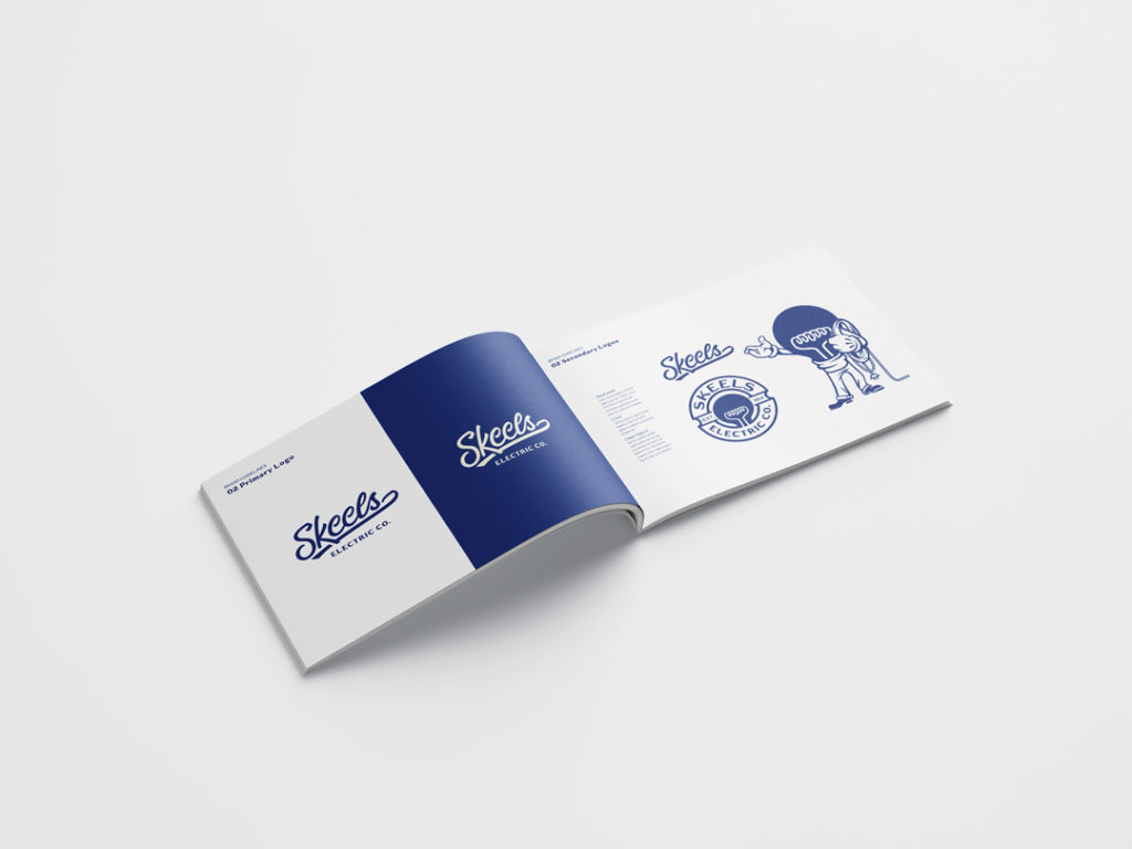
The Brand Strategy paved the way for revisions to the Skeels logo and the creation of a Brand Guide. It was encouraging for the client to learn that a century of brand building wasn’t for naught.
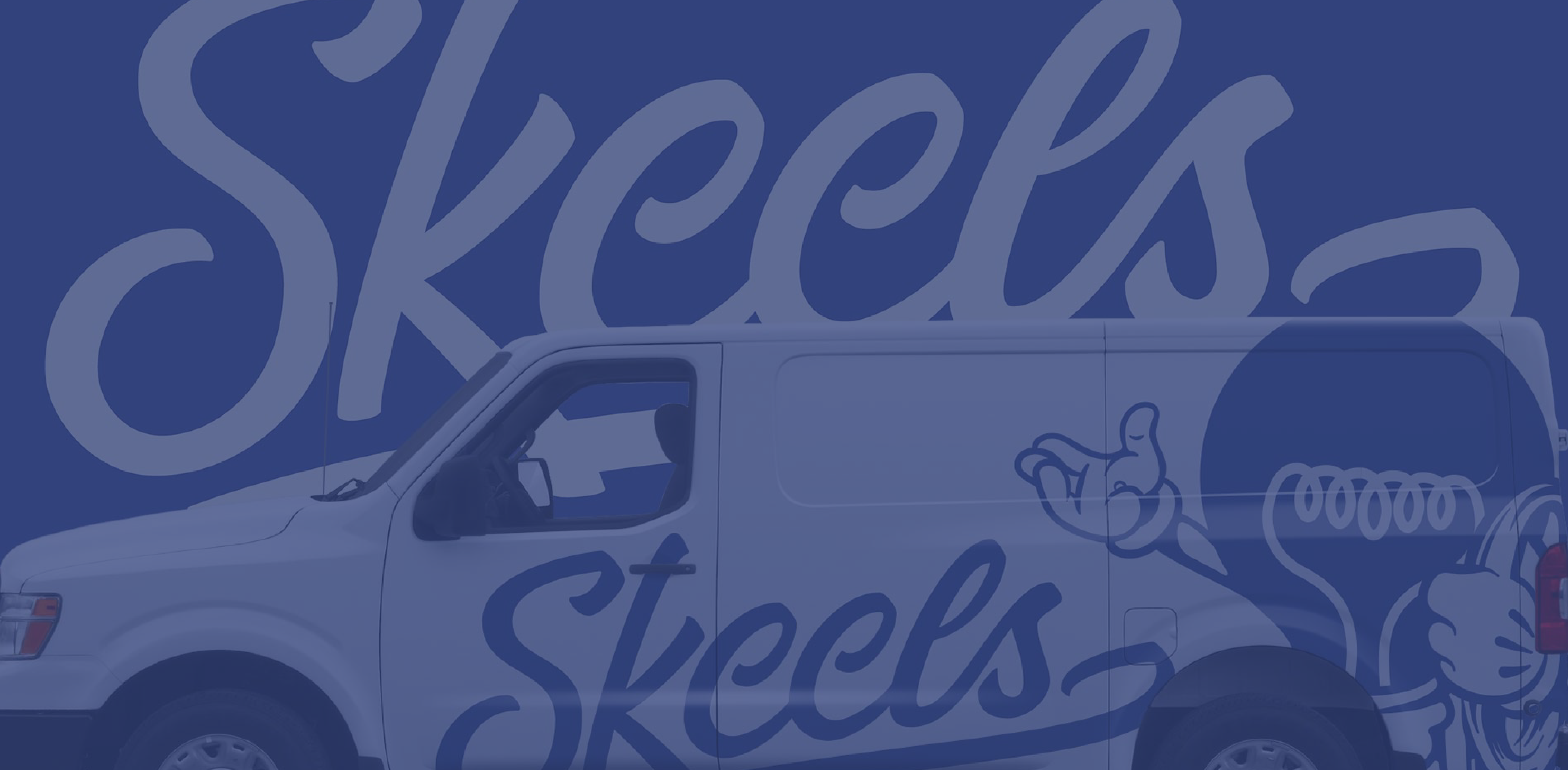
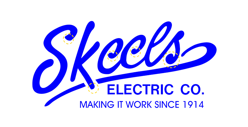
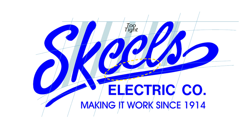
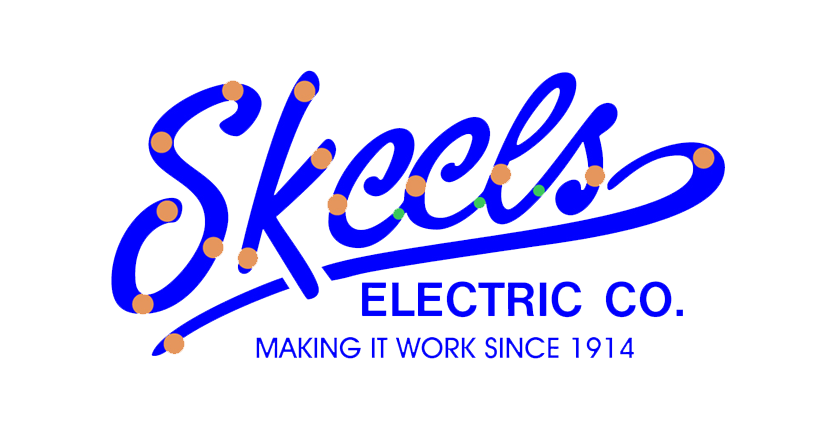
Changes to their logo were nominal because data supported the continuation of the wordmark’s general style with the addition of a few subtle changes. Safety is of the utmost importance at Skeels. In order to look the part, we cleaned up some imperfections in the wordmark that should say “we see all the details”. The most noticeable changes were a few sharp curves added to the ends of letters. The Good Kids wanted to express the second biggest value, innovation, which has been a huge part of Skeels success since the beginning.
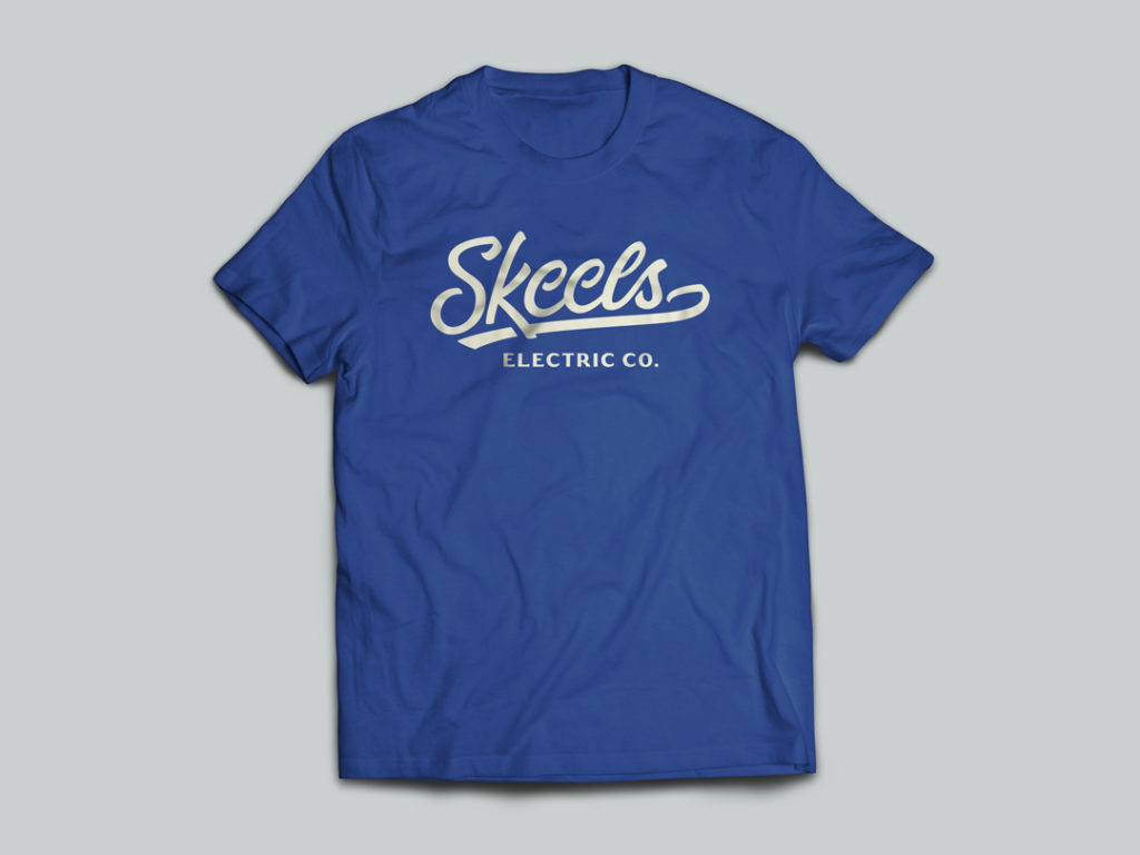
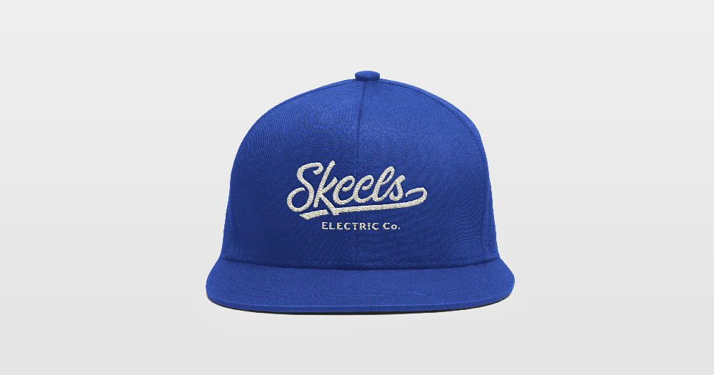
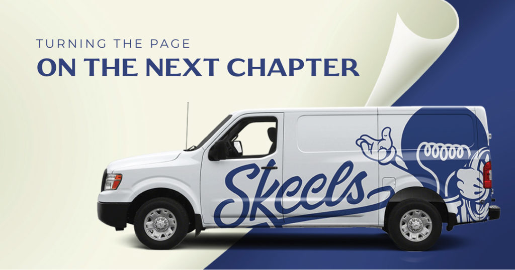
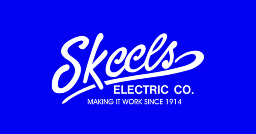
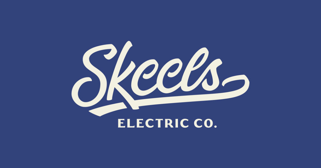
Supplemental colors were added to bring a modern touch to the timeless Skeels’ Blue. A crest was created for social media and merchandise use, and a mascot named ‘Barlow’ was designed that conveys the company’s light-hearted nature and family-centric style. Later, a walk cycle for Barlow was designed and animated by The Good Kids for use in Skeels television advertisements.