The Challenge
Mighty Missouri Coffee Company’s brand story begins like most…an entrepreneur with a passion for his product pulls together a logo because it’s essential for a startup, like a bank account and business insurance.
The logo “worked” for a number of years but owner Brian Jackson soon came to realize that in order to scale, Mighty Missouri had to stand out. The Good Kids walked Brian through their Brand Strategy to determine and declare the coffee roaster’s mission, vision and values. They helped identify Mighty Mo’s ideal client and discovered the communication style that would appeal to its best buyers and imagery that would set Mighty Mo apart from the competition.
The Solutions
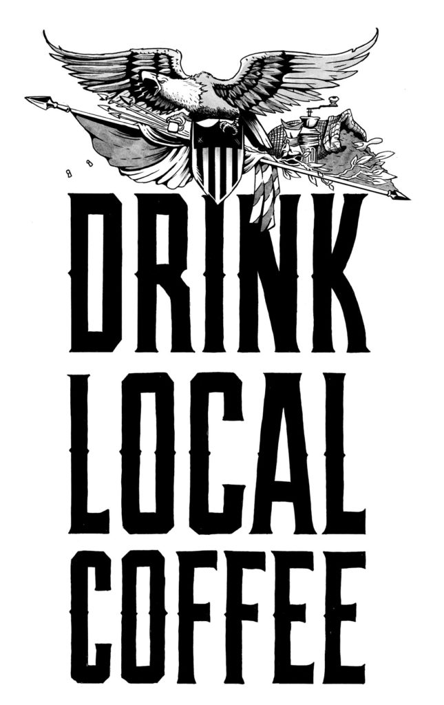
The Good Kids learned the owners had a penchant for patriotism and a deep respect for the great state of North Dakota. They were a company that embodied the American dream, dedication and drive. A competitive analysis revealed a lack of companies leaning into North Dakota heritage and Americana.
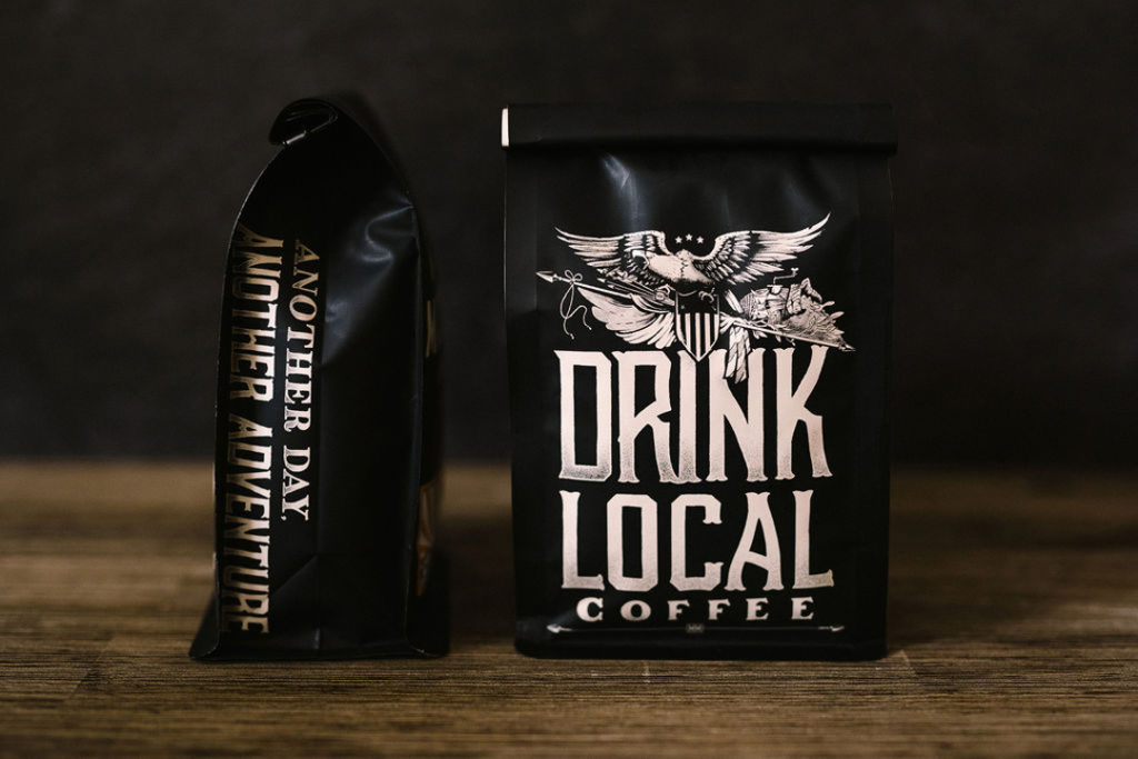
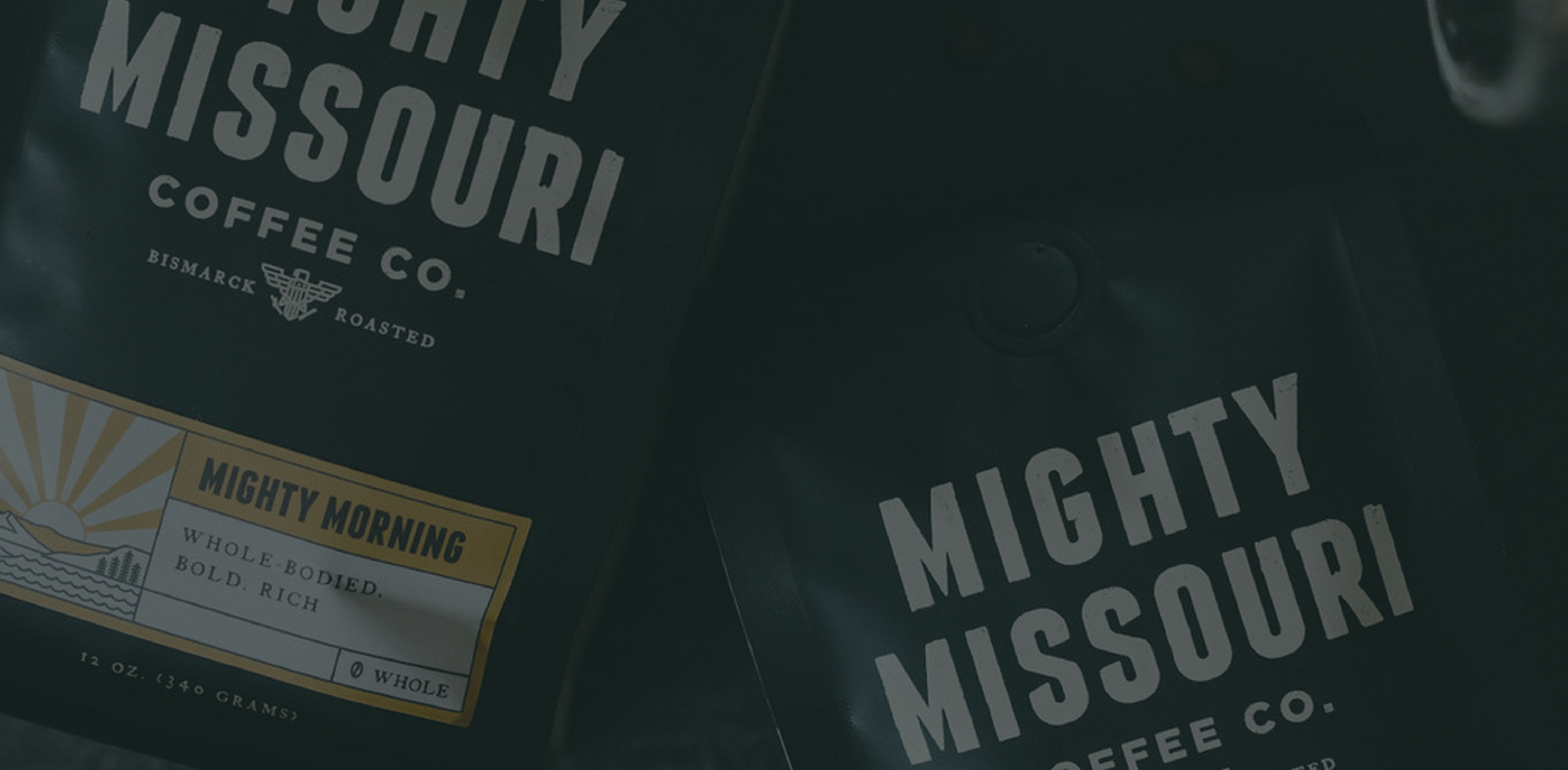
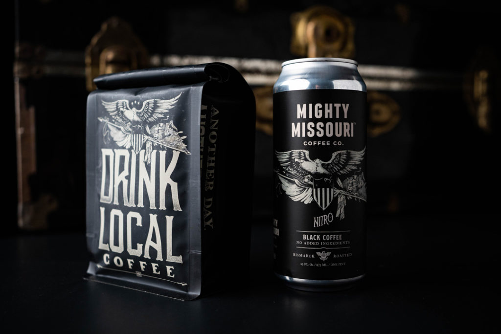
Taking inspiration from 1850s Lt. G.K. Warren maps of the local area, American illustration styles from the late 1800s, and the North Dakota state flag, The Good Kids developed a warm, hand-drawn identity. What cartographer doesn’t enjoy a good cup of coffee?
The Results
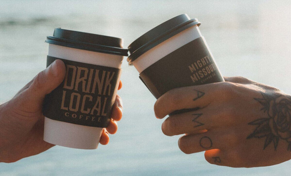
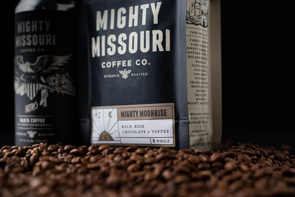
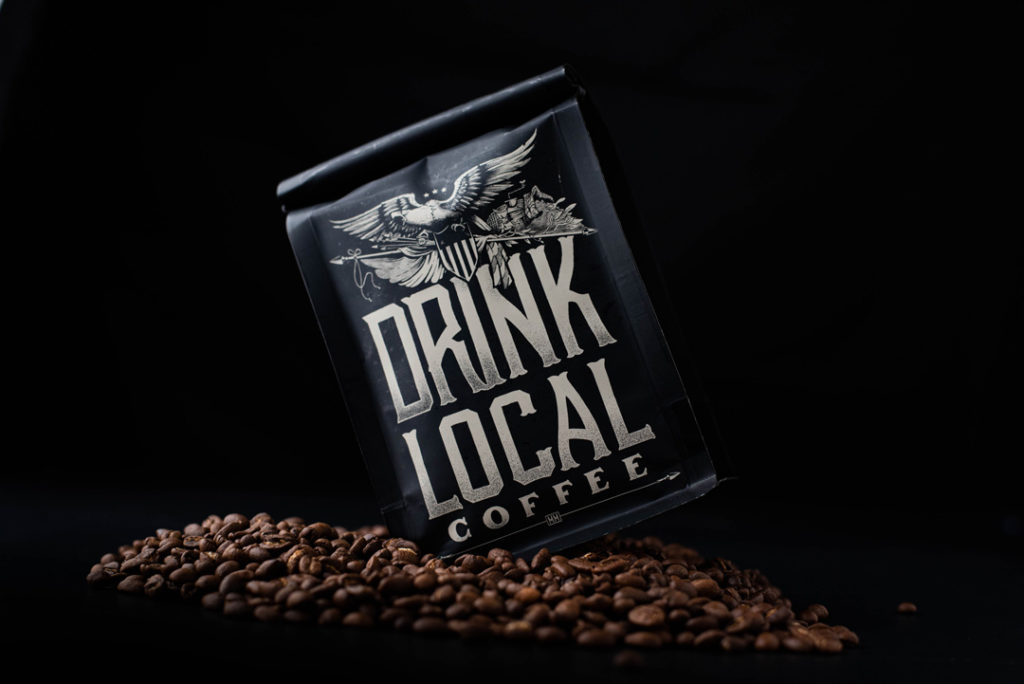
The updated design has elicited positive feedback for Mighty Missouri. Redesigned packaging with a vintage white and black color palette has helped Mighty Mo. stand out on store shelves and has been successful at inspiring people to pick it up and make a purchase.