Introduction
There are approximately 1.8 million nonprofits in the US. 75% of nonprofits consider donations essential. Without successful fundraising and proper organization, nonprofits run the risk of closing their doors. Recognizing this challenge, Maximizing Excellence exists to empower nonprofits to their fullest potential, through services that include strategic plans, fundraising campaigns, feasibility studies, trainings, and more.
The Problem
Maximizing Excellence has great success within South Dakota, where they are located. Yet, after reflecting on their thirteen-year journey, they aspired to expand their horizon and achieve a broader regional reach. Embracing this vision, the team identified the need to revitalize their brand.

The Solutions
The journey with Maximizing Excellence commenced with an immersive strategy and discovery workshop, where collaborative discussions uncovered the essence of their mission, target audience, and brand aspirations. This initial exploration laid the groundwork for the blueprint.


With a solid foundation in place, we embarked on the creation of the visual brand, presenting three distinct design explorations all around the brand idea of “Forward Momentum.” These visual directions served as tangible representations of what the brand could become, providing Maximizing Excellence with a clear vision of their potential identity.
After the top visual direction was selected, we refined two final brand concepts. These concepts were crafted to embody the brand attributes identified in our initial discussions: trustworthy, bold, simplicity, creative, and approachable. Tailored to resonate with Maximizing Excellence’s ideal clients — community philanthropists and nonprofit leaders — each concept offered a unique expression of the organization’s values.
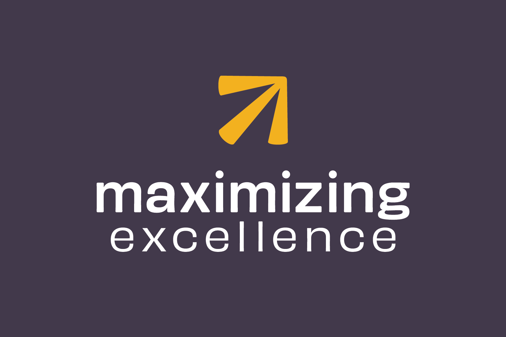
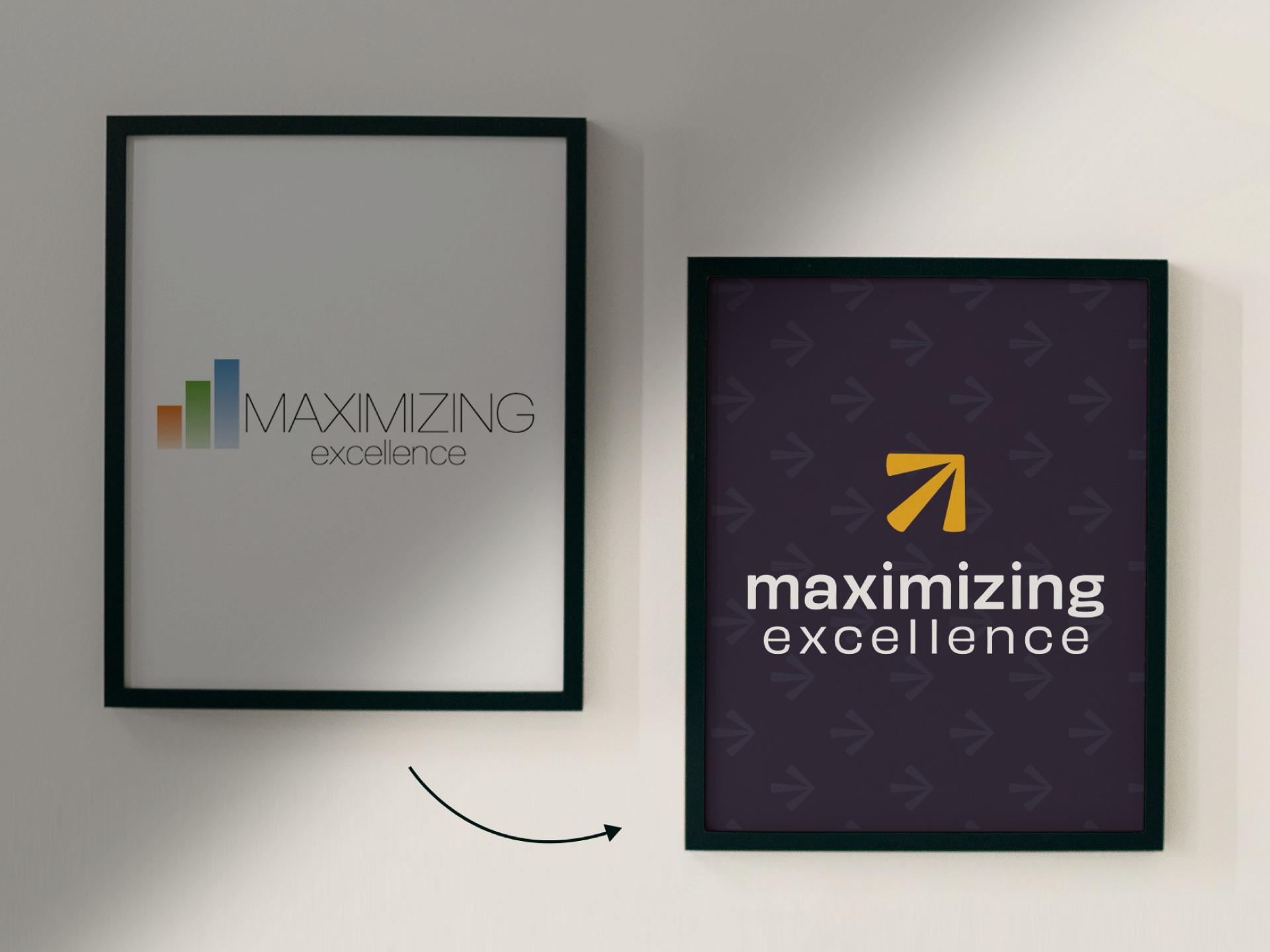
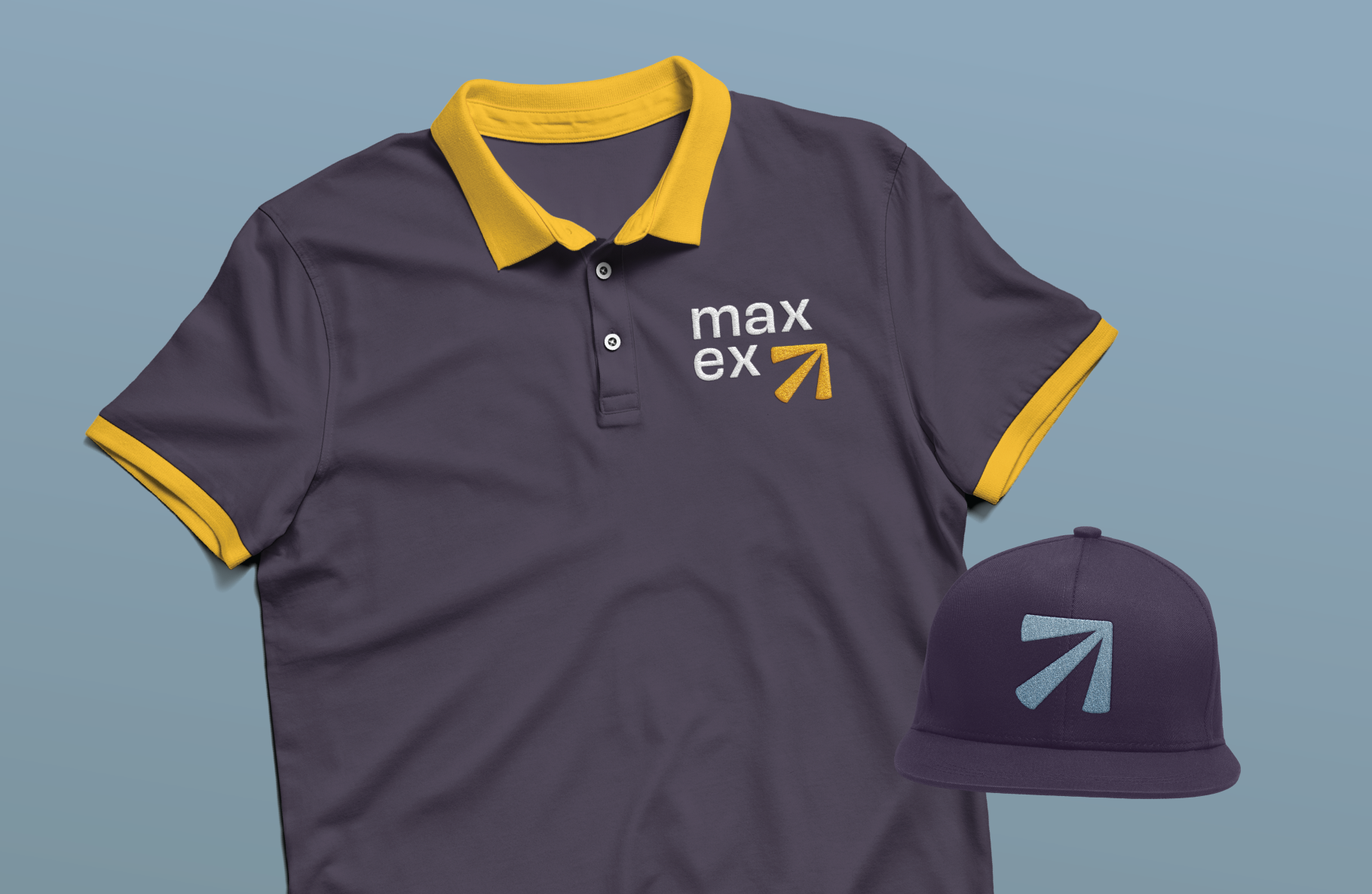
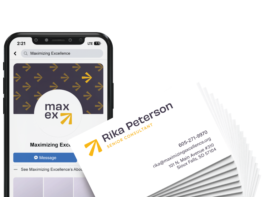
The final logo diverges from the previous logo by featuring a lowercase wordmark, exuding a friendly and approachable demeanor, while an upward-facing arrow symbolizes the direction through which they elevate their clients. The brand features a deep plum as the main color, and is accented by shades of blue and yellow. The approachable logo icon paired with the serious color palette captures the essence of Maximizing Excellence and their commitment to empowerment and progress.
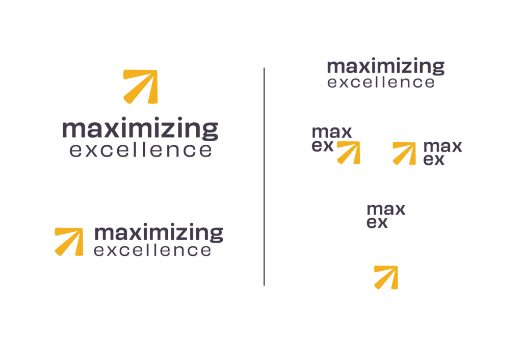

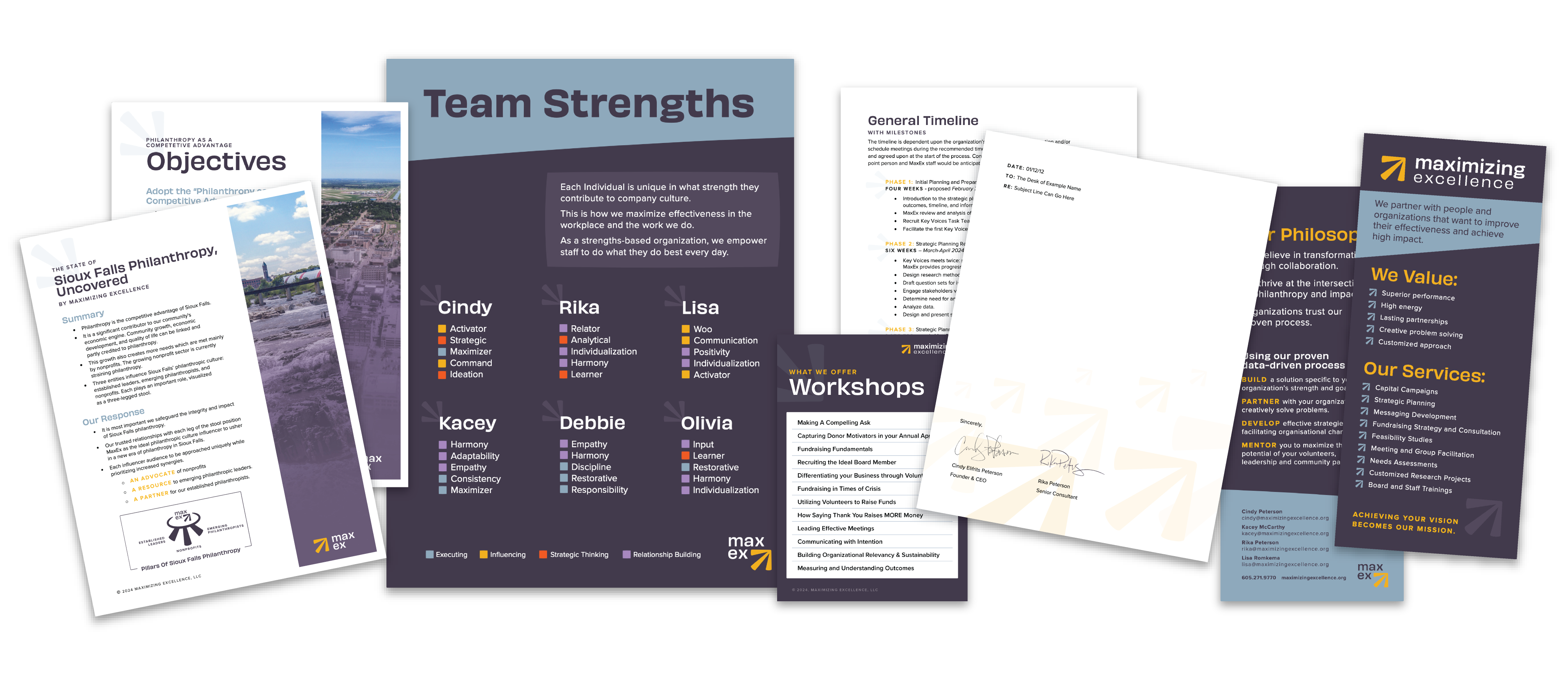
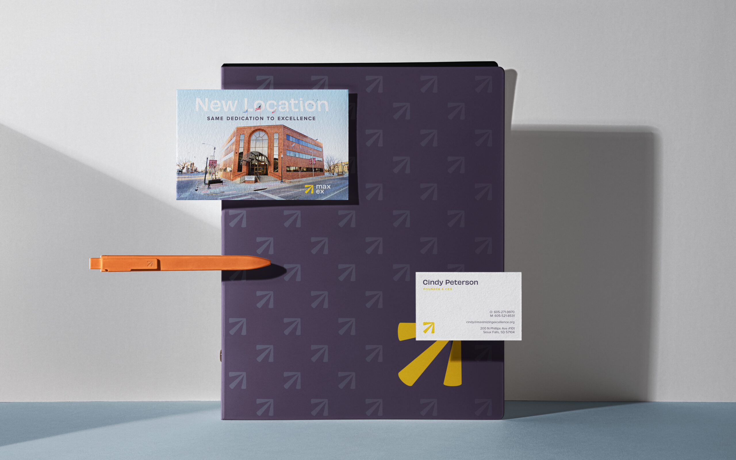
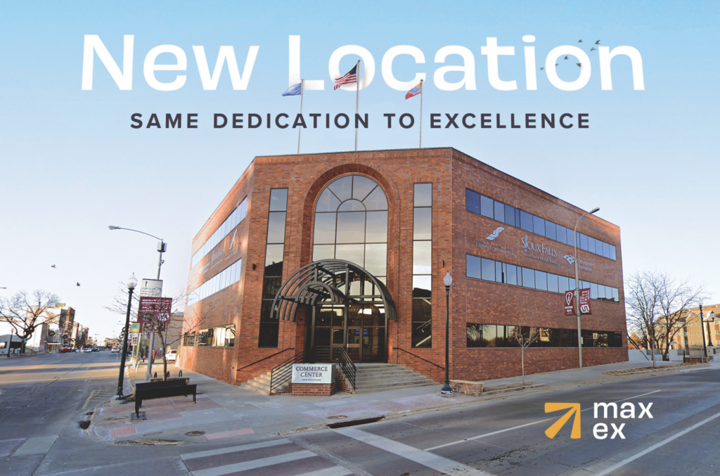
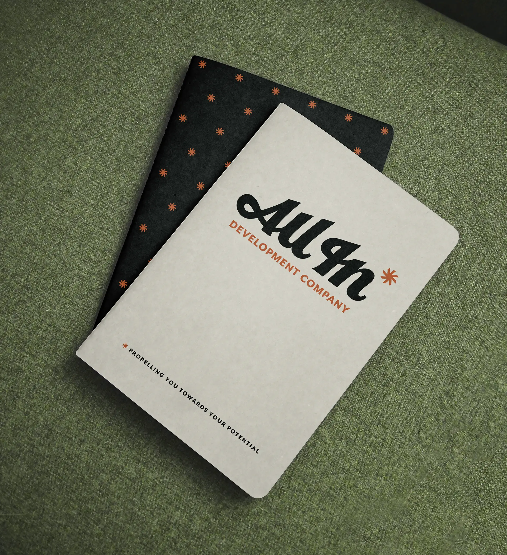
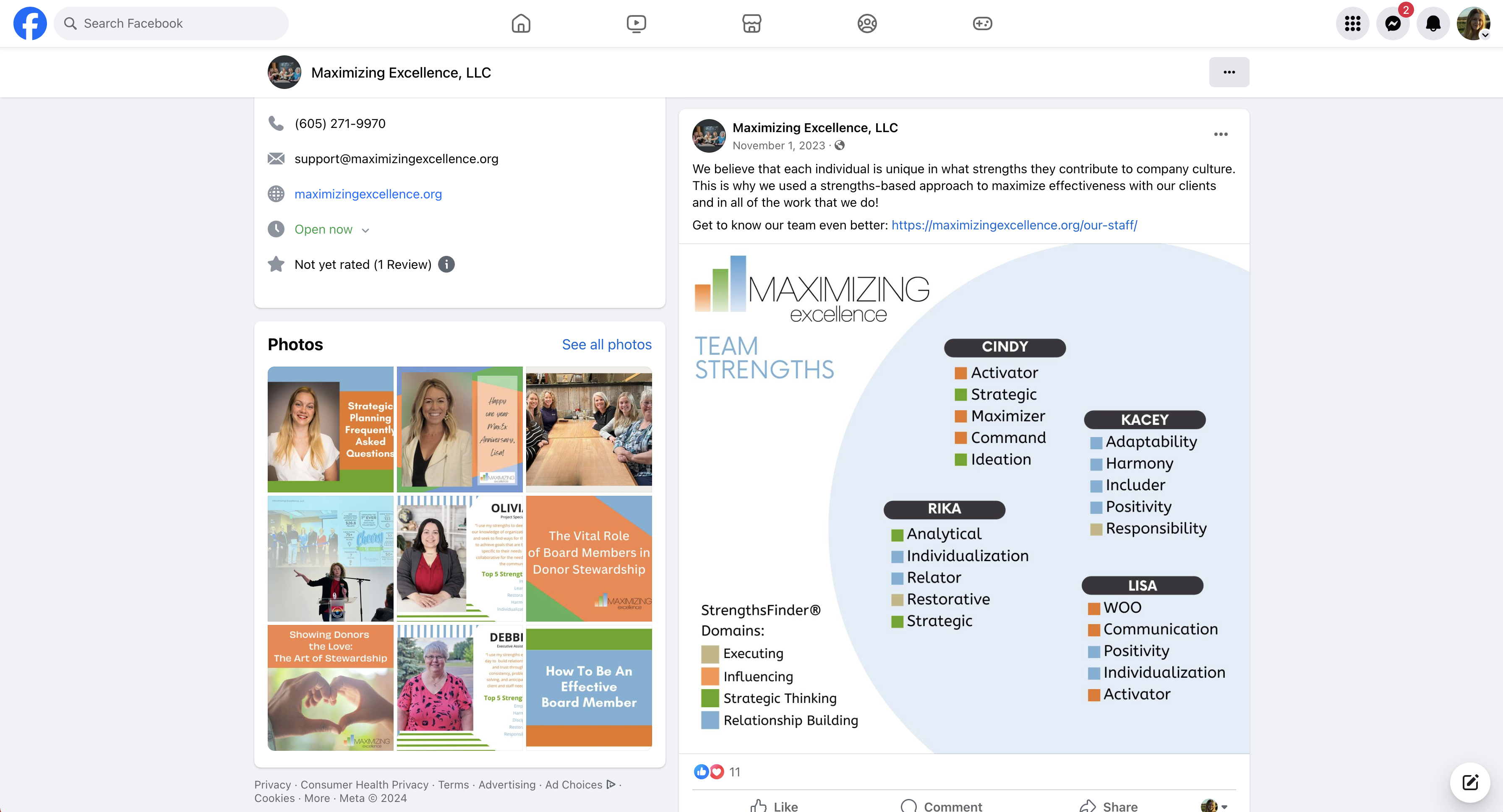
After the visual and verbal brand was finalized, Maximizing Excellence moved swiftly into creating their brand rollout plan. They wanted their brand to be reflected across all areas of their business; including documents, internal signage, social media templates, presentations, and more. With a full suite of refreshed collateral, Maximizing Excellence now has the brand consistency they need to accomplish their growth goals.
The Results
Maximizing Excellence has a myriad of exciting developments on the horizon. At time of publishing, they had just rolled out their new brand – a reintroduction of who they are and why they exist. With big announcements on the horizon in the summer and fall , Maximizing Excellence is well-equipped to showcase their fresh brand, expand their reach, and continue elevating nonprofits to their highest potential.