Introduction
Sometimes, a client comes along and they embody everything we love to work on. SugarBot was a great example of this for a few reasons:
- They’re a start up (we love that eager, future-focused energy)
- Their product is dental technology made with artificial intelligence (hello sci-fi)
- The founders are our friends! Yay!
The Challenge
In the rapidly-evolving world of tech and artificial intelligence, no brand is no bueno.
SugarBot knew from the jump that they would need something that simultaneously said, “Hey, you can trust us!” but also “We’re not quite like the other guys.”

You Don’t Have to Figure It Out Alone

Free 30-Minute Brand Coaching Call
Book a free call to get unstuck and leave with clear next steps. No strings attached.
The Solutions
You already know we start every project with strategy, and this one had to be airtight.
(Okay yes, all our strategies are airtight. We were just saying that for dramatic effect.)
In SugarBot’s case, the founders didn’t just know their audience, they were their audience. Dentists making a product for other dentists? They’re dentists! So when it came to getting inside the mind of their ideal customer, they didn’t have to go far.
Then we uncovered SugarBot’s big differentiator. Unlike other dental AI software that tries to be everything, everywhere, all at once, SugarBot keeps it simple. It focuses on cavities. That’s it. Which means it’s more effective and more affordable.


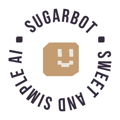
We defined the core brand attributes during the strategy. They were defined as: simple, trustworthy, comfortable, fun, and human. This charming combo says to dentists and patients alike, “You don’t have to find me intimidating,” which was exactly the point.
Our brand idea (the phrase that sets the tone for everything to come) was: Dental Confidence With Simple Tools.
Sweet. Simple. To the point.
From there, the strategy gave our creative team clear direction:
- Use a more human color scheme that breaks away from the usual tech palette
- Lean into something cute, youthful, and genuinely approachable
So that’s what we did.
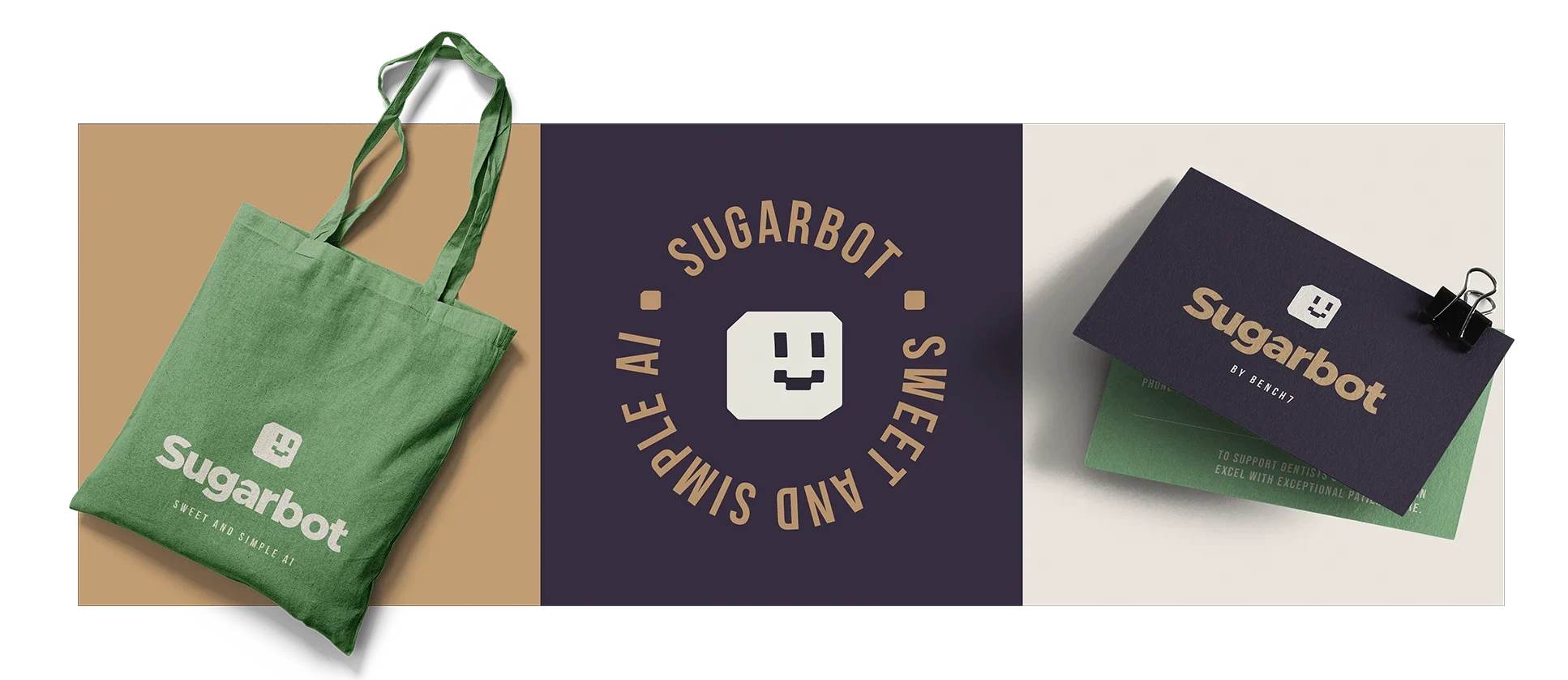
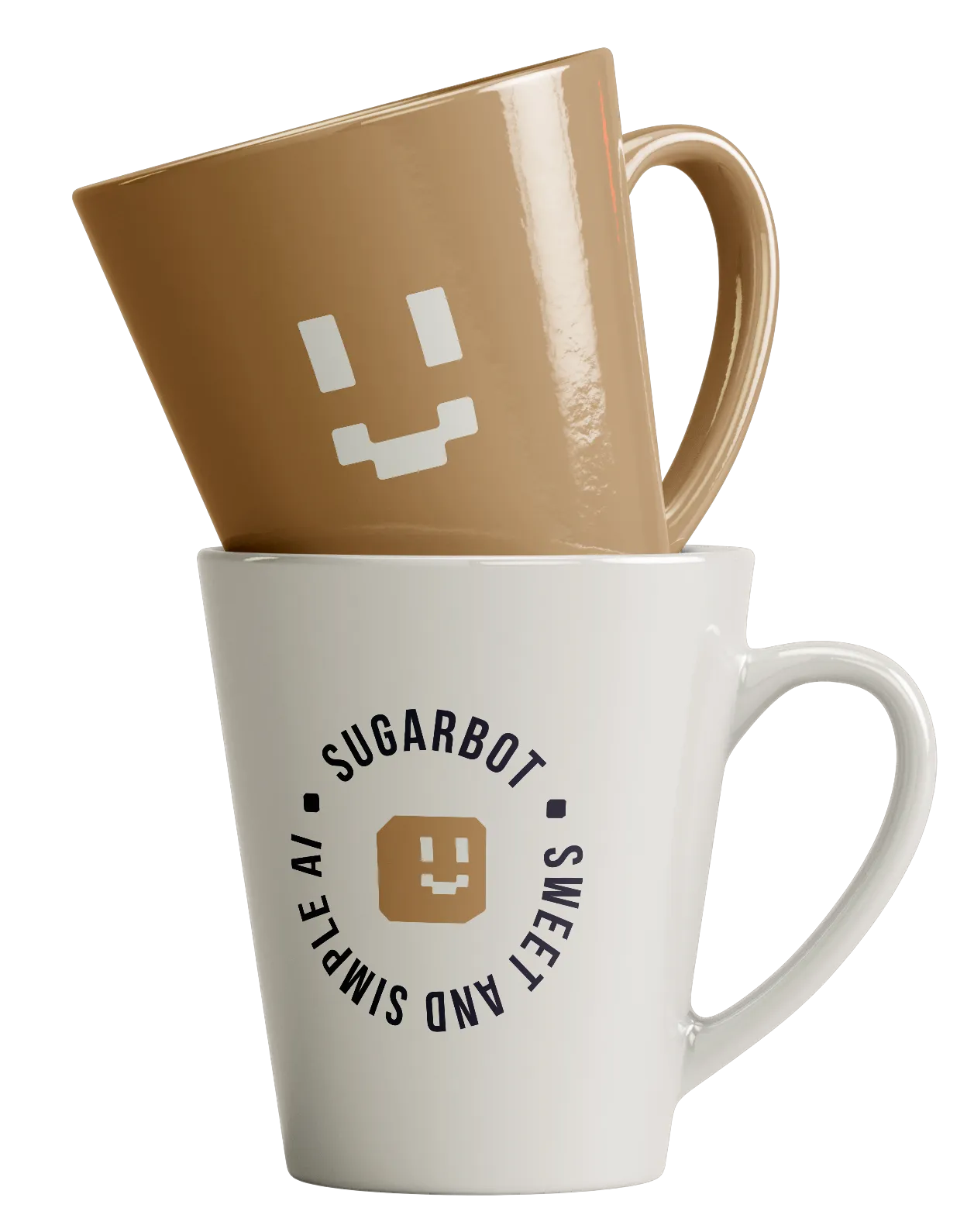
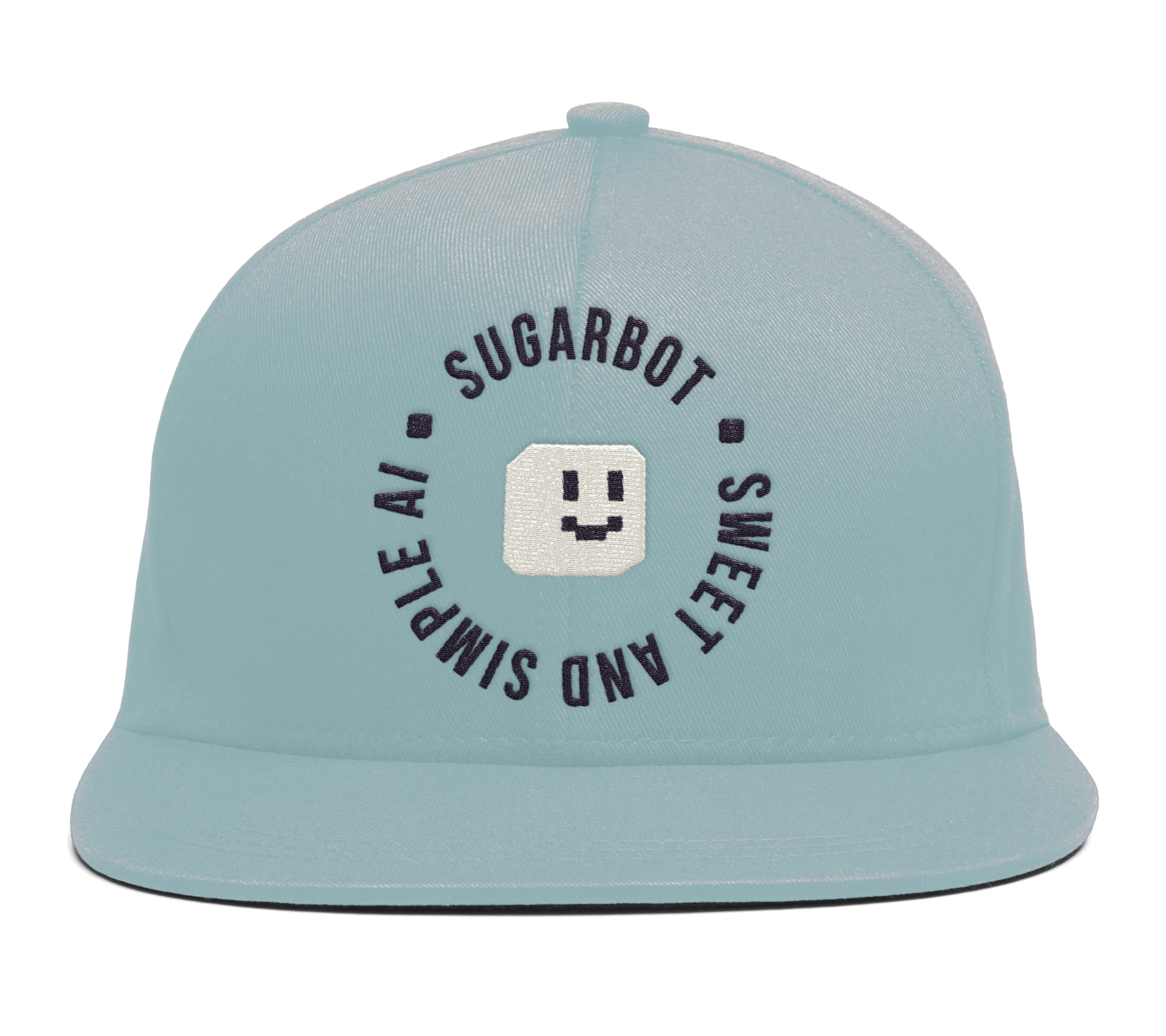
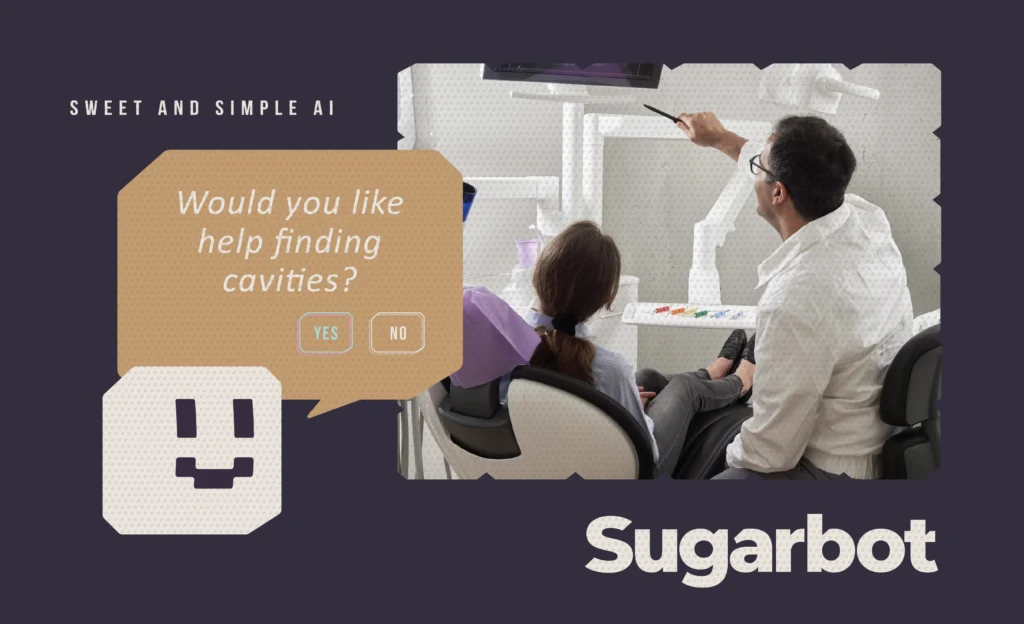
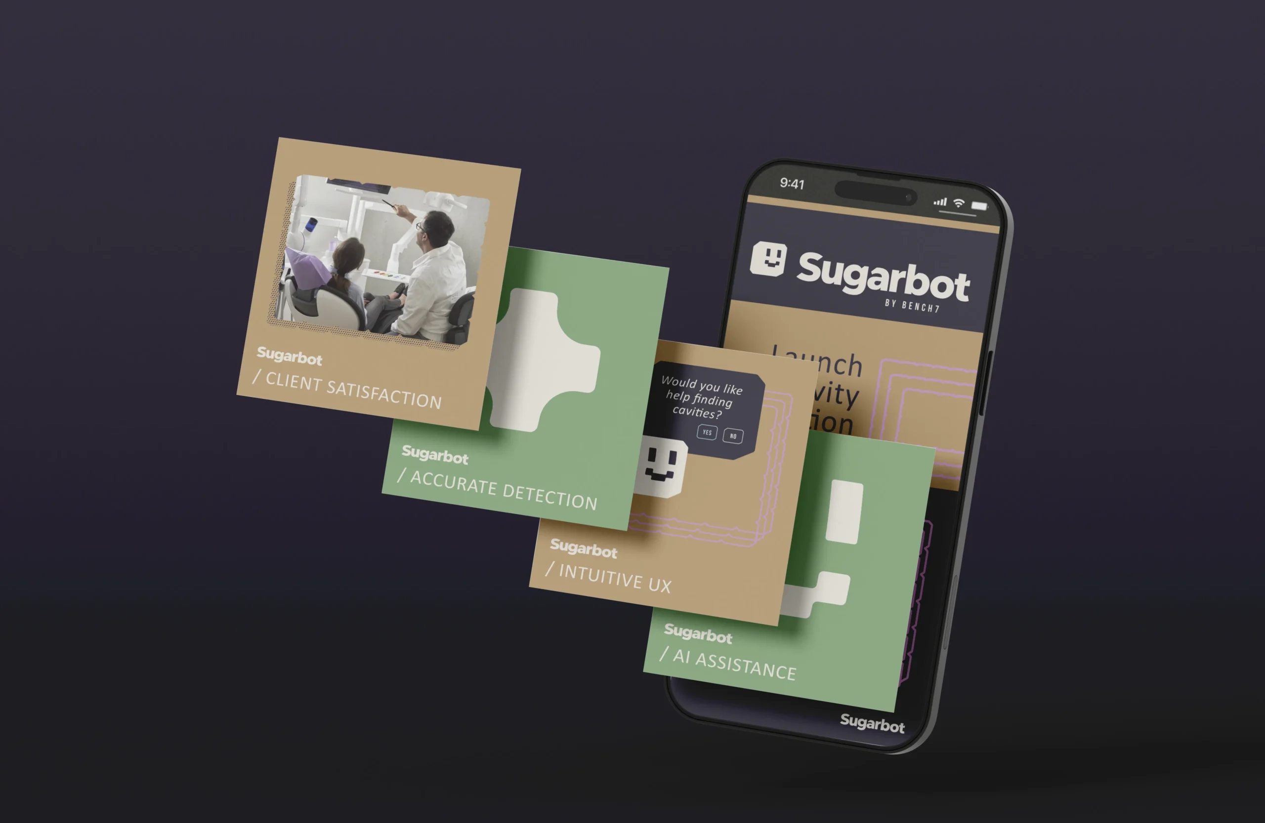
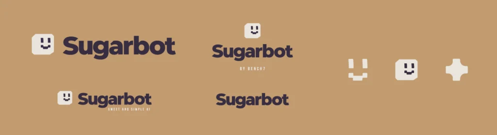
We landed on a visual direction named “The Companion.”
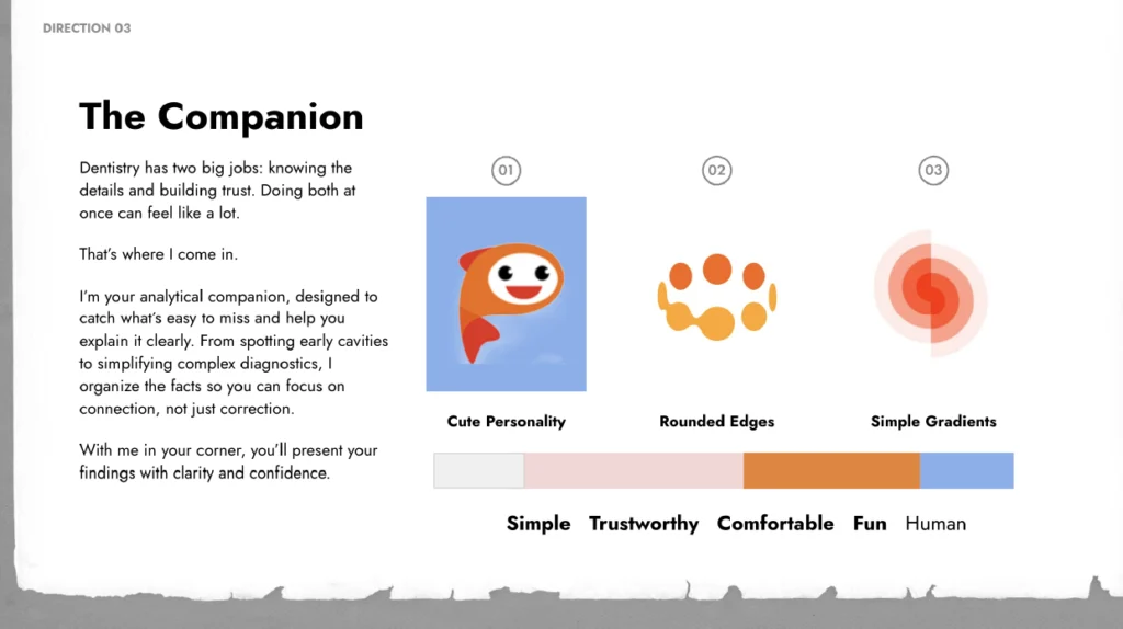
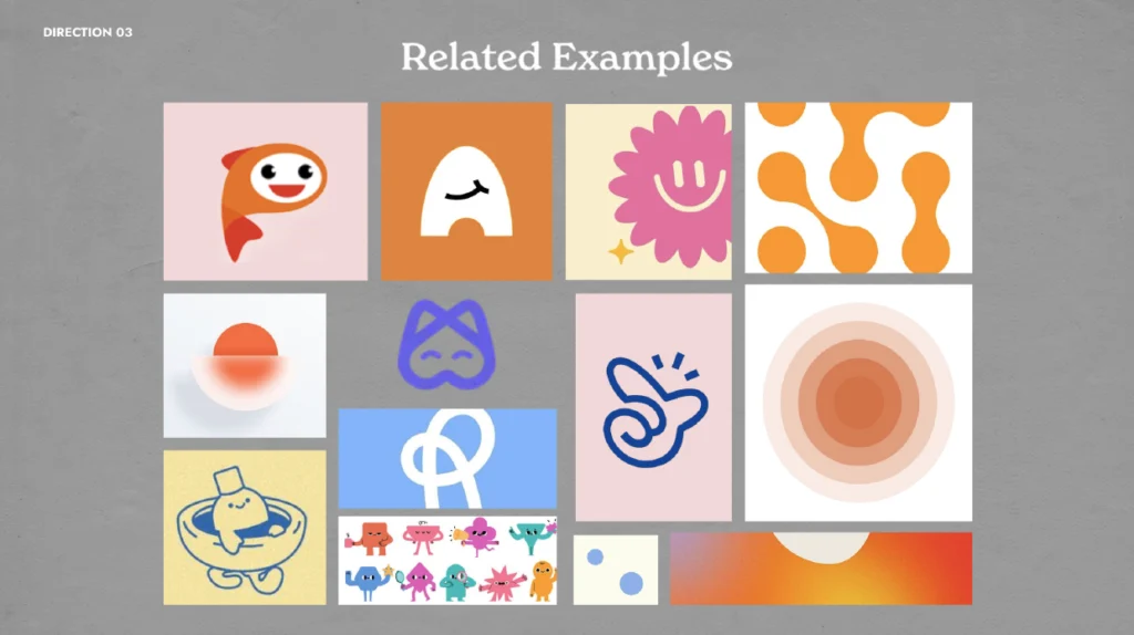
It’s a fresh, fun take featuring a friendly character and color choices that stand out in the sea of blues and grays dominating the industry. It was the perfect setup to help SugarBot stand out, and feel right at home in dental offices across the country.
Next stop: Sketches!
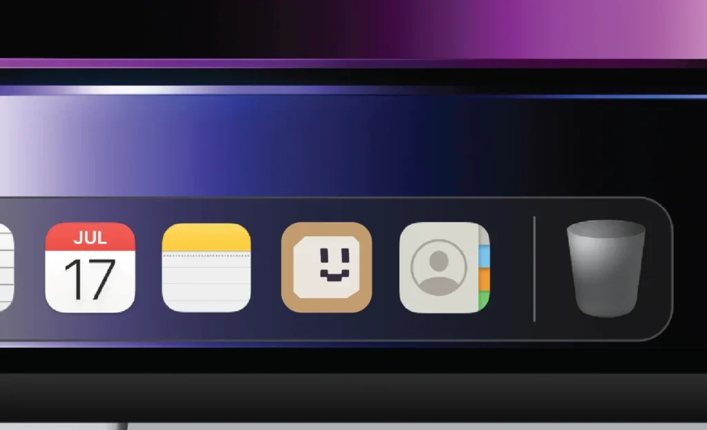
From the very beginning, SugarBot knew they wanted a character. A helpful guide. A gentle explainer. A visual friend that says, “This tech is here to support, not replace.”
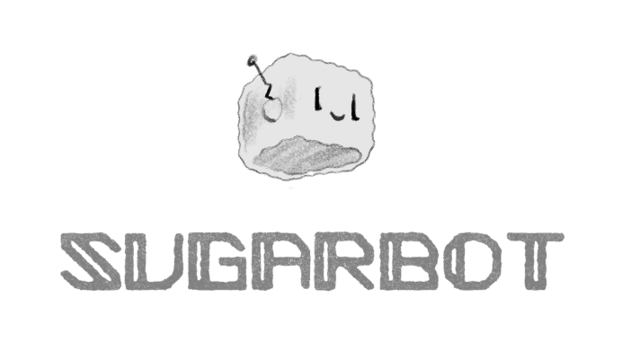
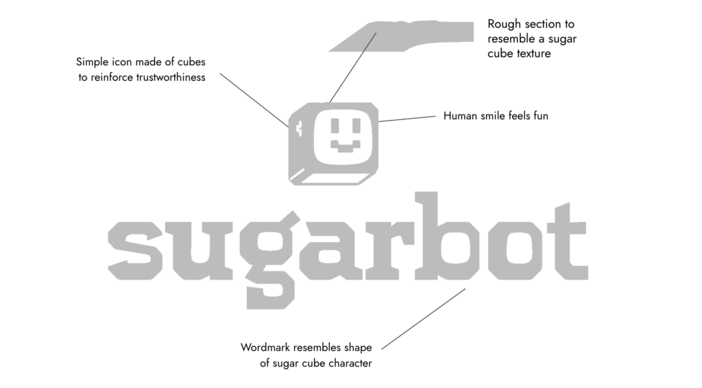
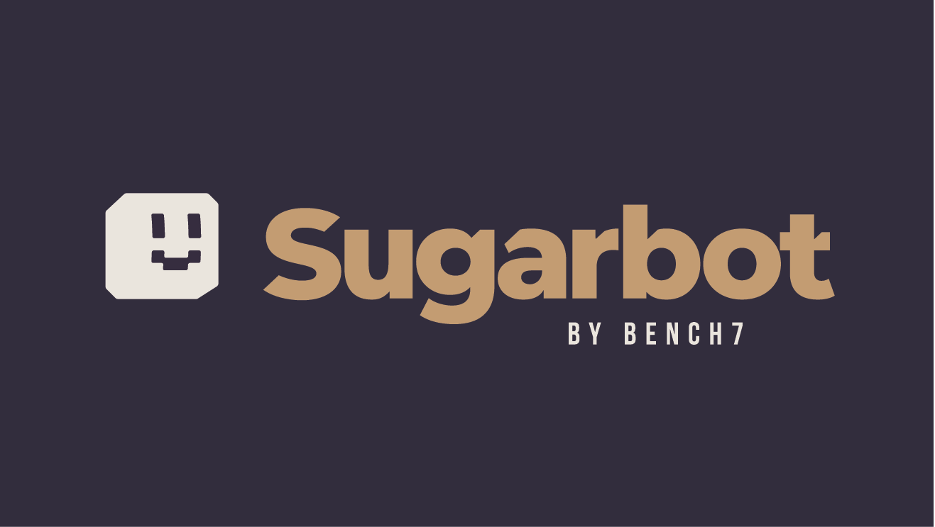
We landed on the perfect choice: A sugar cube. It was charming, clever, and right on brand.
Now we just needed the right colors.
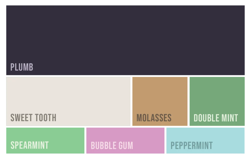
In a world full of cool-toned tech blues and grays, we leaned into SugarBot’s core brand attributes to lead the way, and created a color palette that was totally different: plum, off-white, tan, green, light green, pink, and sky blue. A palette that feels sweet, soft, and smart.
The Results
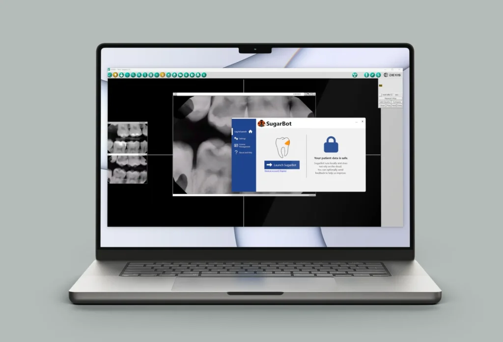
Backed by strategy, powered by design, and sweetened with a little charm, SugarBot is ready to make dental AI feel more human, helpful, and approachable.
Keep an eye out the next time you’re at the dentist; you just might be met by a friendly sugar cube explaining how well you’re doing with your oral care!