Introduction
Watford City was once a quiet stop on the prairie; just a place for trains to refuel in the early 1900s. Many believed it would disappear like other pop-up railroad towns after World War I.
Watford, however, had other plans.
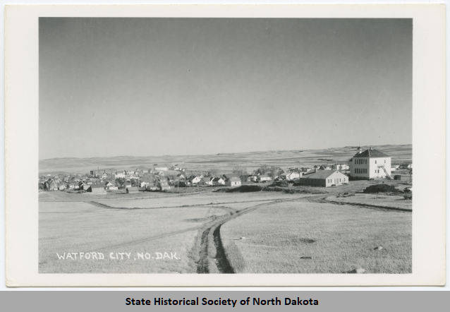
Often called “the little engine that could,” the city defies expectations. Fueled by determination and the belief that big things can grow in small places, it built a future no one saw coming. During the 2010 economic downturn, when much of the country stood still, Watford pushed forward. People arrived seeking opportunity, purpose, and a place to build something real. The population surged from 1,400 to over 6,000, making it one of the fastest-growing micro communities in the U.S.
Today, Watford City is more than a dot on the map; it’s proof that resilience builds remarkable places.
The Challenge
Watford City had the momentum and the vision, but their brand simply hadn’t kept up.
It felt underdeveloped and outdated, missing the energy and heart that make the community special. They needed a brand that matched who they’d become (and who they’re still becoming).


You Don’t Have to Figure It Out Alone

Free 30-Minute Brand Coaching Call
Book a free call to get unstuck and leave with clear next steps. No strings attached.
The Solutions
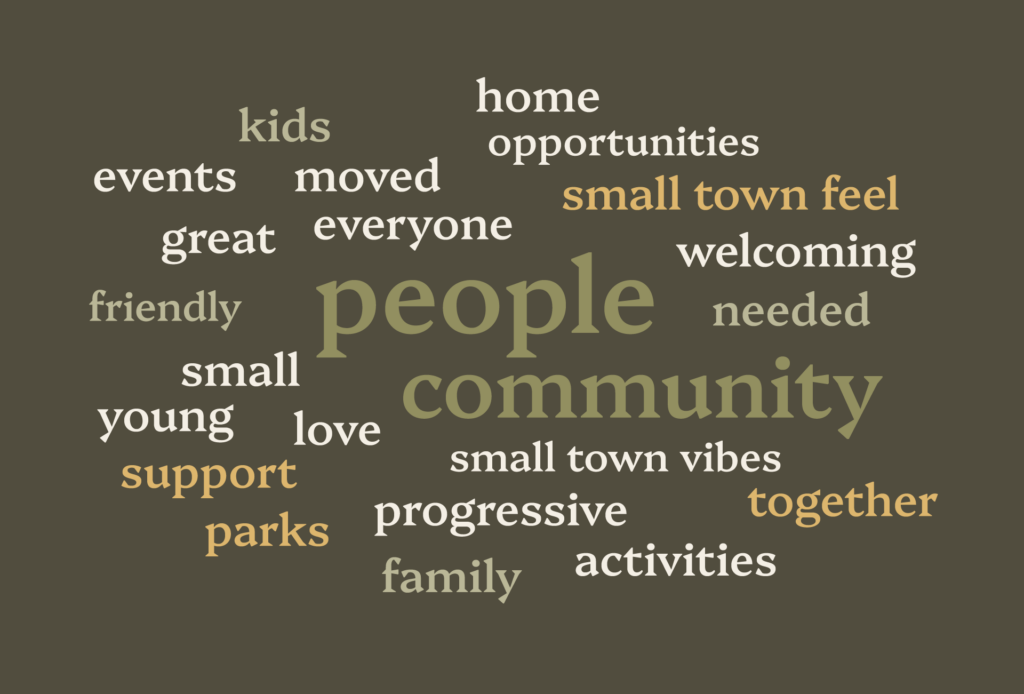
We started by listening: to residents, business owners, and those who’ve watched the city evolve. A public perception survey gave us an honest look at how people saw Watford City: where it shines, what it could build upon, and what stories needed to be told louder.
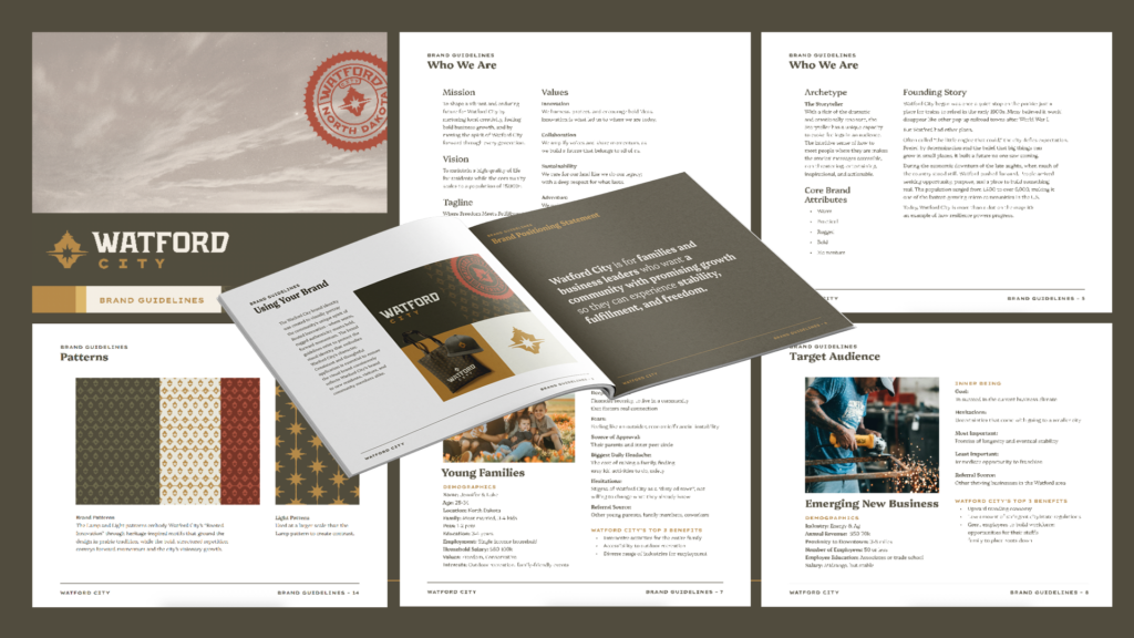
From there, we built a comprehensive brand blueprint full of insights and direction.
This included looking at the context in which Watford City exists, because branding is deeper than just designing a logo; developing an understanding of the whole picture helps build a brand with meaning.
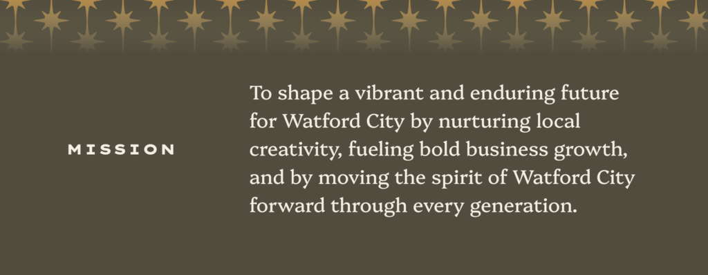
We developed a mission and vision that captured Watford’s forward motion:
Next came the brand’s archetype: confident but kind, ambitious yet grounded:

The archetype’s helped guide everything else, from voice to visuals.
We defined the brand voice as: inspirational, daring, visionary, purposeful, artful.
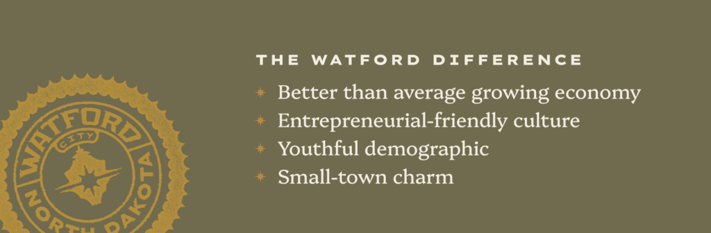
Then we took a look at what truly makes Watford City shine, and determined its main differentiators.
From there, we landed on the brand idea that would anchor everything moving forward: Rooted Innovation; a perfect reflection of the city’s duality of tradition and progress.
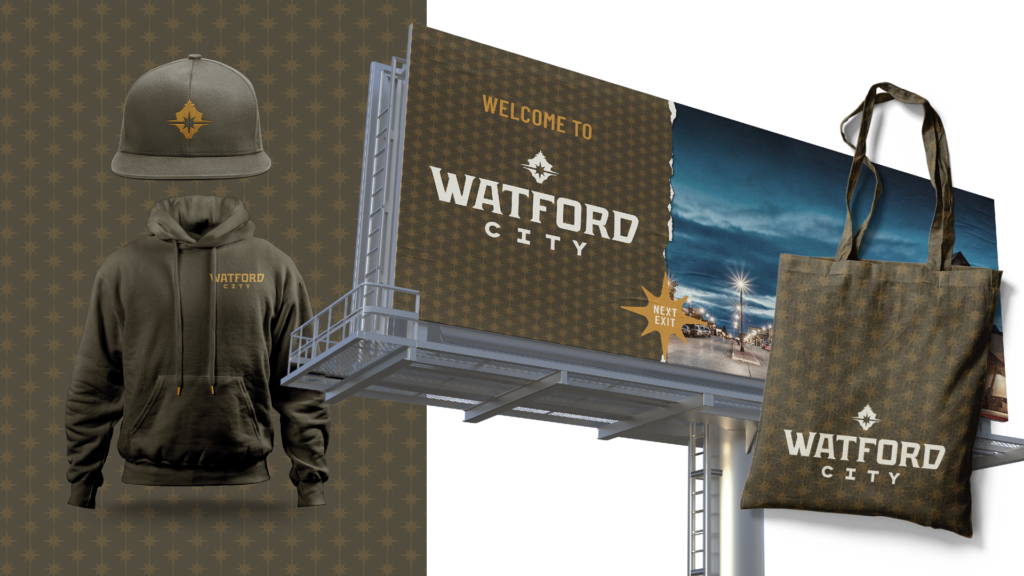
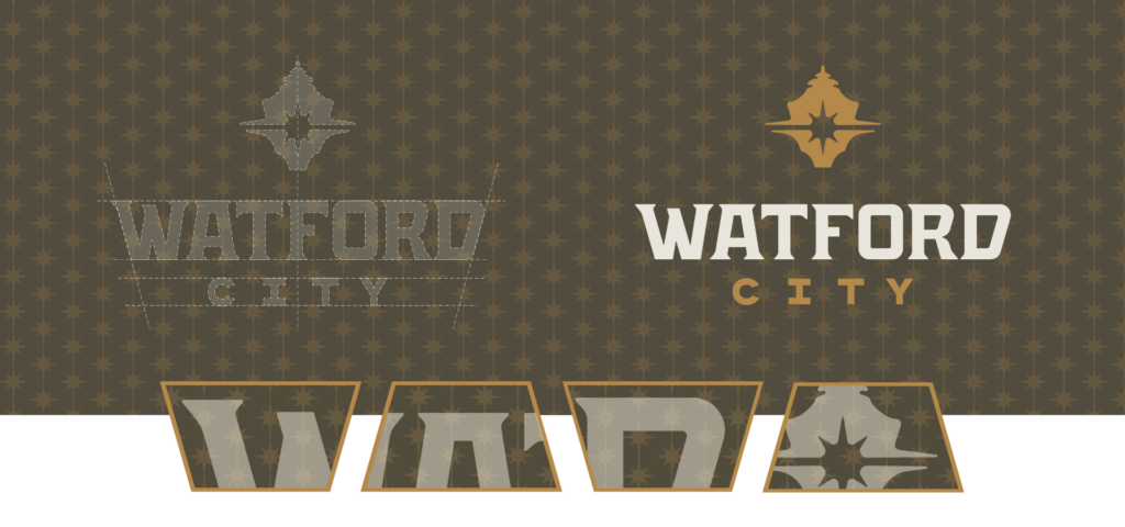
With our brand idea intact, we explored three visual strategy directions, and ultimately landed on one with elements that would make the city stand out from the rest: defined linocuts, warm colors and bold contrast.


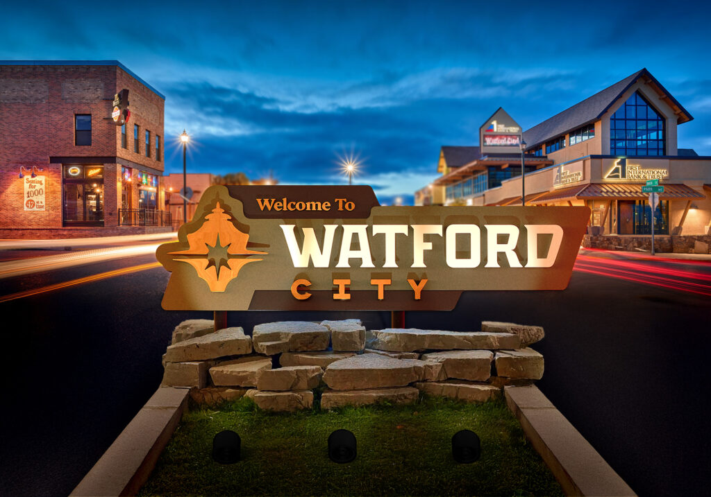
When it was time to select a sketched concept, one design stood out: Concept 4, featuring an abstract streetlight that nods to Watford’s iconic downtown lamp post. The icon represents the city’s welcoming spirit, innovative drive, and rugged surroundings.


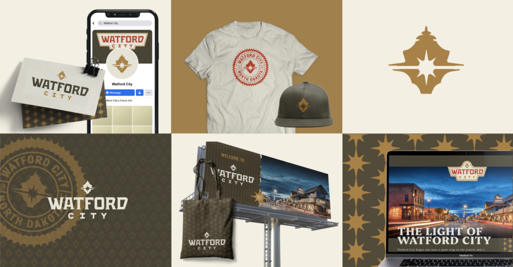
Finally, we brought it all together in a refined brand presentation that felt sturdy and bold; just like the city itself.
The Results
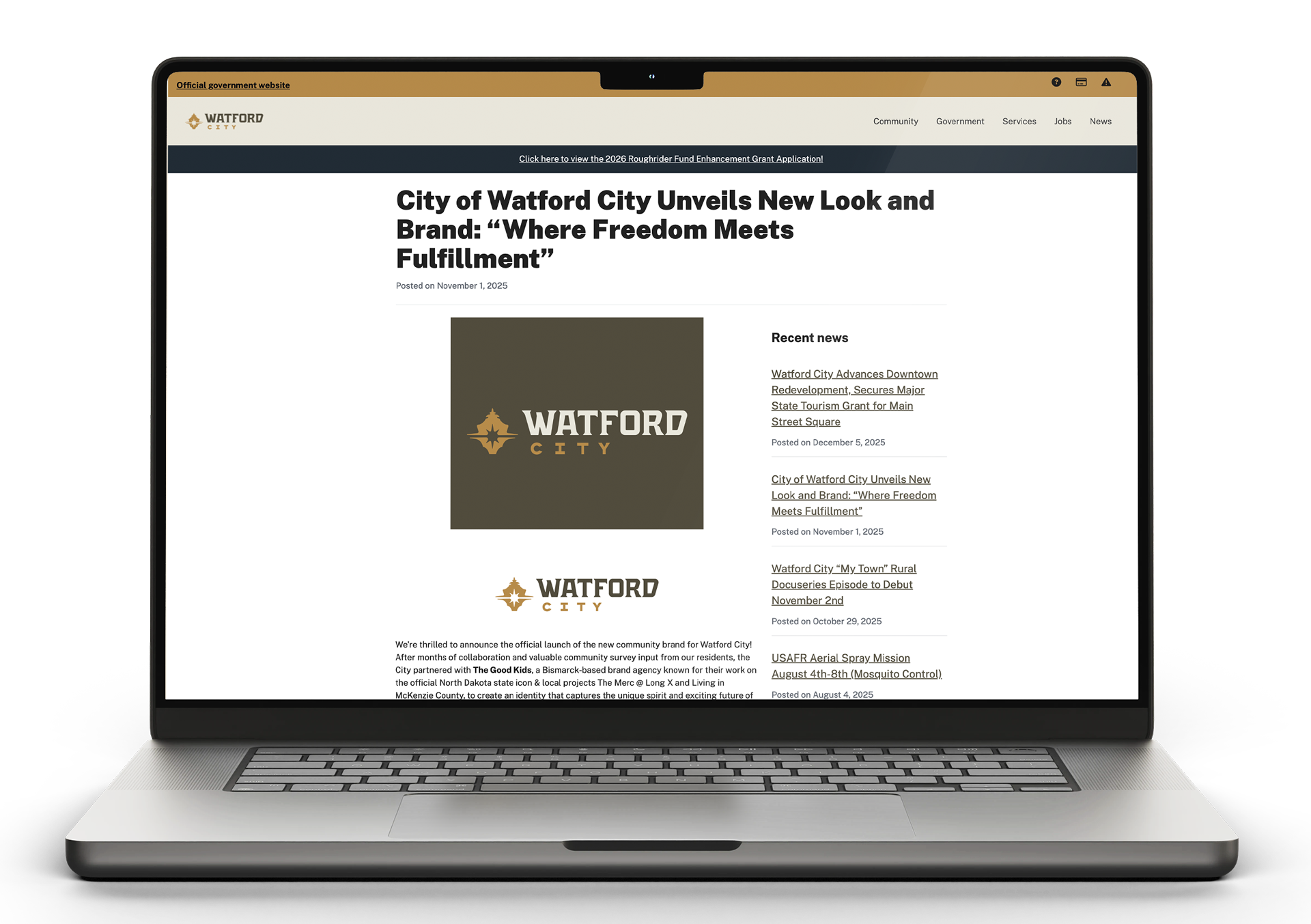
Watford City proudly revealed the new brand with a red carpet event – a fitting celebration for a brand this strong. With a press release to boot, the city has welcomed the new identity with open arms.
Watford City is ready to illuminate its next era for young families and entrepreneurs. We can’t wait to see how it shines.