Introduction
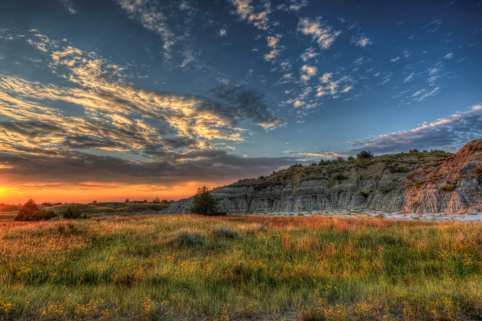
North Dakota is known for many things: wide-open prairies, boundless outdoor recreation, and thriving agricultural opportunities. Simply step outside your front door and you’ll experience breathtaking sunsets, and some of the kindest people you’ll ever meet.
The Peace Garden State has plenty to be proud of, but there was one piece missing: a recognizable state icon to bolster state pride, and encourage tourism.
As proud North Dakotans, The Good Kids were honored to take on this project. We understand the spirit of life in our great state, and we were thrilled to capture that essence in the icon.
The Challenge
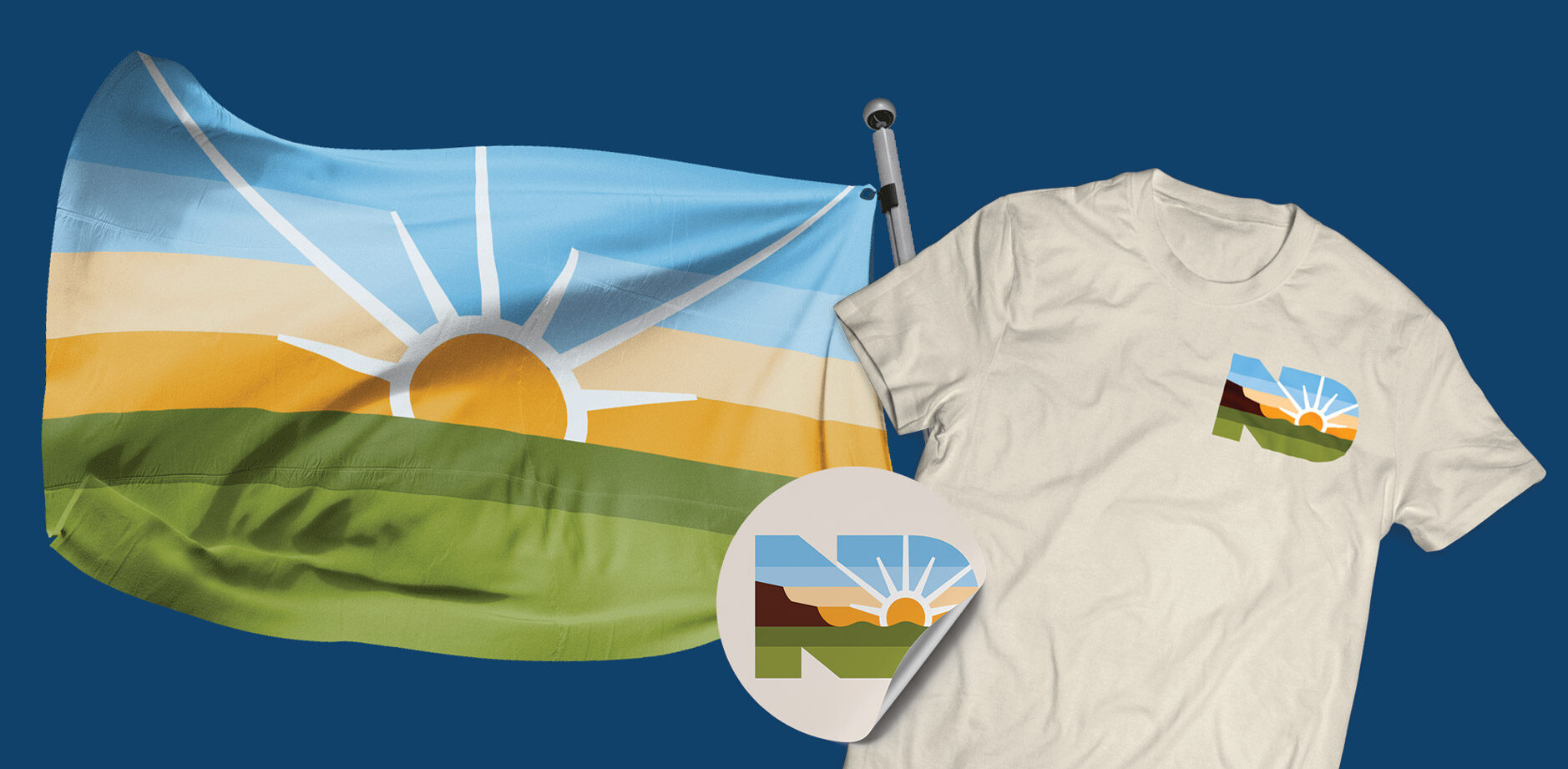
The North Dakota Department of Commerce was ready to complete the state’s brand suite. While the existing “Be Legendary” brand has served the state well, it lacked a visual icon – a symbol that could be quickly recognized, remembered, and embraced by both locals and visitors.

You Don’t Have to Figure It Out Alone
Free 30-Minute Brand Coaching Call
Book a free call to get unstuck and leave with clear next steps. No strings attached.
The Solutions
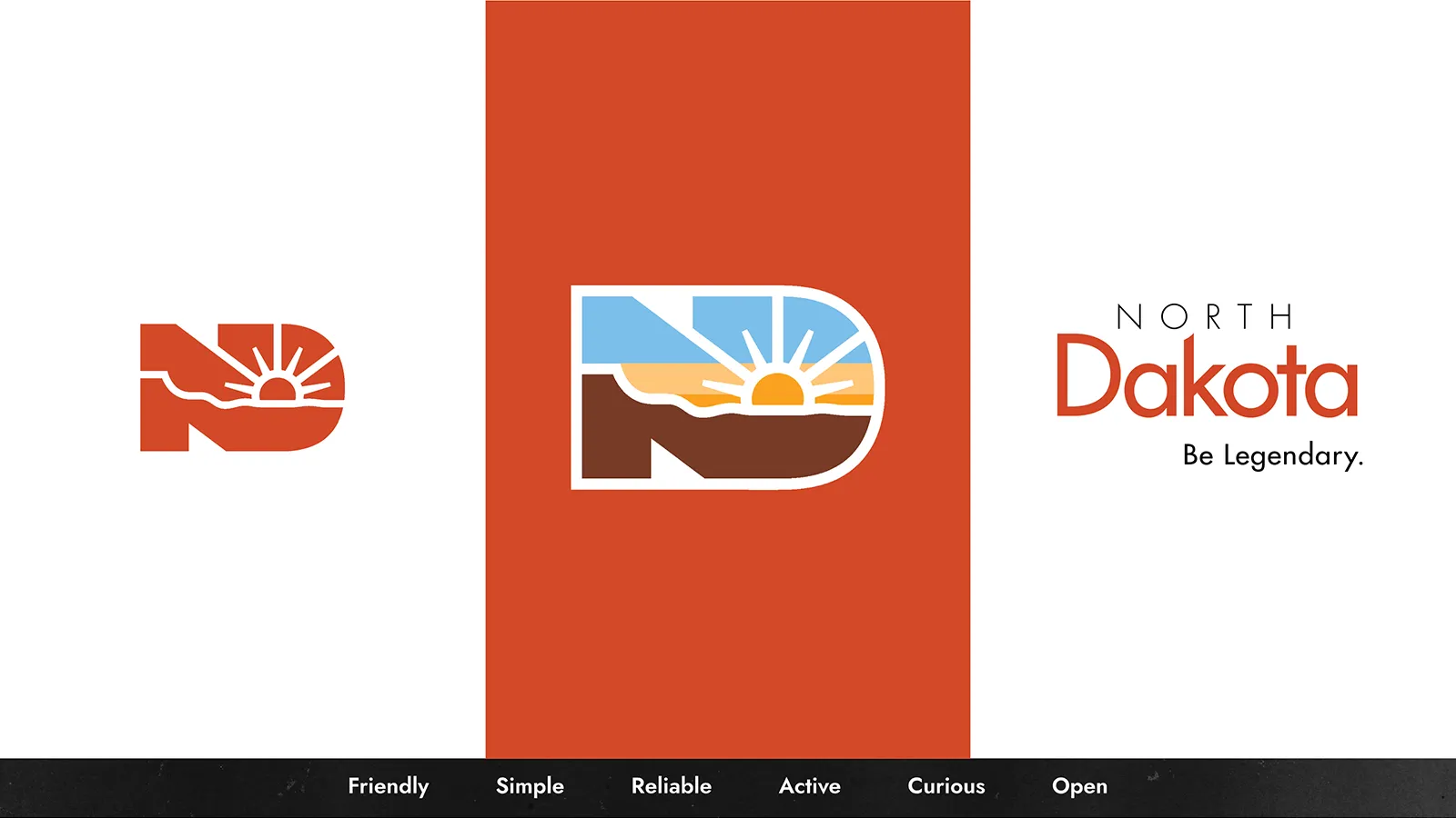
We began by grounding ourselves in strategy – the foundation step that gives design purpose and meaning. We explored the “Be Legendary” brand, what it stands for, and who it aims to reach. Then we analyzed how other states use icons to represent their culture and offerings (think of Colorado, California or Texas).
From there, we defined five core traits the North Dakota icon should embody: Friendly, Simple, Reliable, Active, and Curious.
These attributes would act as our compass for the remainder of the project, helping us imagine the emotion and energy the icon should convey.
Collaborating closely with state and local tourism officials and experienced marketing professionals, we reviewed their data and tourism insights, and incorporated our own creative perspective to build a well-rounded picture of where the icon needed to go.
Selected slides from brand blueprint
With that clarity, we were ready to bring the vision to life. We developed three distinct visual directions – each with its own set of ideas, and aesthetics. After thoughtful discussion with the North Dakota Department of Commerce, Legendary Sunsets was chosen to lead the way.
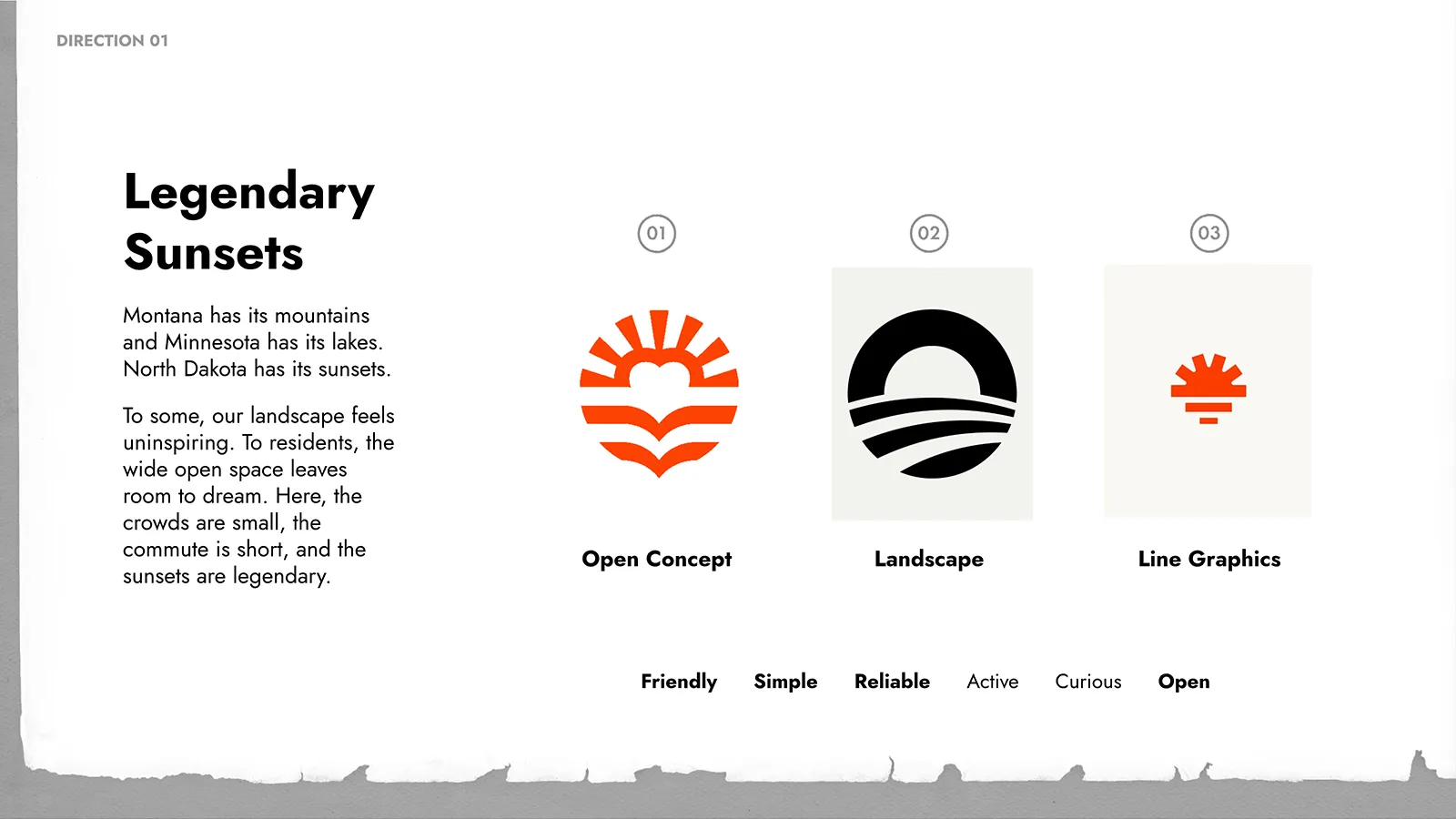
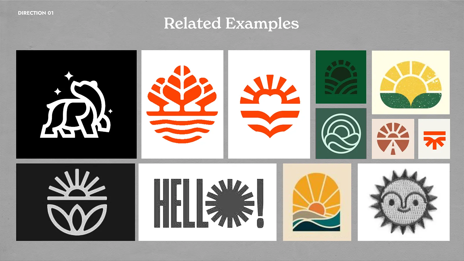
“Montana has its mountains and Minnesota has its lakes. North Dakota has its sunsets. To some, our landscape may seem unremarkable. But to those who live here, the wide-open spaces are full of potential. The crowds are small, the commutes are short, and the sunsets are legendary.”
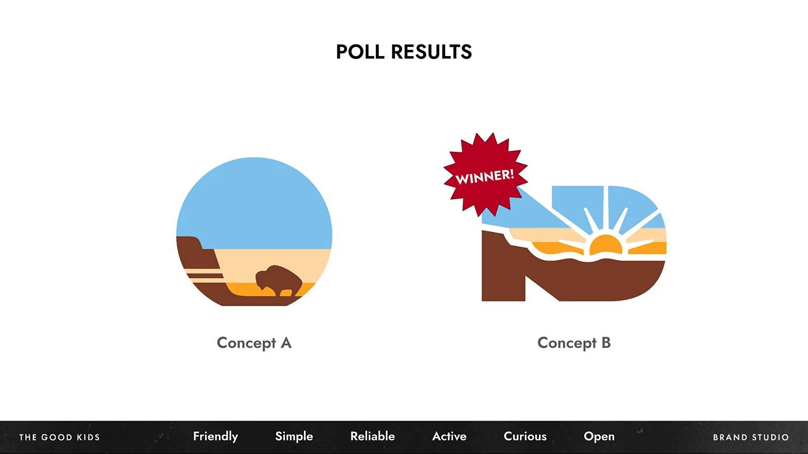
From there, we moved into sketching. Seven initial concepts were created – each rooted in the strategy and core traits we established. After careful review, two concepts were chosen to pursue.
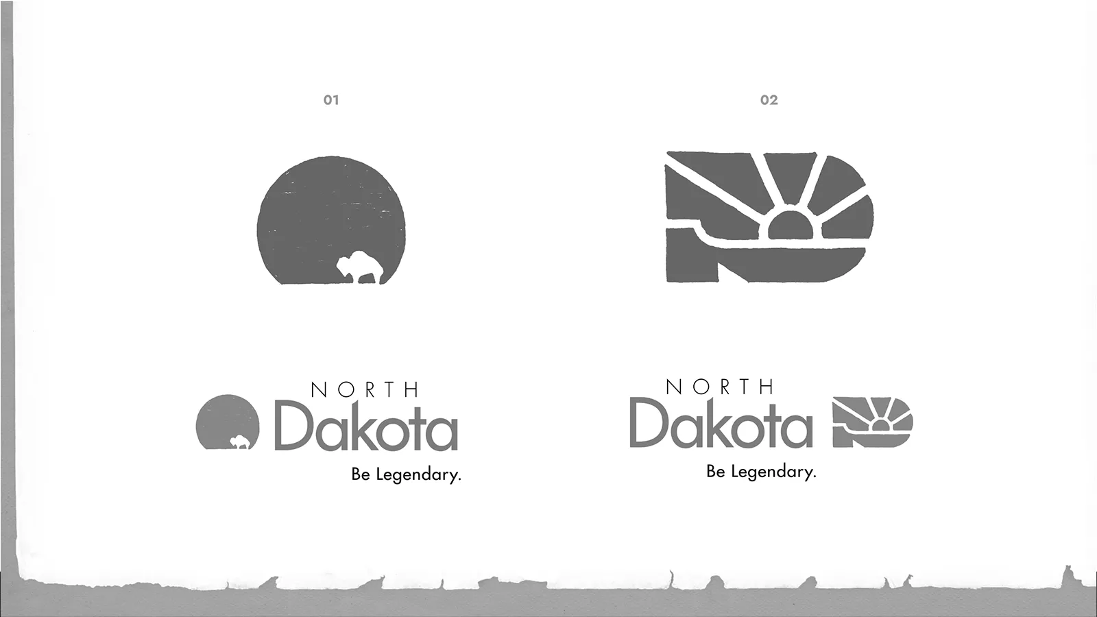
Next came the refinements: cleaning up the lines, introducing color, and developing digital versions that stayed true to the sketches.
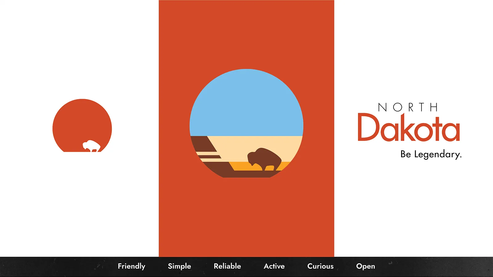
When the time came to share with the public, we presented both concepts in a simple, accessible poll open to the entire state of North Dakota.
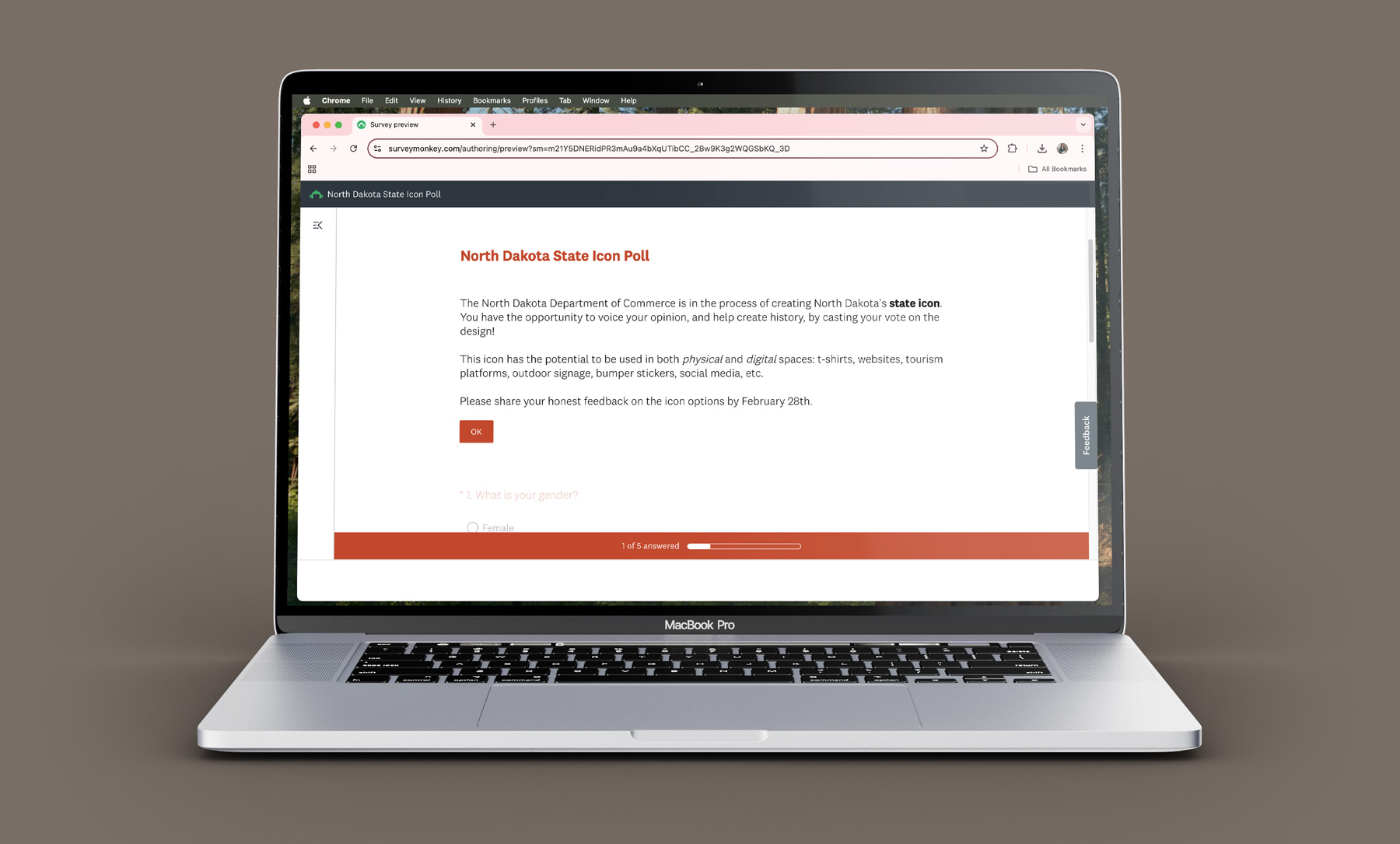
The poll was advertised on television, social media, and various email newsletters. We knew we couldn’t fully capture months of strategy and design work in a single poll – but we wanted the people of North Dakota to be part of this moment. And they showed up.
Out of 10,000 responses, over 80% chose Concept B: the monogram.
From the beginning, we understood that a symbol representing an entire state would naturally spark a range of opinions. North Dakota is home to diverse communities, landscapes, and perspectives – and capturing all of that in a single icon is no small task.
That’s why the North Dakota Department of Commerce was proactive about inviting feedback. They wanted to ensure the public felt seen and heard, knowing that the best ideas often come from collaboration. As part of that process, we kept a close eye on the public feedback. One common request stood out: swap the brown base for green to better reflect North Dakota’s legendary grasslands.
We, as well as the North Dakota Department of Commerce agreed. To stay aligned with the state’s existing brand, we referred directly to the Department of Commerce’s brand guide to ensure the green featured in the icon matched a color already established within the brand.
Selected slides from Icon Presentation
The Results
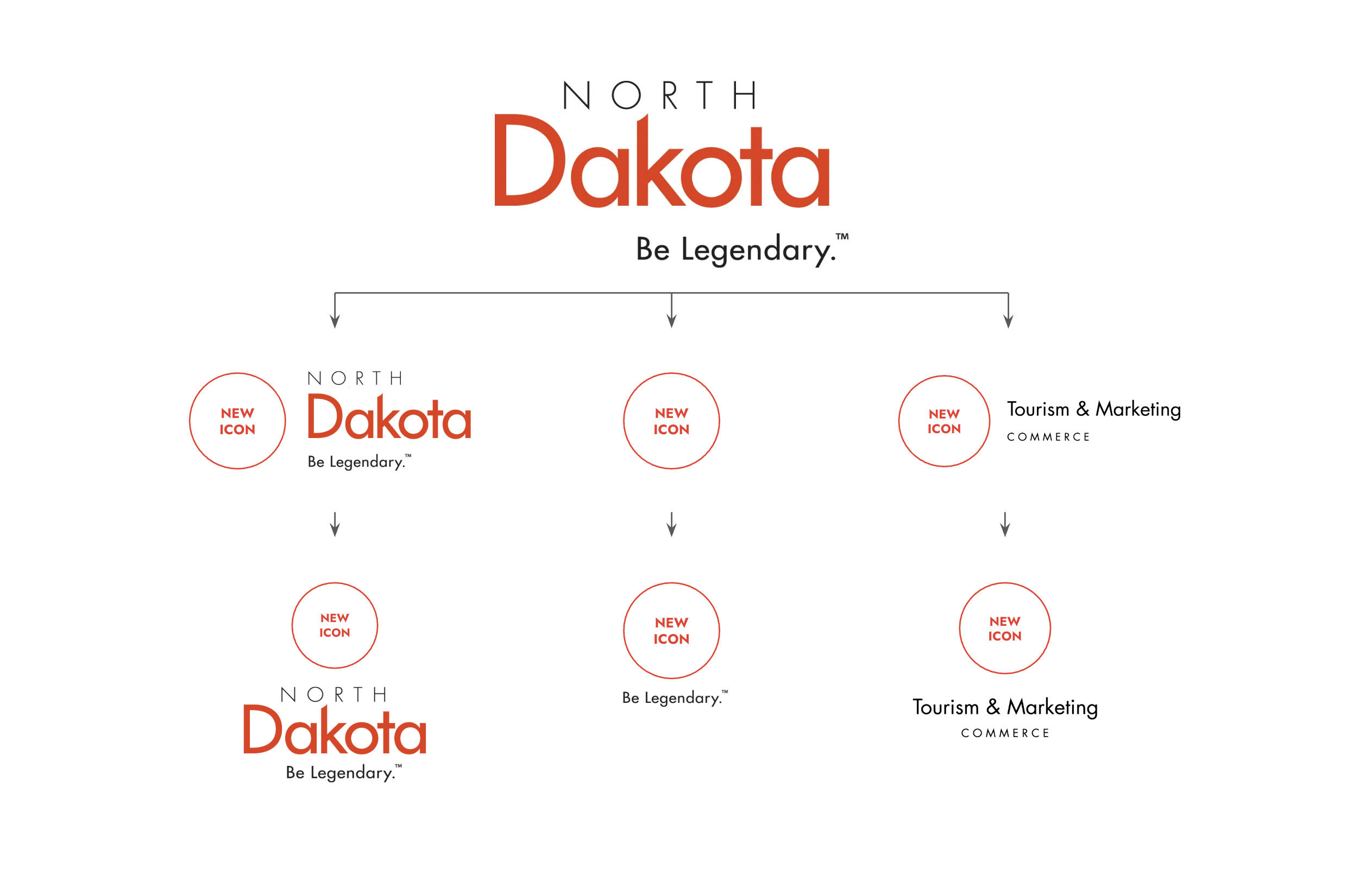
So, what do you think, North Dakota? Are you excited to wear this icon on a t-shirt? Share as a sticker? Rock as a temporary tattoo?
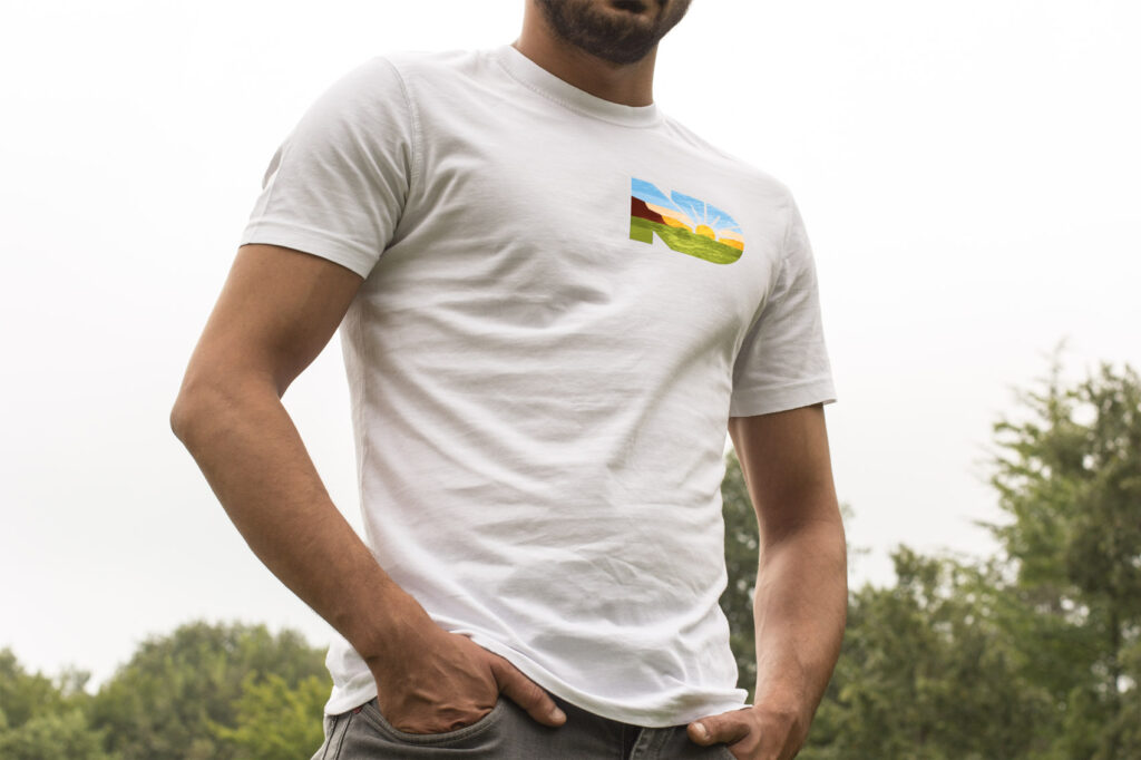
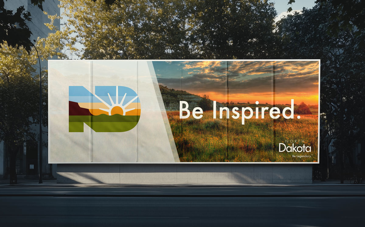
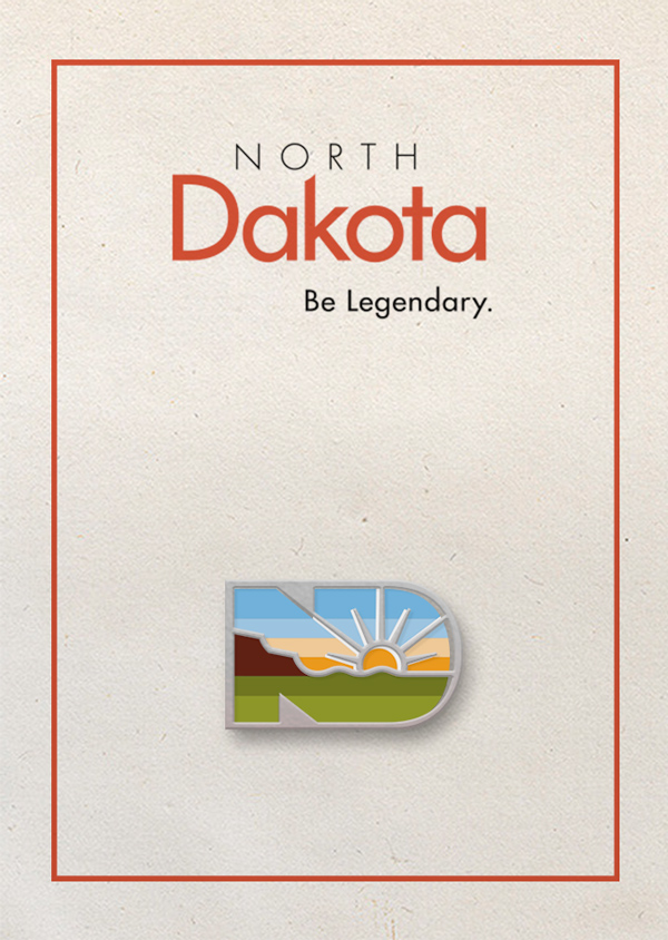
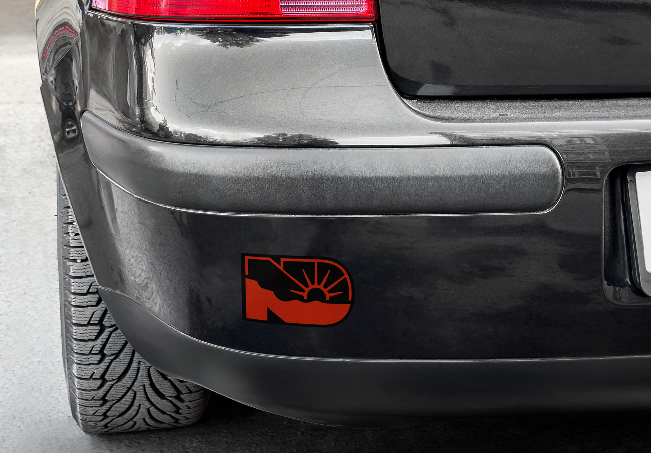
Brand in use
If you’re ready to show your state pride, check out the North Dakota Department of Commerce’s shop to grab the new state icon on your favorite gear!


