Introduction
Since 1963, HSI Solutions has been helping North Dakota’s hospitals run like well-oiled machines. As a subsidiary of the North Dakota Hospital Association (NDHA), they complement NDHA’s policy and advocacy work by focusing on the day-to-day operations that keep healthcare systems running smoothly.
Over the decades, their services expanded far beyond hospitals. Today, they support a wide range of providers, from nursing and residential care facilities to physicians, dentists, and allied health professionals across the region.
The Challenge
For all the good they were doing, HSI was flying under the radar. Awareness was low, even among NDHA members, and that lack of visibility posed a real risk to their long-term growth.
They needed a brand that would earn attention, build recognition, and clearly communicate their role as a trusted partner to North Dakota’s healthcare providers.

You Don’t Have to Figure It Out Alone

Free 30-Minute Brand Coaching Call
Book a free call to get unstuck and leave with clear next steps. No strings attached.
The Solutions
We started with strategy, because before you can make something look good, you have to make sure it means something.
Together, we defined HSI’s key audiences: critical access rural hospitals and rural long-term care facilities. From there, we defined HSI’s brand archetype as The Ruler; a personality built on structure, leadership, and dependability.

In addition to who HSI was speaking to, we clarified why their audiences should be listening; this involved defining their HSI’s emotional benefit. Sure, they offer operational support for healthcare systems, but what does that mean on a deeper level? For HSI’s target audiences, that translates to fairness, trust, honesty, safety, and stability.
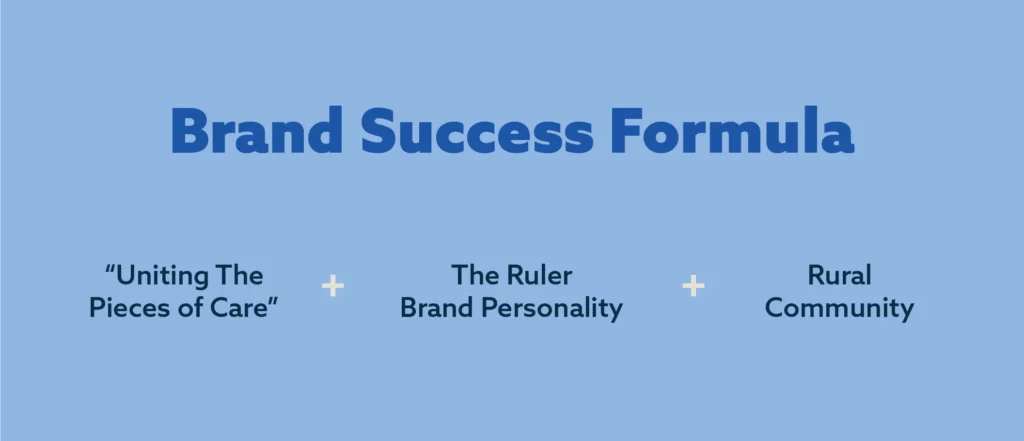
We also landed on a unifying brand theme: “Uniting the Pieces of Care.”
It perfectly sums up what HSI does every day; connecting people, processes, and systems to create order across a complex landscape.
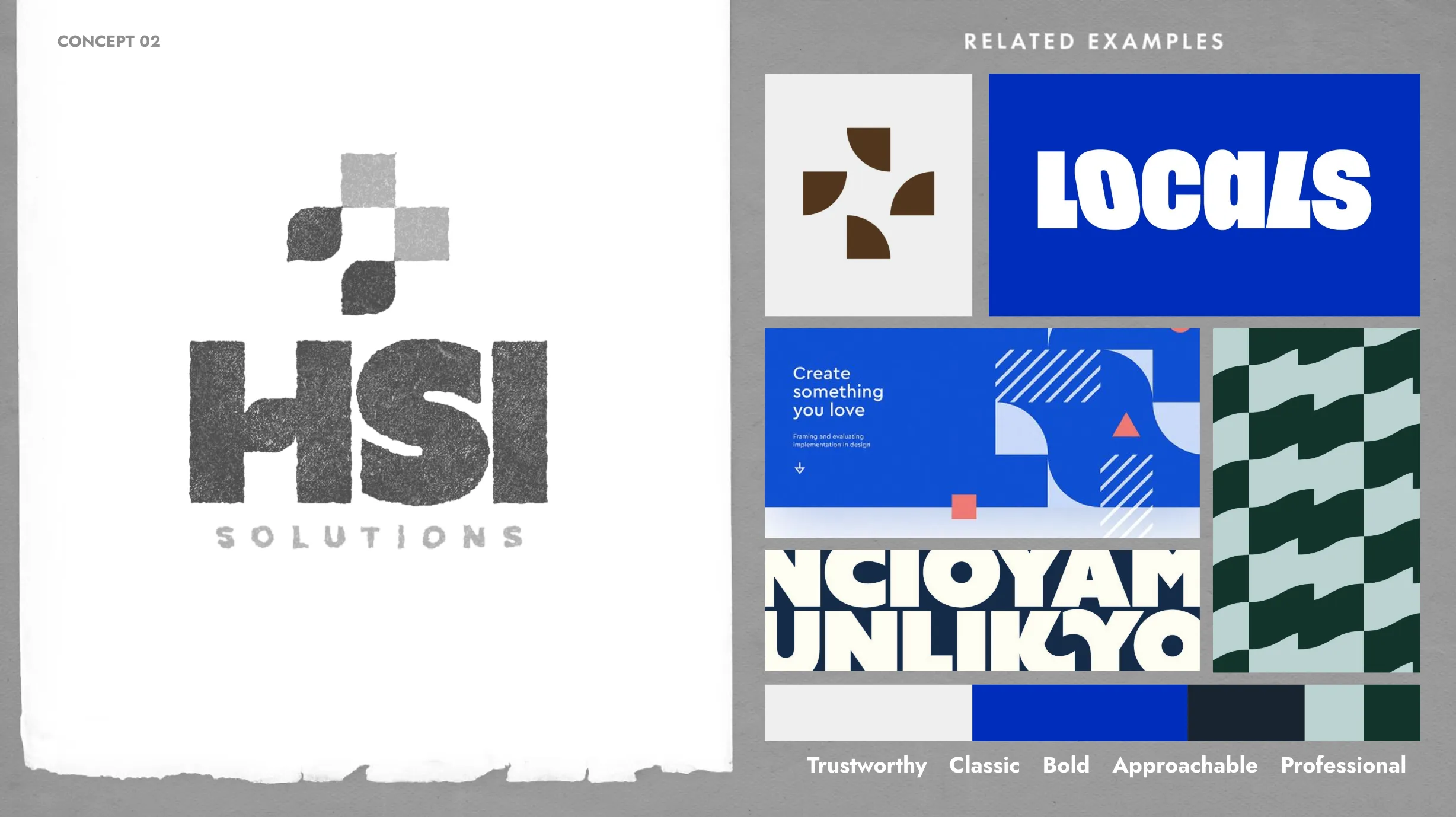
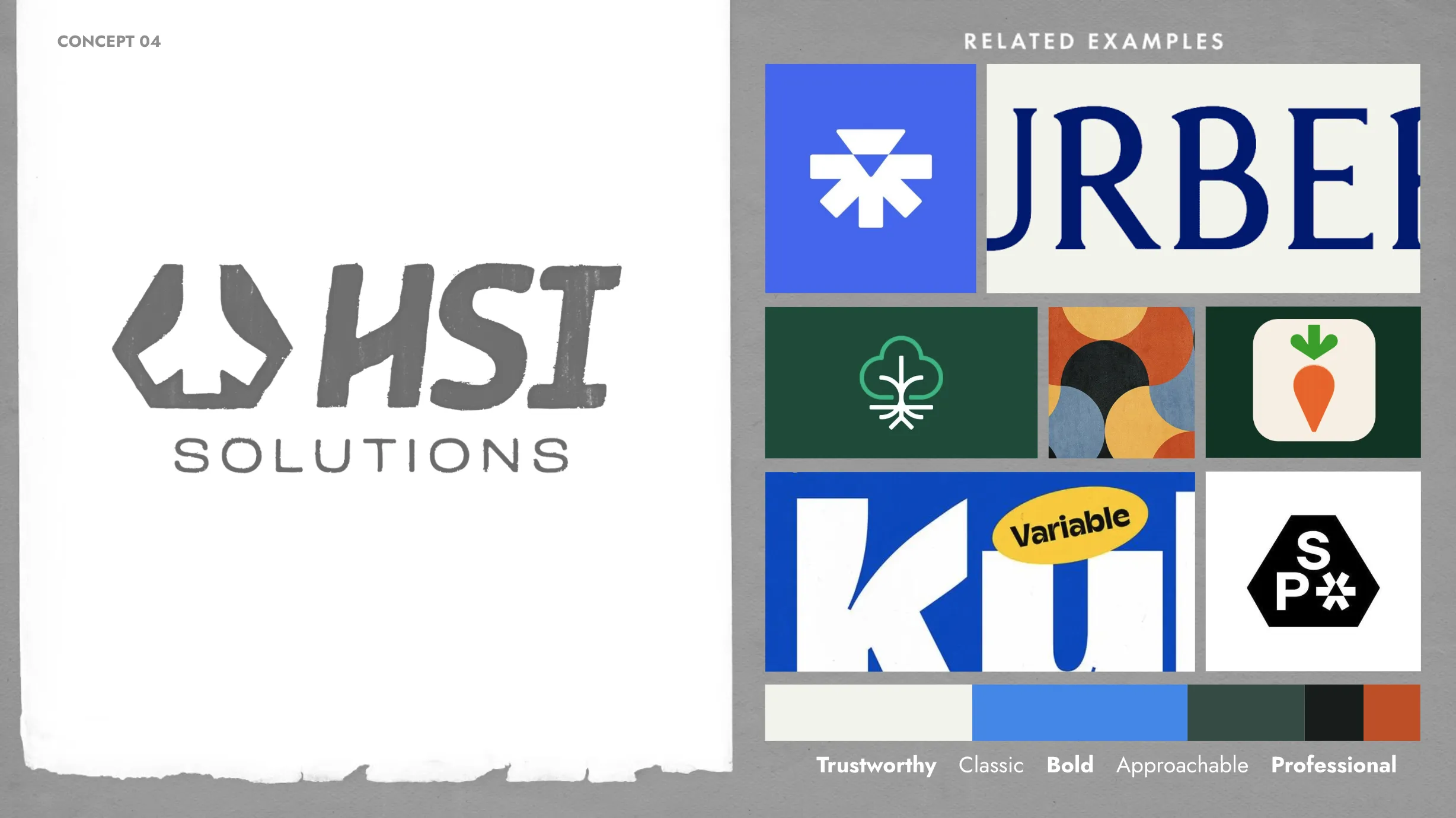
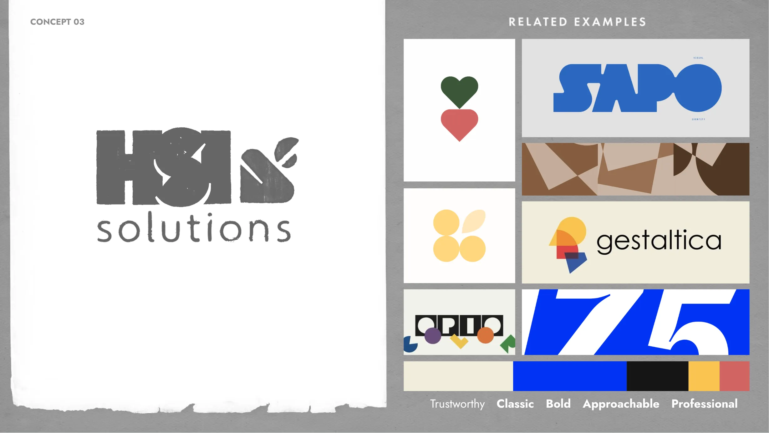
As part of the strategy, we defined the core traits that would guide the future design. These attributes capture HSI’s personality and what the brand should feel like:
Trustworthy. Classic. Bold. Approachable. Professional.

And with our strategic foundation in place, we finally had our formula for brand success:
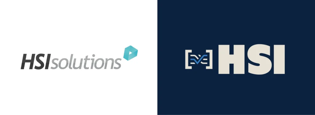
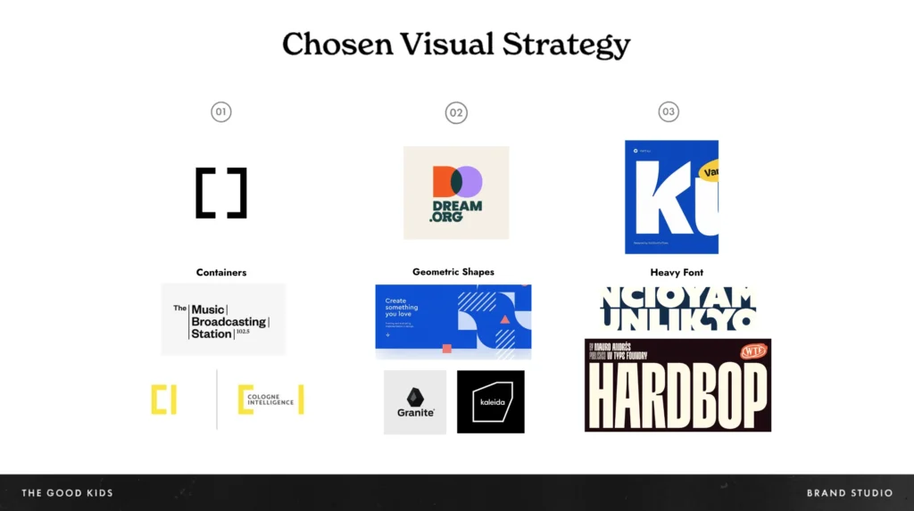
Our market research showed what we were up against: a landscape full of teals and greens. Modern sans-serif fonts. Stock photos galore. In other words, the healthcare visual landscape was playing it safe (like really safe).
To help HSI stand out, we knew we’d need a look that could command attention, while staying grounded in trust and professionalism.
We developed three creative directions, each offering a unique spin on their new identity. The winner?
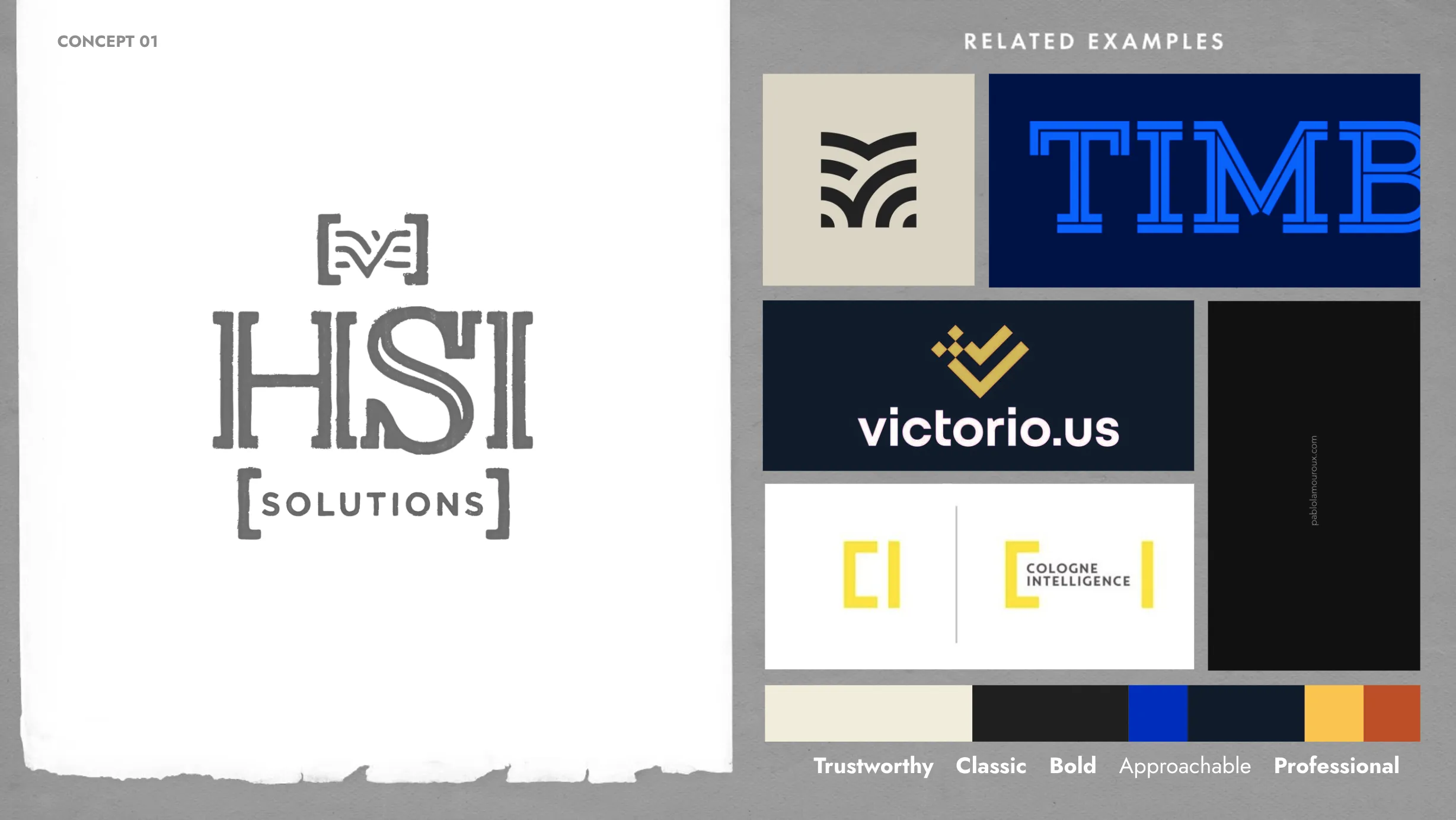
“Holding It Down.”
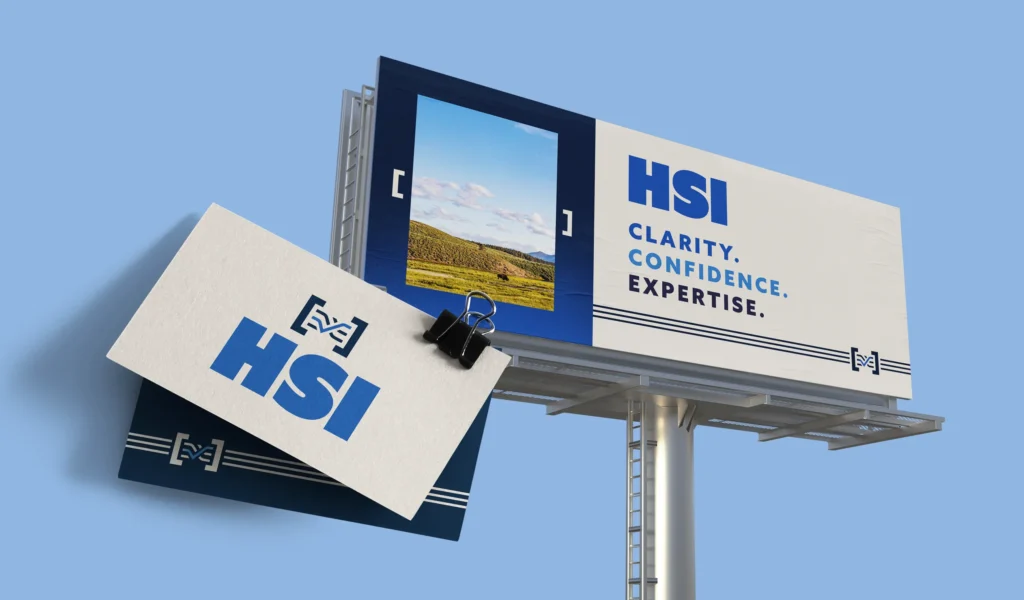
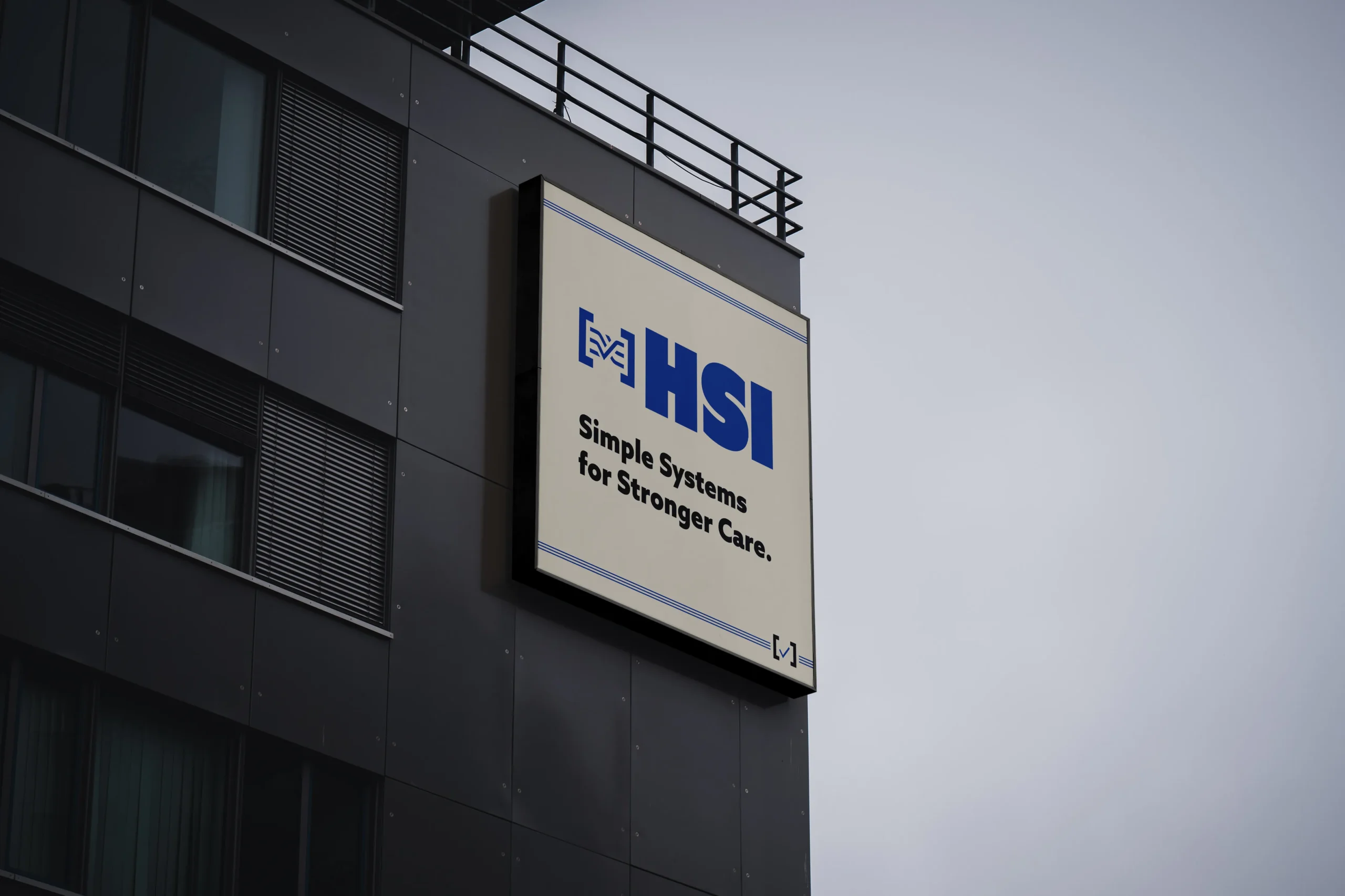
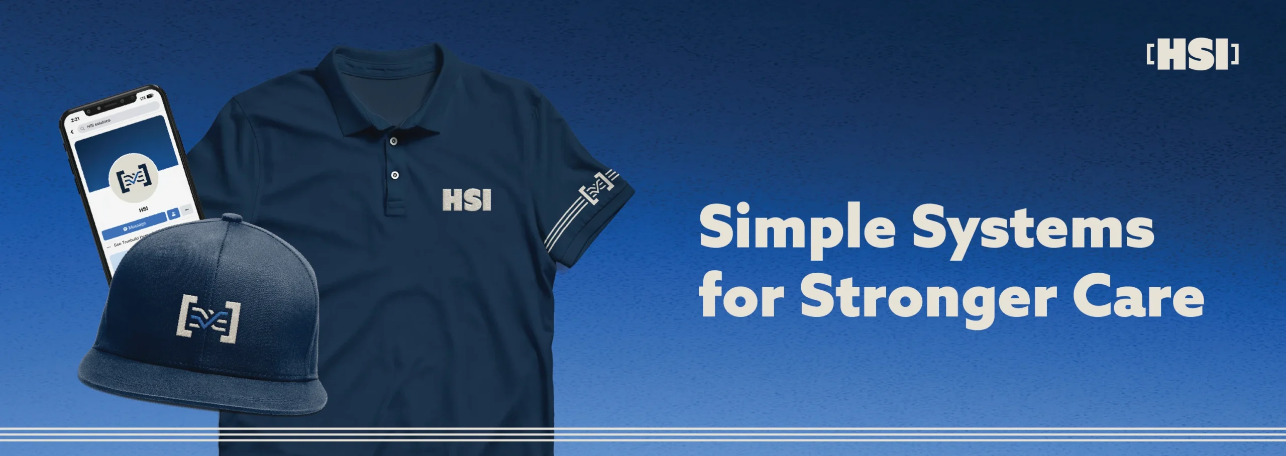
This concept brought strength and structure to the forefront, using solid containers, bold typography, and confident design elements to visually express control and dependability.
Once the direction was locked, we moved through rough sketches, and landed on the following:
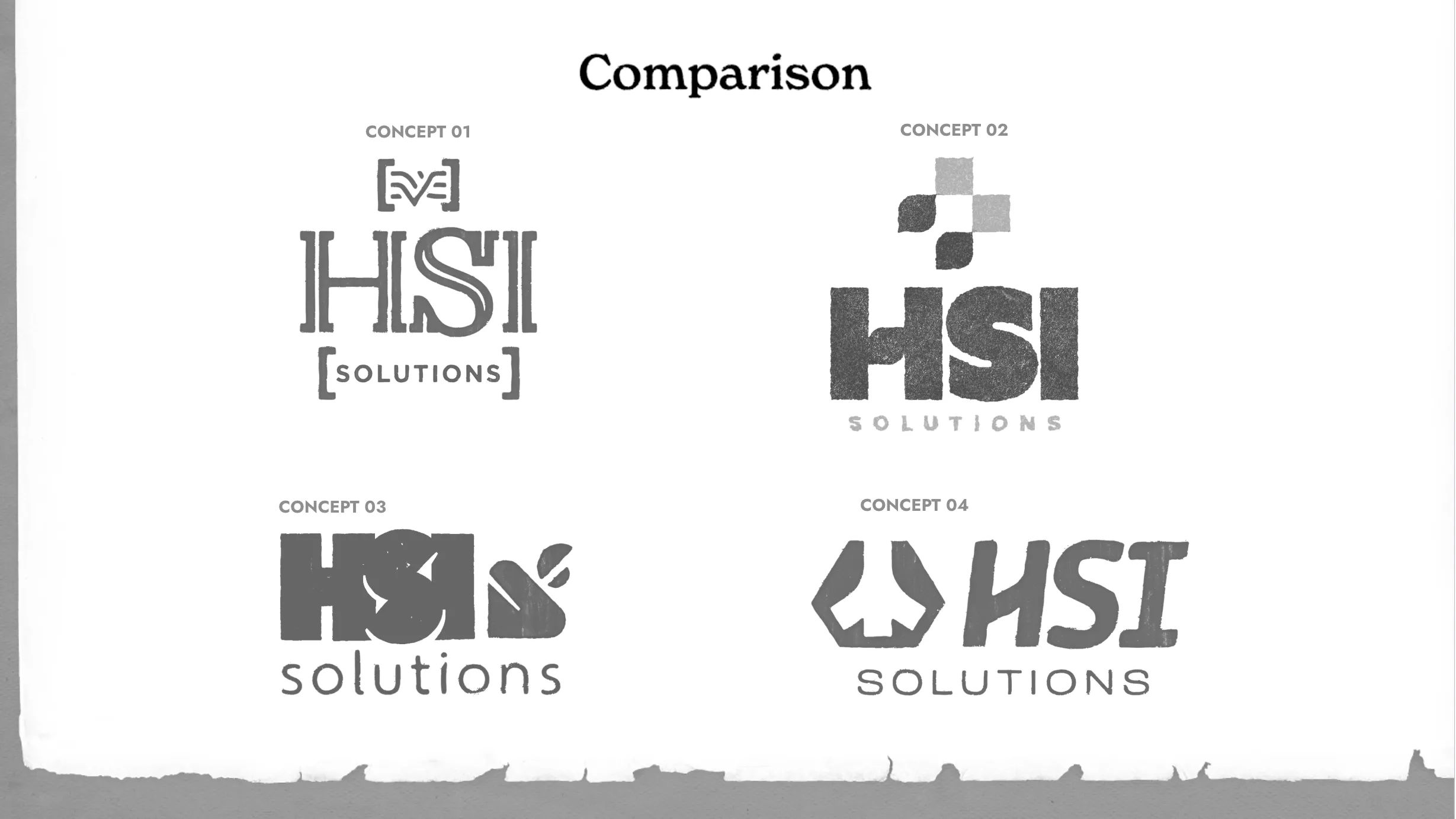
And finally, the final brand presentation: the moment where everything clicked.
The chosen option was a clear reflection of HSI’s promise, and offering.
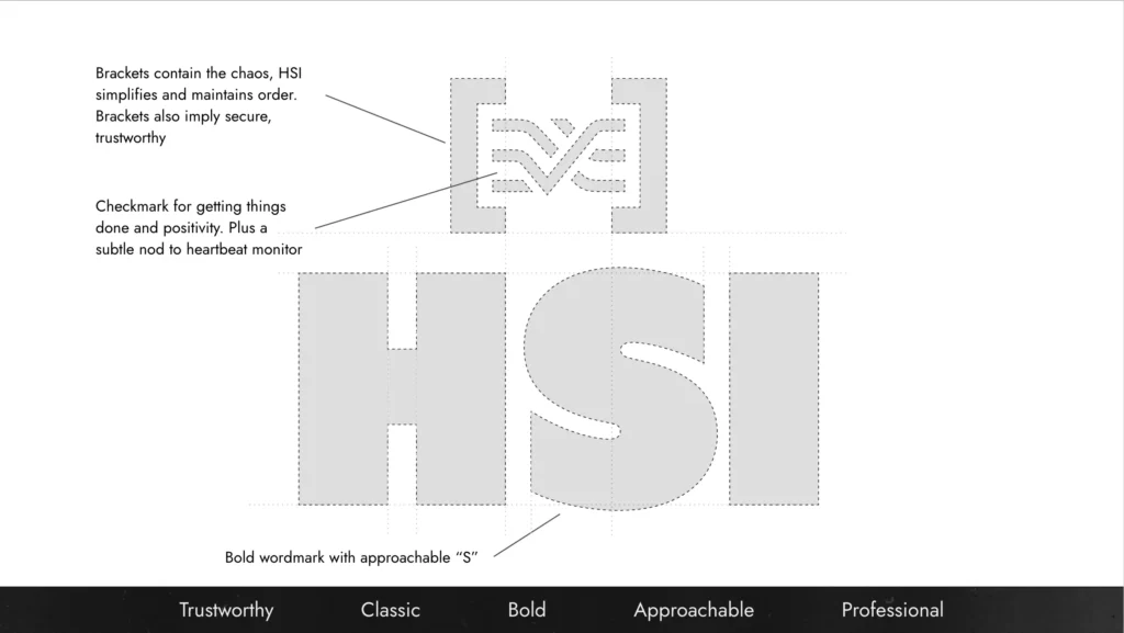
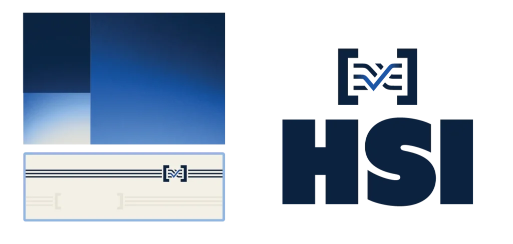
The system communicates mastery over chaos through its clean, bracketed visuals, and it maintains that approachable, human touch that keeps HSI so deeply connected to its community.
The Results
HSI’s keeping the excitement in-house for now, and unveiling the new brand to their team first before taking it public. It’s a thoughtful rollout for a brand built on order and confidence!
With a confident new look, a sharper story, and a clear sense of direction, they’re ready to show North Dakota’s healthcare community exactly what it looks like when everything works together. With the new, solid brand intact, they’re primed to increase awareness of their services to NDHA members, and in turn, provide patients with better, more effective care.
When HSI builds Simple Systems for Stronger Care, everyone wins.