Introduction
Since 1985, Rock’n 50’s has been serving up classic diner fare with a side of nostalgia. Founded by Darwin Leier, the restaurant was built on a simple but powerful vision: to create a place where everyone feels at home. With its retro booths, vintage jukeboxes, and welcoming atmosphere, Rock’n 50’s had long been a local treasure – but it was time to put the pedal to the metal and rev up its brand appeal for the next generation.

The Challenge
While Rock’n 50’s has a rich history and a dedicated customer base, its brand had lost some of its original shine. Awareness among younger generations was dwindling, and the brand had many appealing, but disconnected elements. Rock’n 50’s needed a refresh – one that would really make some noise and draw in a new generation of diners.
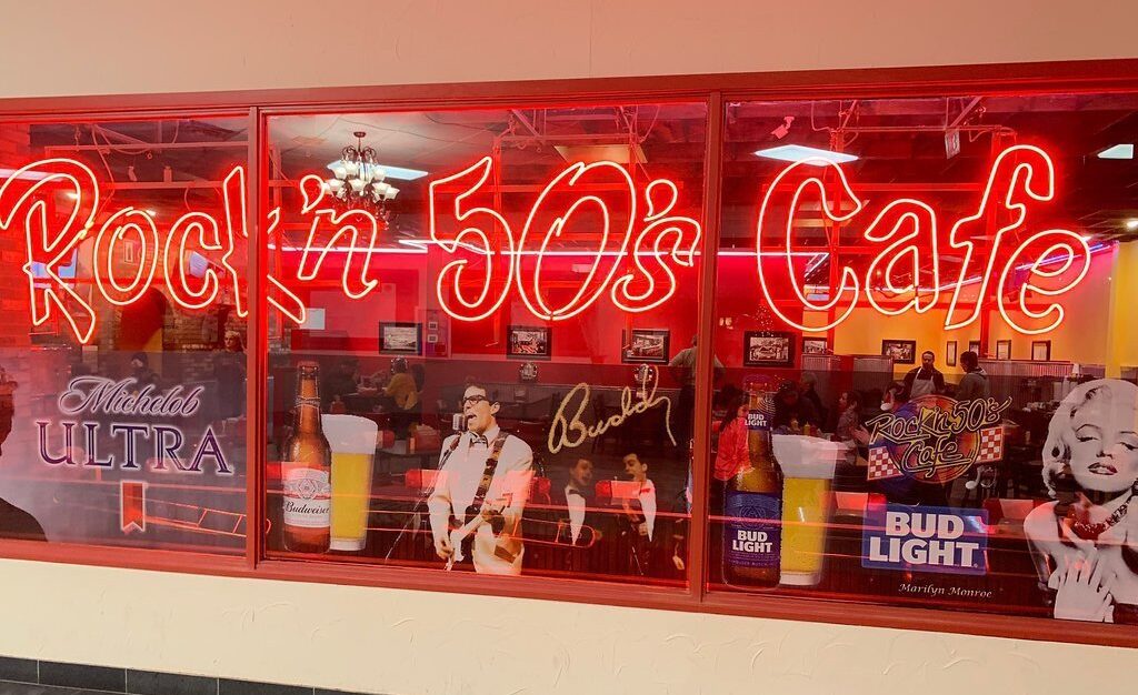


Old Brand

You Don’t Have to Figure It Out Alone

Free 30-Minute Brand Coaching Call
Book a free call to get unstuck and leave with clear next steps. No strings attached.
The Solutions
The first stop? No, not a time machine journey back to the 1950’s – although it might feel that way!
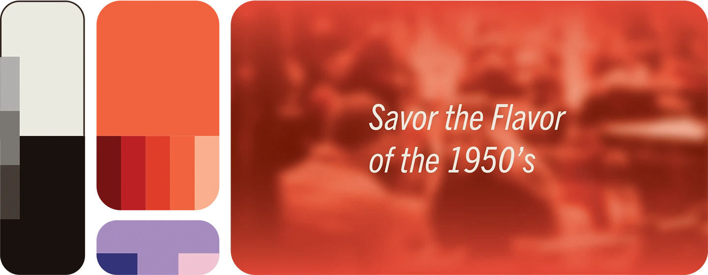
We kicked things off with a brand strategy to set the foundation. We dug deep into the brand’s roots, conducting a market analysis and identifying key target audiences. From there, we solidified the brand story around the idea: Lost in the Flavor of the 1950s. This concept served as the guiding star for every design decision that followed. We established core brand attributes that captured the restaurant’s essence: nostalgia, family-friendly, bold, playful, and immersive.


Selected slides from brand blueprint
With the brand story in place, we explored three visual directions.
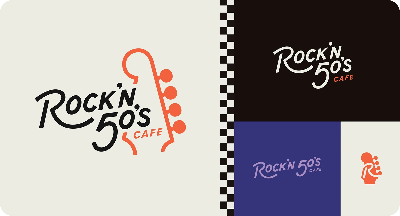
The winner? None other than The Big Show – a direction that preserved the main themes of the restaurant while incorporating a fresh energy. Nostalgia and modern appeal? Coming right up!
From there, we got to work on some sketches to explore all the possibilities. Some were subtle refinements of the existing logo, while others took a more adventurous approach.


brand concept
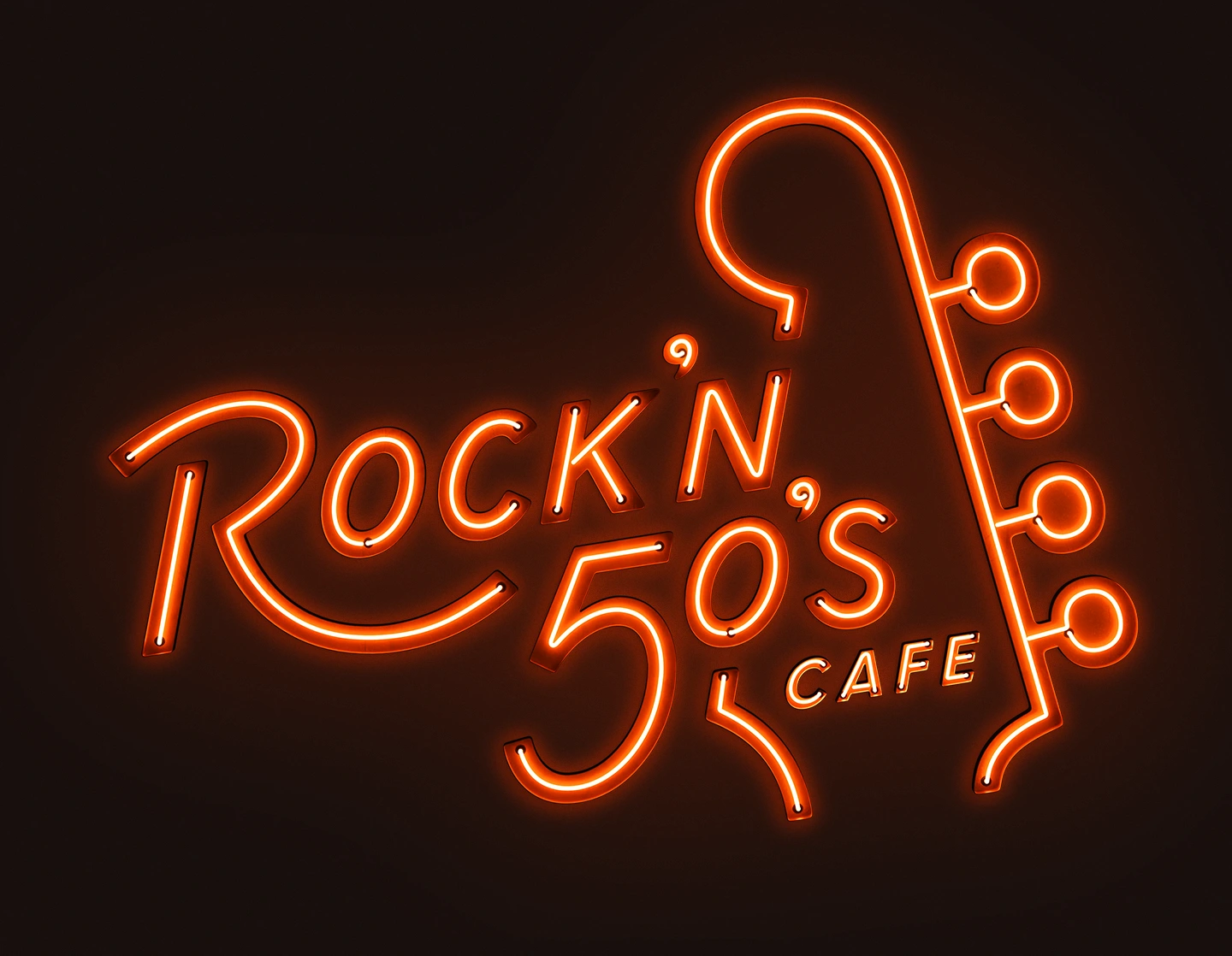
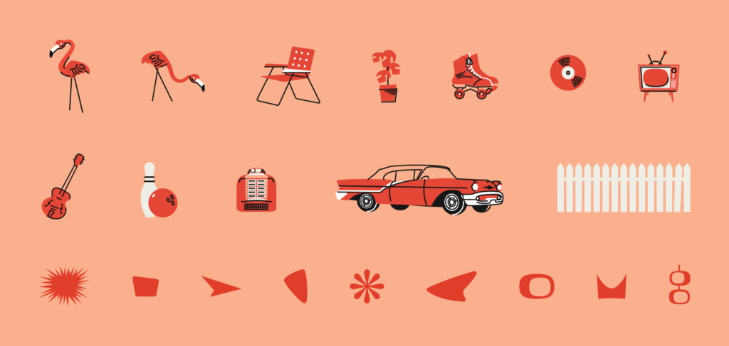
In the end, Rock’n 50’s opted for a bold, unique design featuring a guitar headstock and 50’s-inspired hand lettering. The final touches were a vibrant color palette, and playful illustrations that brought the brand to life in an unforgettable way.

The Results
We’re excited to share that Rock’n 50’s brand has officially been launched, and it’s cooler than a convertible with the top down.
With a refreshed look that maintains the magic of the 1950s while speaking to today’s audiences, the restaurant is ready to welcome a whole new generation of guests and their families. Stop by, grab a burger and a shake, and experience the charm of the updated brand for yourself.
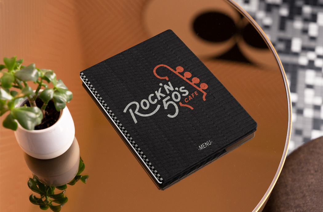

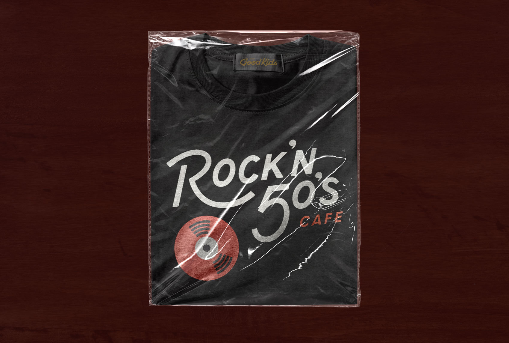
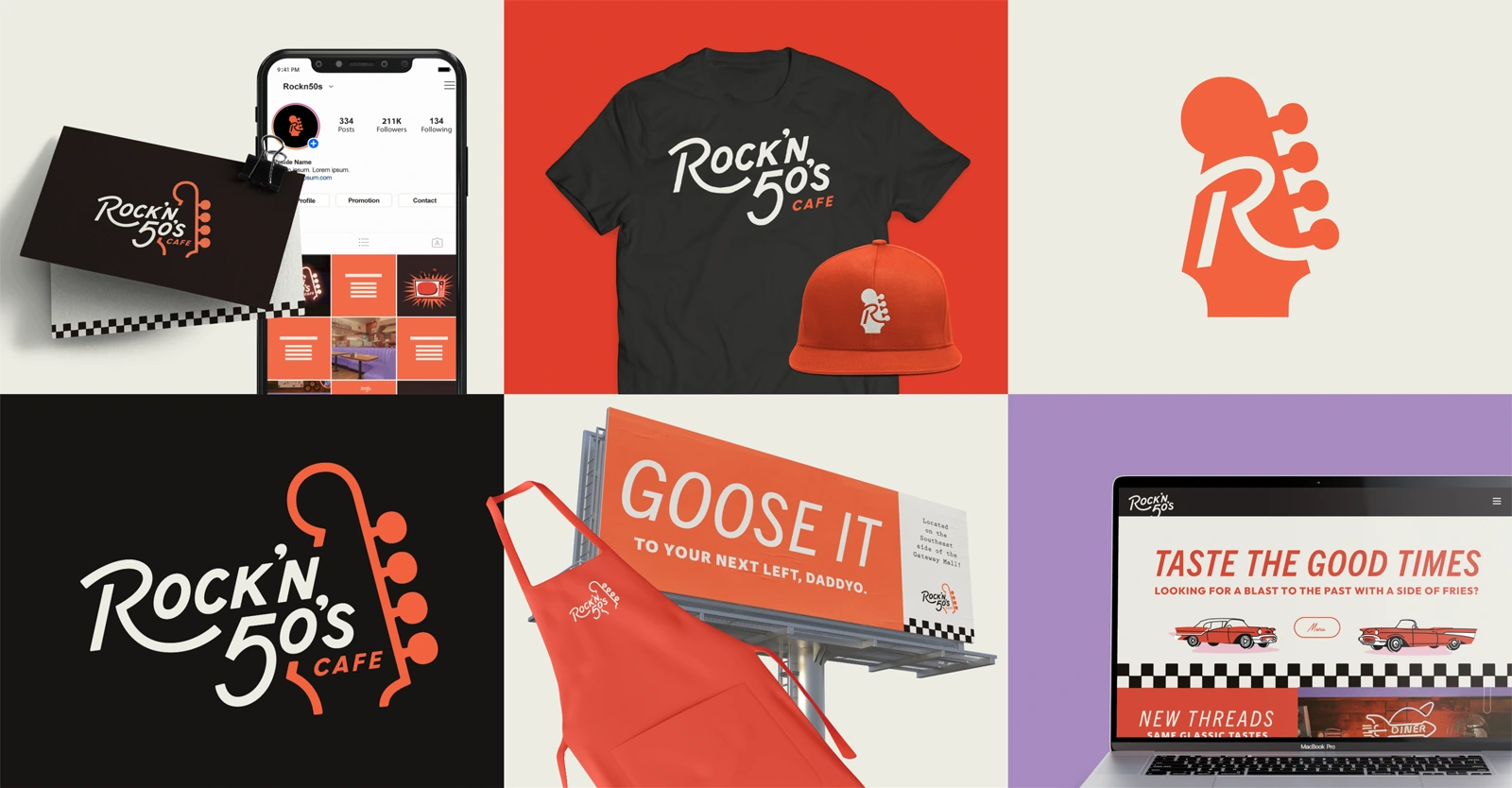
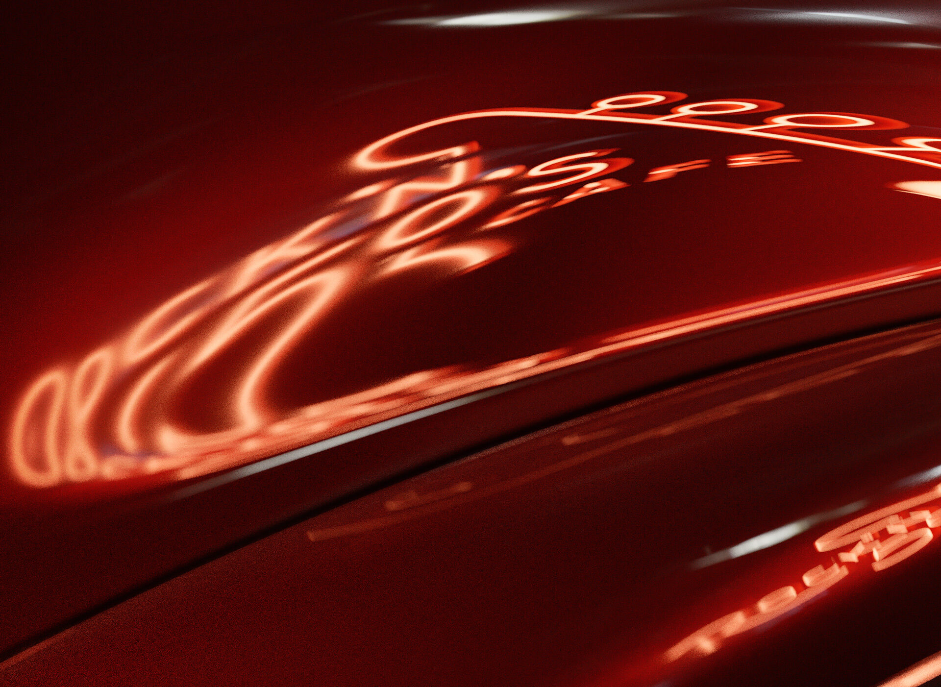
Brand in Action