Carden Custom Framing
In 1989, an idea unfolded between husband and wife duo, Carla and Dennis Leingang. They shared a mutual love for art and the preservation of cherished memories. Fuelled by their passion, they embarked on a journey together, opening a custom framing shop in downtown Bismarck. Their mission was clear; they aimed to assist locals in celebrating their most precious moments and loved ones by offering high-quality frames to preserve their treasured memories. With a sweet fusion of their names, they named their venture “Carden Custom Framing,” and opened their doors.
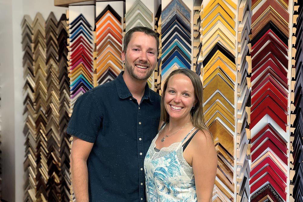
Fast forward three decades and Carla and Dennis decided to entrust Carden’s legacy to their nephew, David, and his wife, Alicia. David and Alicia, brimming with enthusiasm and ambition, were determined to elevate the business to its fullest potential. Their vision included expansion to multiple locations and the establishment of Carden as a hub for local artists. With these aspirations in mind, they decided to pursue professional branding services to transform Carden from a cherished, local, secret into a well-known community treasure.
The Challenge
Shortly after taking over the business, it became evident to David and Alicia that Carden Custom Framing suffered from a lack of brand awareness within the local community. They recognized that the time had come for a significant transformation. If they wanted their robust vision for Carden to come to fruition, a fresh brand was imperative.

The Solutions
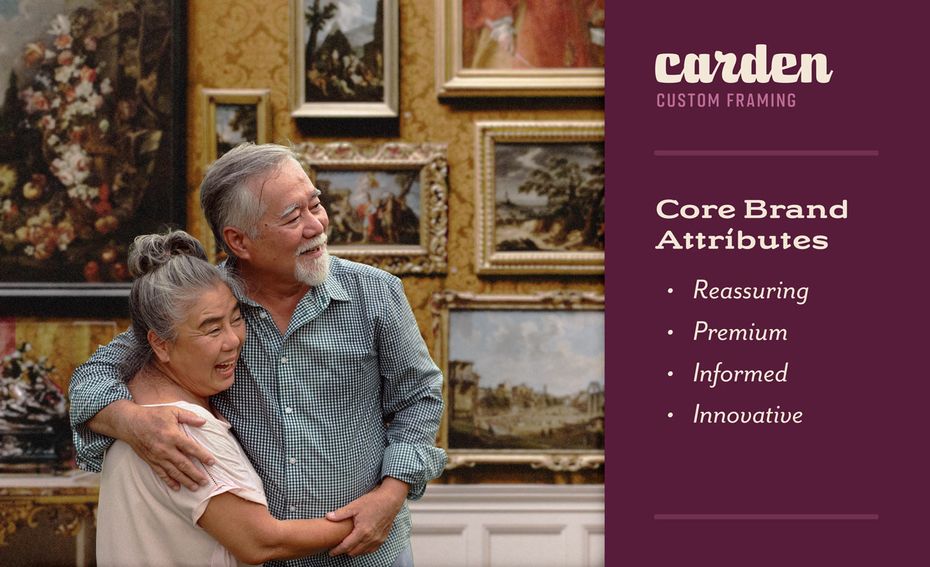
The journey towards a professional-level rebrand began with a Blueprint of the brand. To understand how the brand was perceived, the Good Kids designed a comprehensive survey, tapping into the minds of the community. Armed with valuable survey responses, the Good Kids crafted a brand Blueprint that shed light on Carden Custom Framing’s primary audience — sentimental mothers and retired art collectors. This insight formed the foundation for how the brand would need to resonate with the people who mattered most.
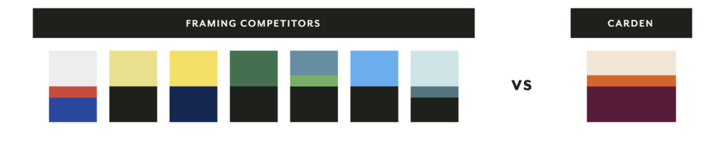
The Blueprint also included an analysis of the market’s visual and messaging trends, with the aim of positioning Carden’s brand as a distinct presence amidst its competitors. With the brand’s guiding principles firmly established, the Good Kids embarked on the exciting journey of creating Carden’s new brand identity.
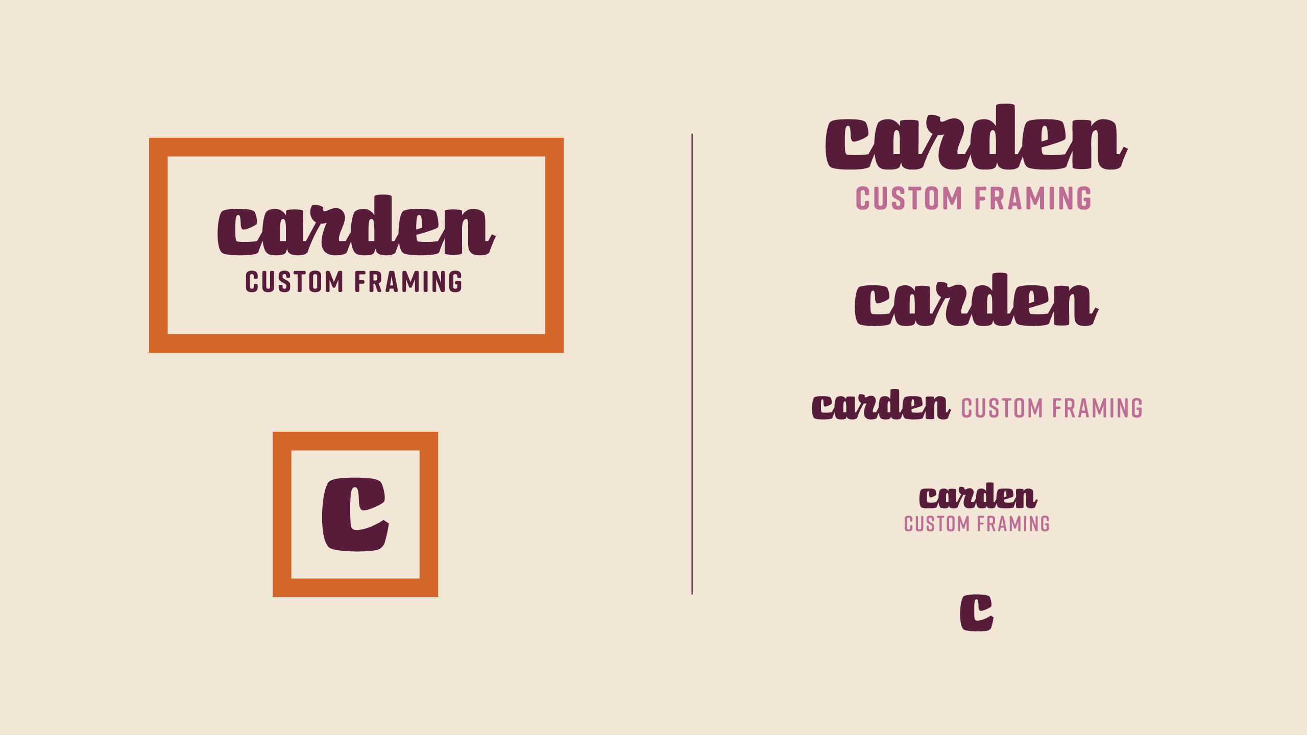
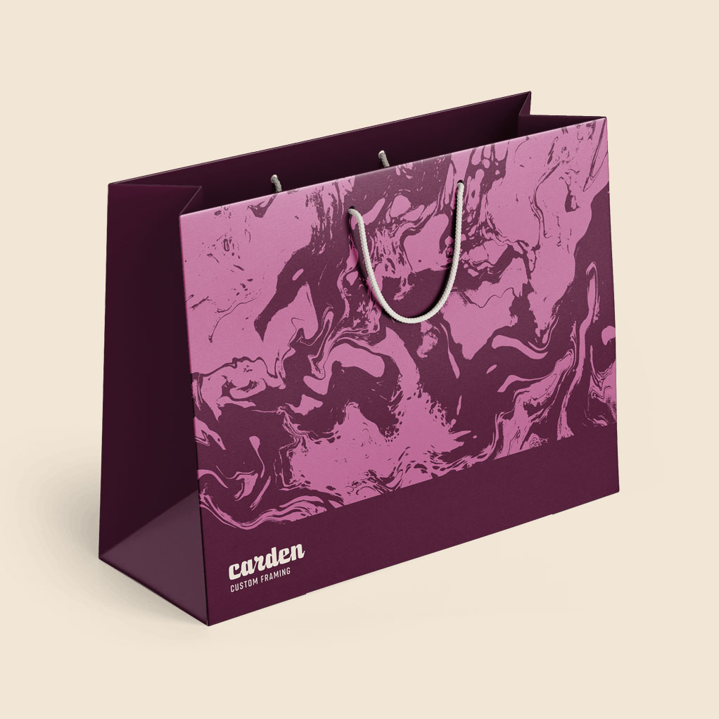
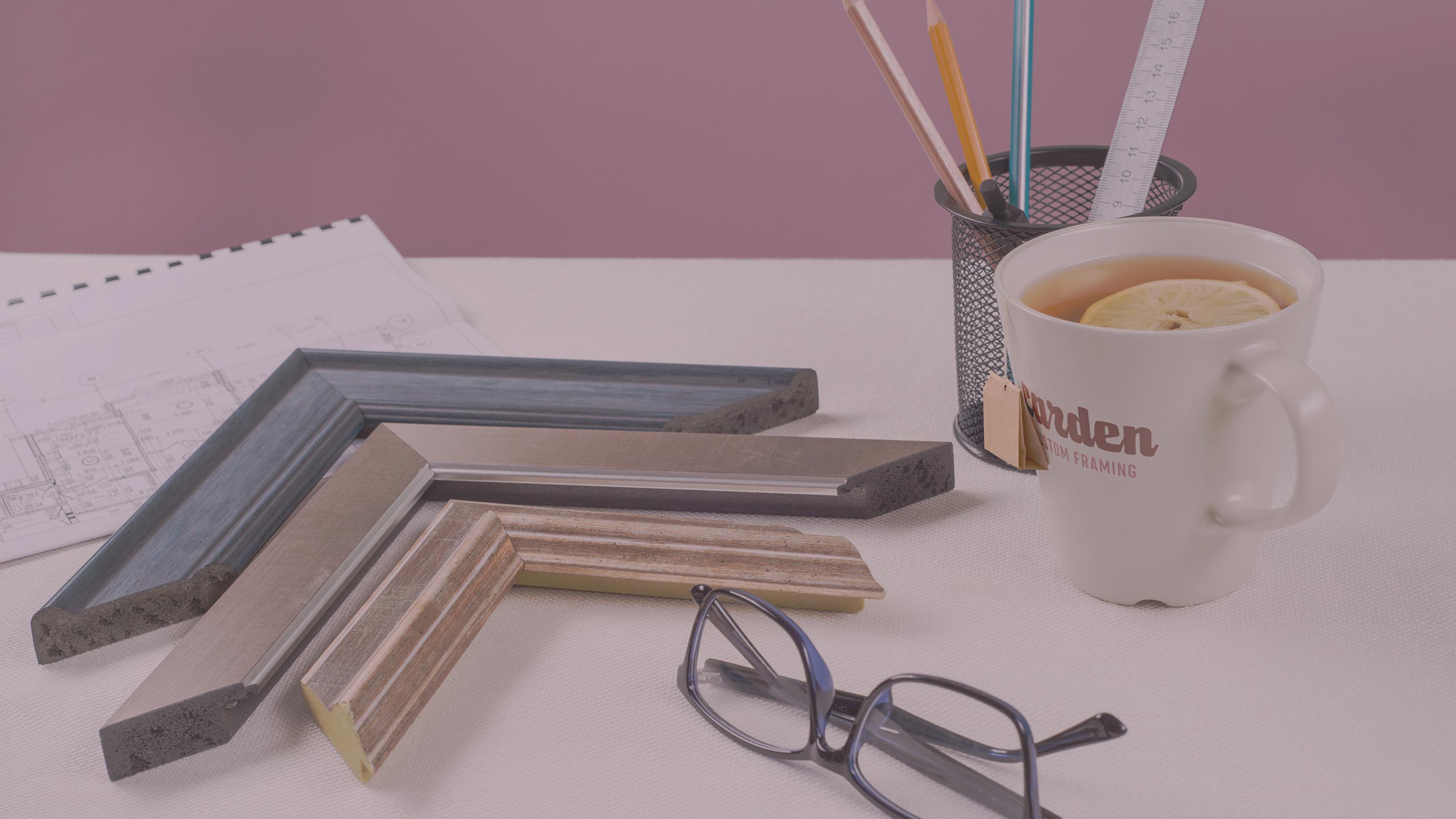
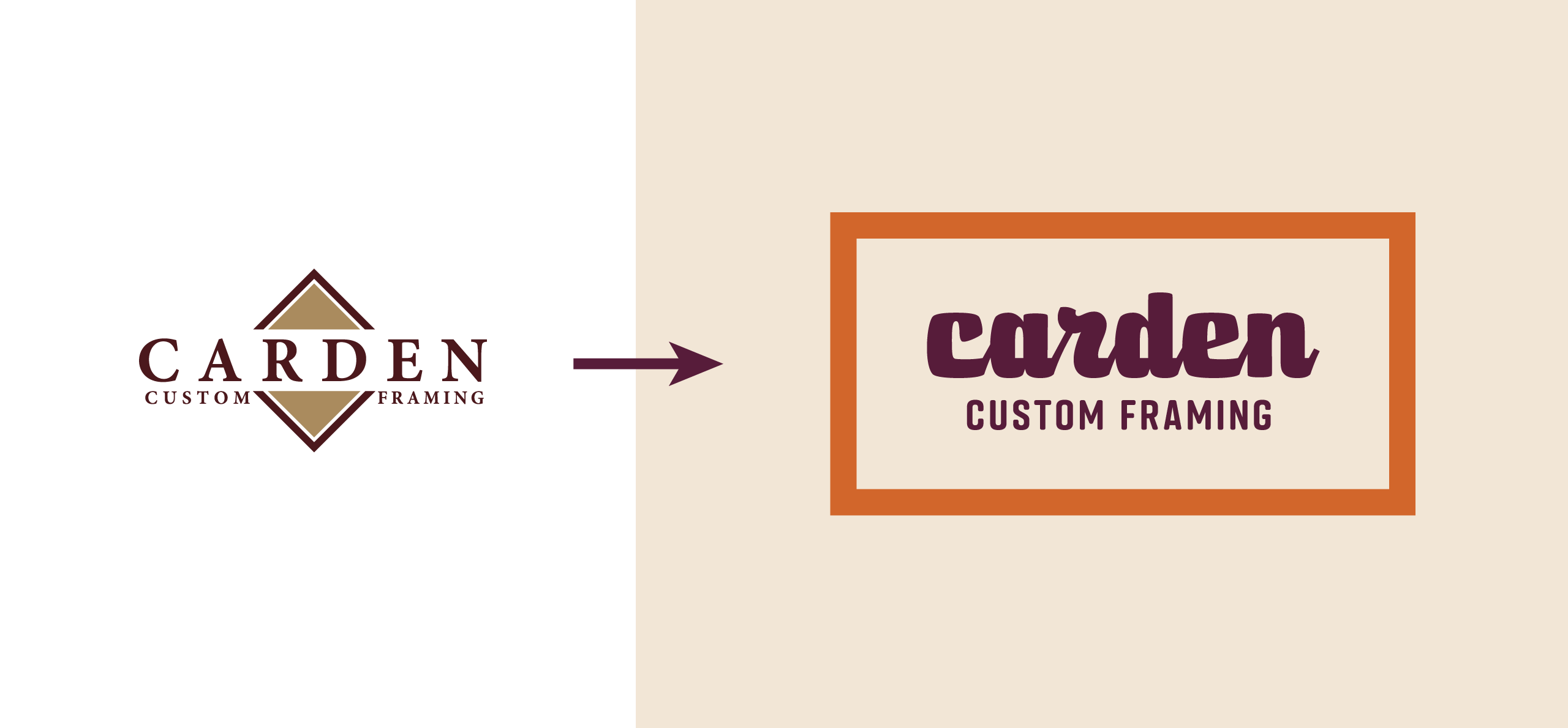
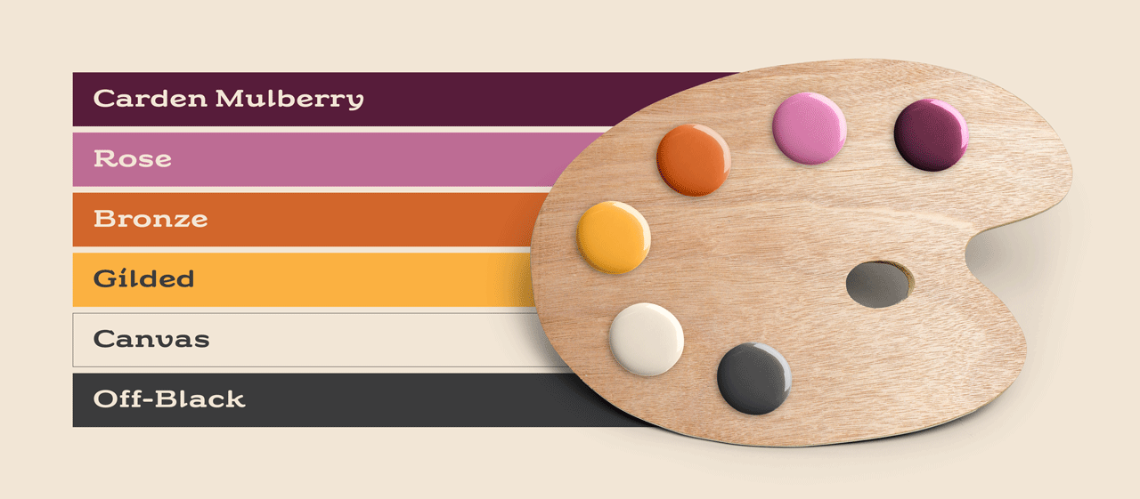
The result was a mature yet refreshingly contemporary brand palette, a fusion of deep wine hues, a vibrant pop of yellow, and a playful dash of purple. This palette was thoughtfully designed to be inviting to both target audiences. To make the brand truly stand out in an innovative yet professional manner, a thick, modern script was employed, crafting a distinctive visual signature.
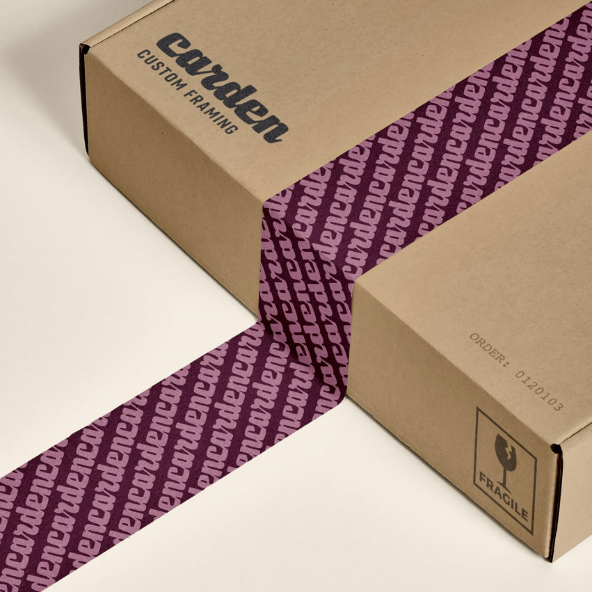
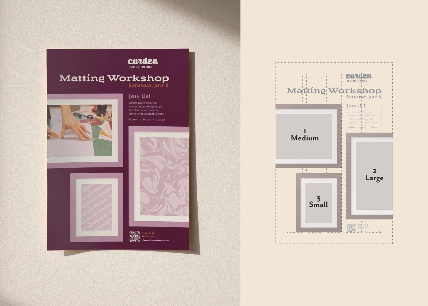
The final step in the branding process was the creation of a layout system. Carden’s layout system consisted of repeating frames, utilizing the brand’s colors. The layout system serves as an additional brand touch that can be used throughout collateral or web pieces.
With the design complete, a comprehensive brand guidelines website was created to provide David and Alicia with full access to the professional branding guidance, and recommendations from the Good Kids.
The Results
Today, Carden Custom Framing proudly stands as a destination for high-quality art preservation services, as well as the premier location for those seeking framing services. The business sports a brand that is both modern and appealing, perfectly tailored to its target audiences. The brand has cast a wide net, drawing in older community members who appreciate art, and capturing the attention of a younger, sentimental clientele. Carden has transcended its humble beginnings to become a symbol of quality and creativity, a testament to the power of strategy, creativity, and the art of a brand transformation.