Introduction
Money is personal. It buys your kid’s first soccer cleats. It stocks the shelves of your new coffee shop. It helps you sleep at night. For the people Aspire Credit Union serves, including young families putting down roots and small businesses dreaming big, it’s more than numbers in an account. It’s the catalyst for something bigger.
Aspire came to us with one goal: to modernize their brand and leave behind the dusty old banking playbook. They didn’t want to feel like just another institution. They wanted to show up as a true partner in growth, built to serve the next generation with optimism, clarity, and heart.
The Challenge
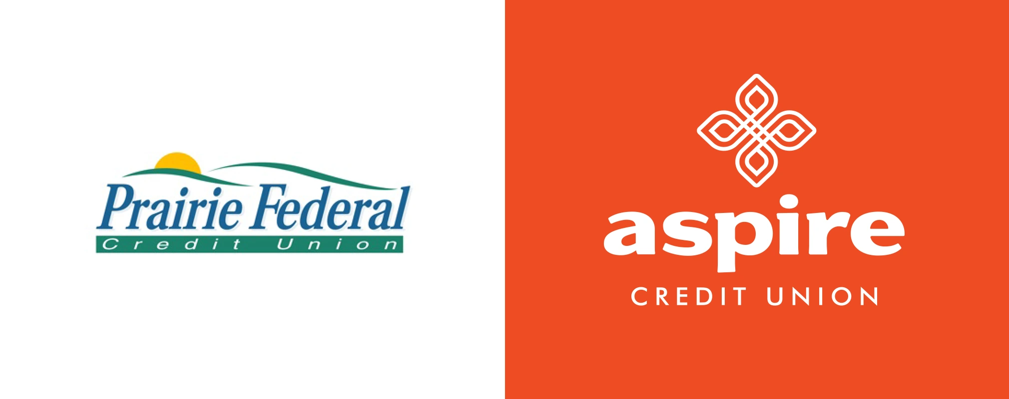
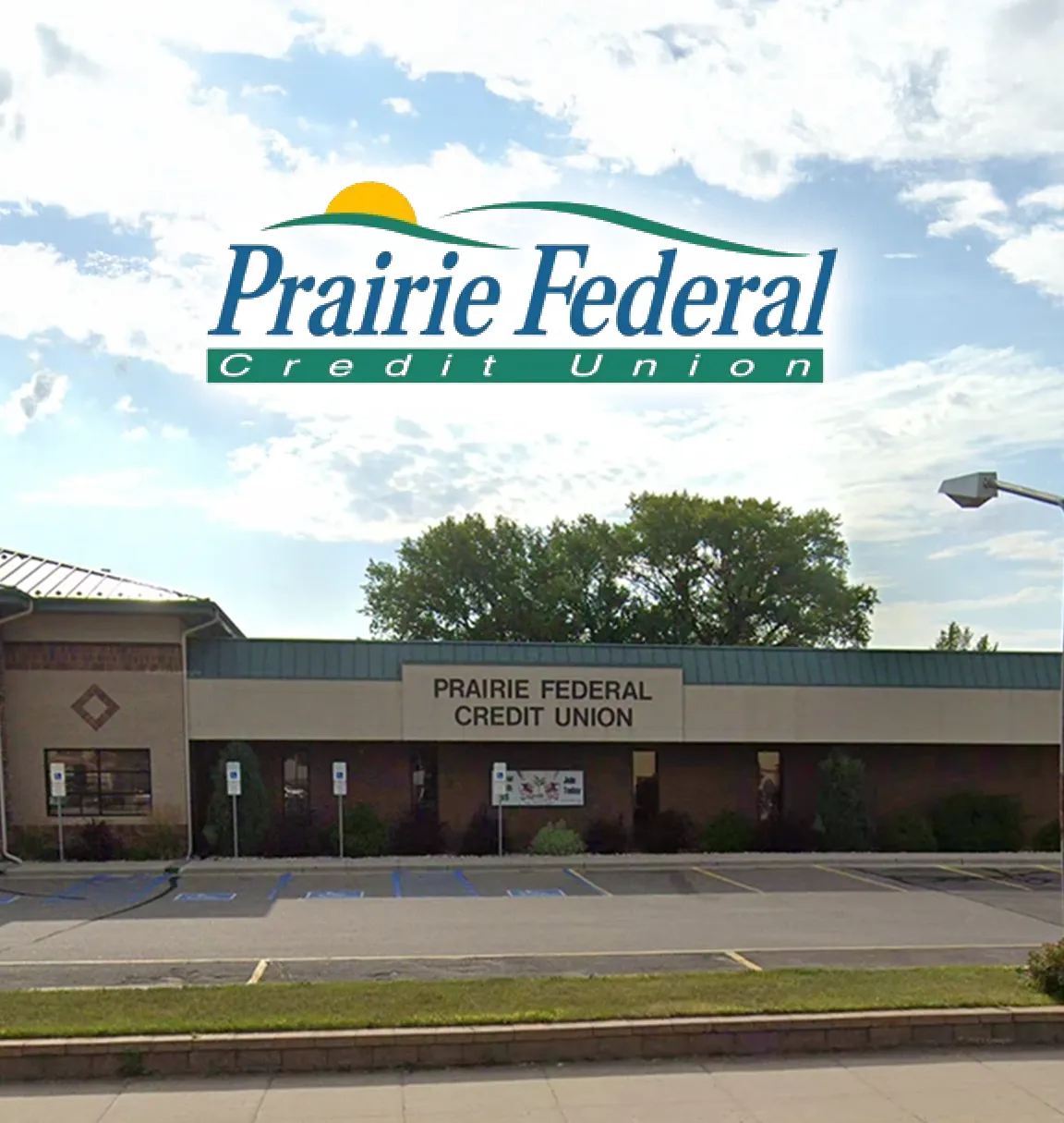
Formerly known as Prairie Federal Credit Union, their brand leaned heavily into North Dakota pride. That made sense for longtime locals, but it wasn’t doing them any favors with the younger crowd.
They’d already made a bold move by renaming themselves Aspire Credit Union; a name full of forward energy and fresh air. Now they needed a brand to match.
Their mission was clear: connect with the next wave of members. In a category full of beige, buttoned-up brands, Aspire had to look and sound different to get noticed.

You Don’t Have to Figure It Out Alone

Free 30-Minute Brand Coaching Call
Book a free call to get unstuck and leave with clear next steps. No strings attached.
The Solutions
We started with the basics: who they wanted to reach, and what would actually speak to them. Through research, and lots of digging, we found the opportunity hiding in plain sight. Most credit unions sounded like spreadsheets. Aspire could sound like a real human.
We explored themes of growth, including torches, sparks, and rising flames, but one symbol stood out: the monarch butterfly. It’s an unexpected choice for a credit union, which made it perfect.
The butterfly is drawn in a continuous line to represent partnership and connection. It’s angled upward at 45 degrees to reflect progress. Aside from pretty, it’s also purposeful.
We paired it with a vibrant orange, and a modern font to build a brand that you’d actually want to engage with.
Logo Inspiration
This symbol, paired with a vibrant color palette and a modern, approachable font, gave Aspire a fresh look that’s unlike any other financial institution in North Dakota.
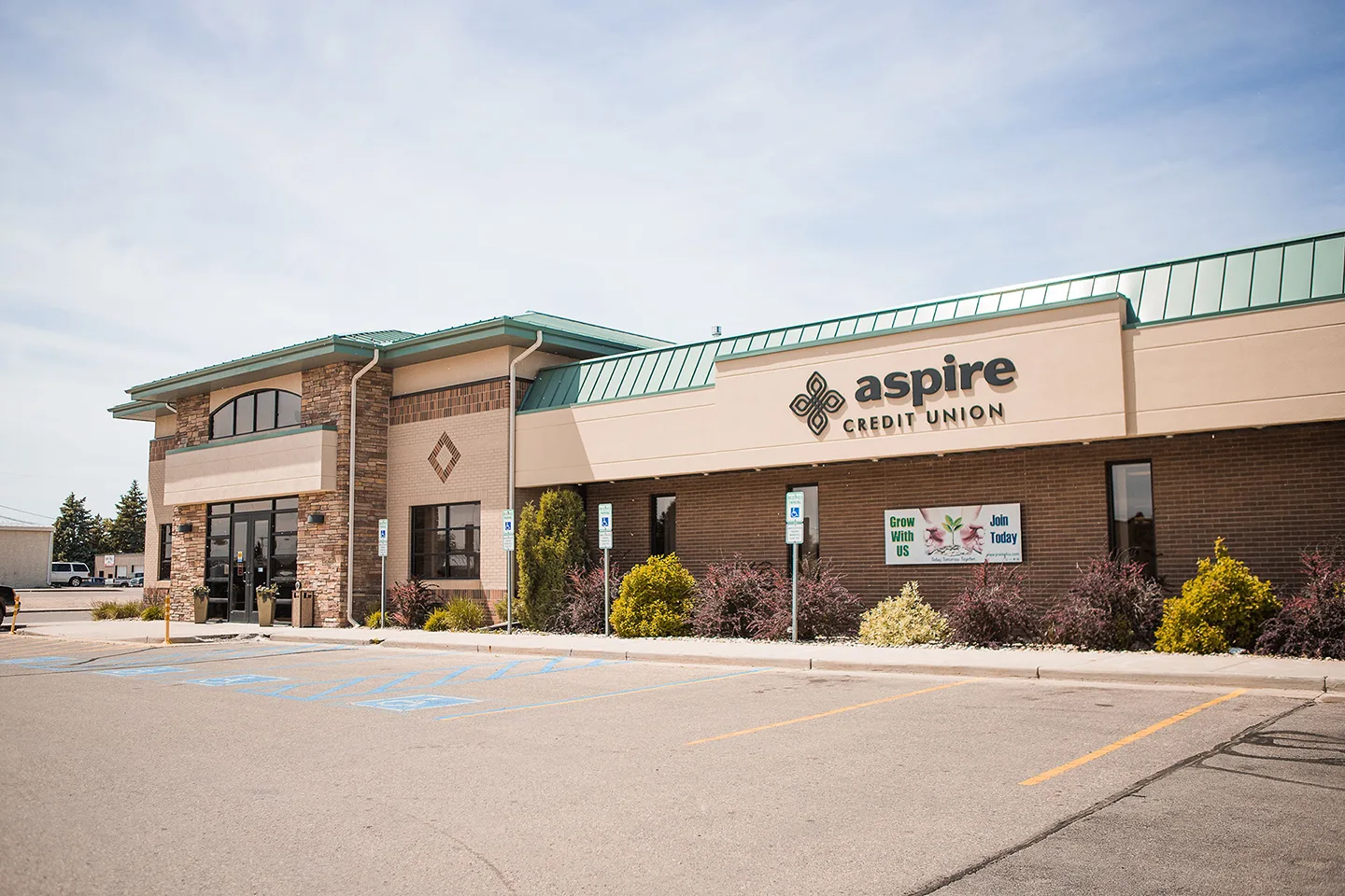
The Results
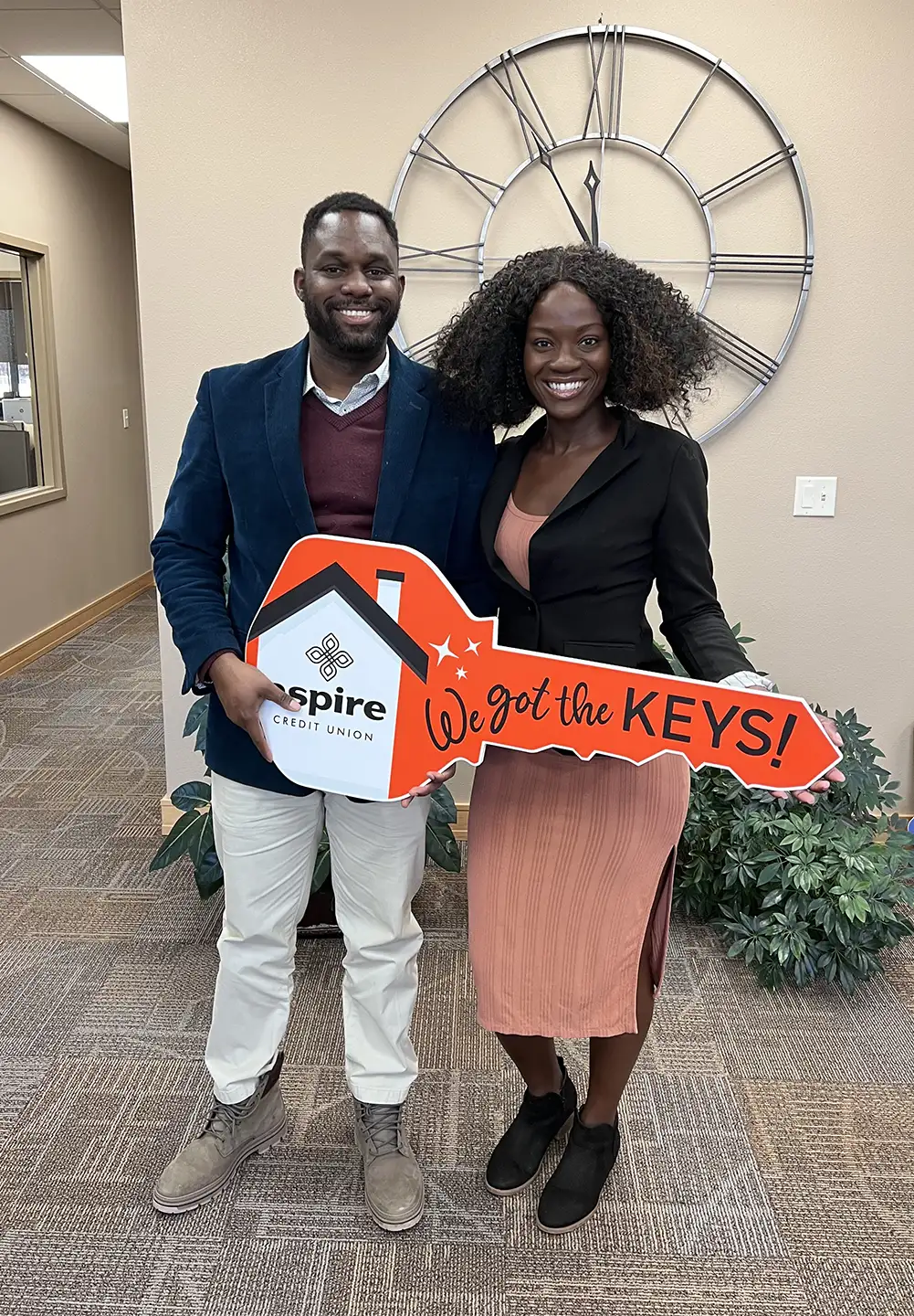
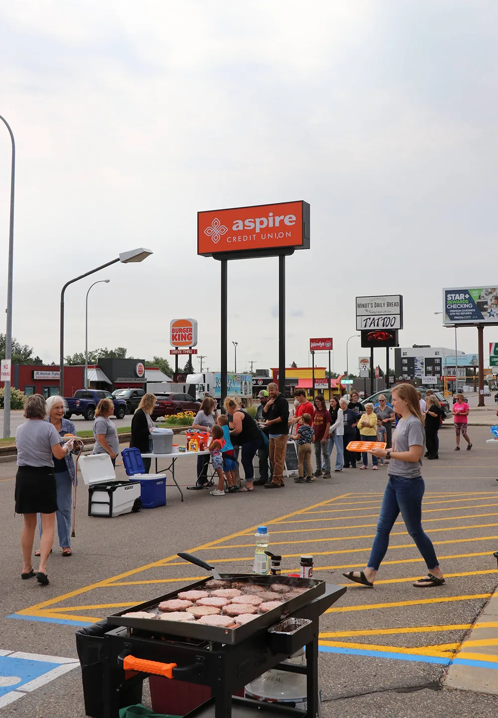
The results showed up where it mattered. Aspire expanded their social media following, and saw new growth with young families and small business owners who resonated with the brand’s energy and optimism. Today, people see Aspire as more than a place to stash money, but as a partner for whatever comes next.
Commercials By Threefold
Most importantly, Aspire now has a brand that reflects who they really are: not a faceless financial institution, but a team of humans helping other humans build something meaningful.