Introduction
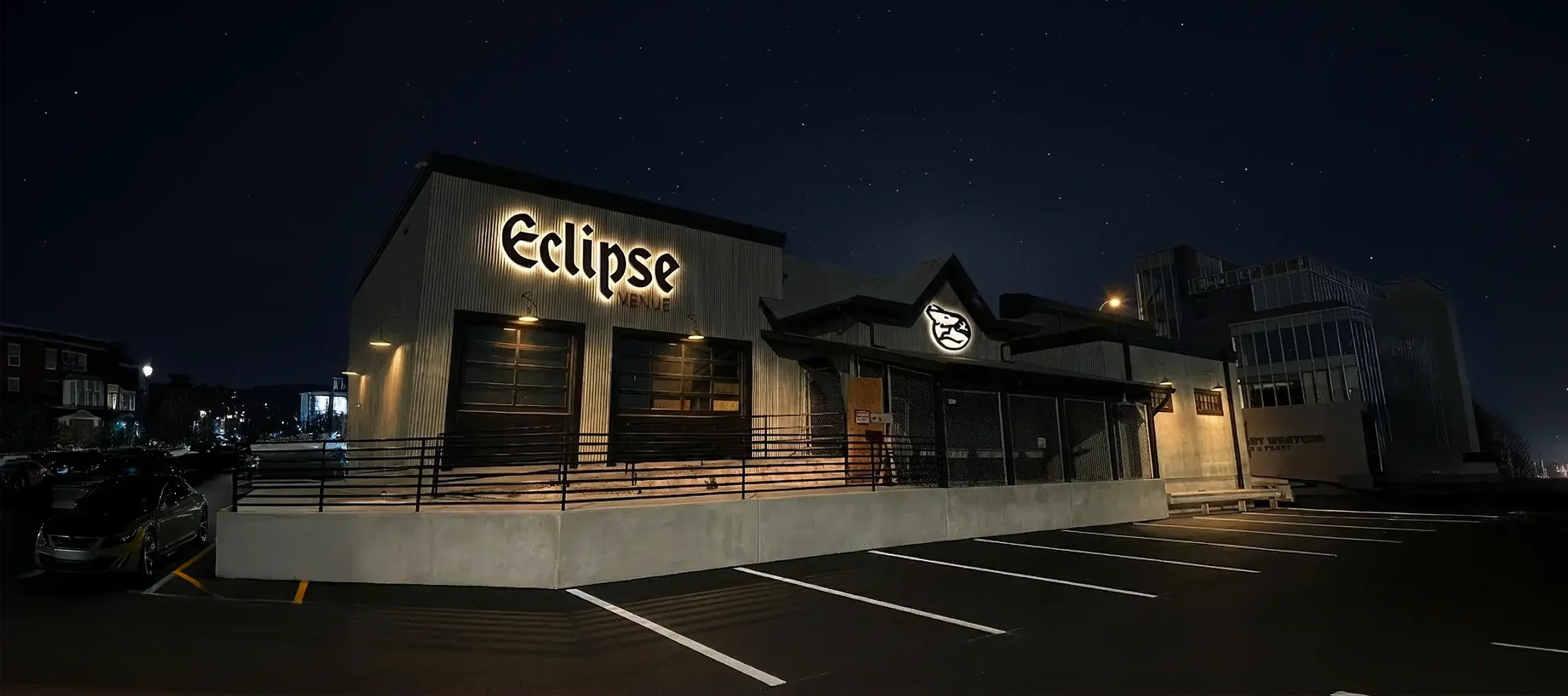
Eclipse is downtown Bismarck’s newest premium event venue, and it’s already set to become the city’s next cultural hotspot.
Its founders aren’t newcomers to shaping the local scene; over the past decade, they’ve launched restaurants, a brewery, and gathering spots that have become part of the community’s rhythm.
Eclipse is the natural next chapter: a space where weddings feel timeless, concerts feel electrifying, and every event feels like it belongs on a stage worthy of the people and moments it celebrates.
The Challenge
The venue itself was taking shape, and a brand needed to be built alongside it. Bismarck needed an event space with a brand that would stand out, feel premium without being intimidating, and give the community something to rally around. Our team needed to craft an identity that reflected the elegance and energy of the event space, while clearly communicating what makes Eclipse unique.


You Don’t Have to Figure It Out Alone

Free 30-Minute Brand Coaching Call
Book a free call to get unstuck and leave with clear next steps. No strings attached.
The Solutions
We kicked things off with a deep dive into strategy. Through plenty of market research and an immersive workshop, we built a blueprint that defined Eclipse’s brand moving forward.
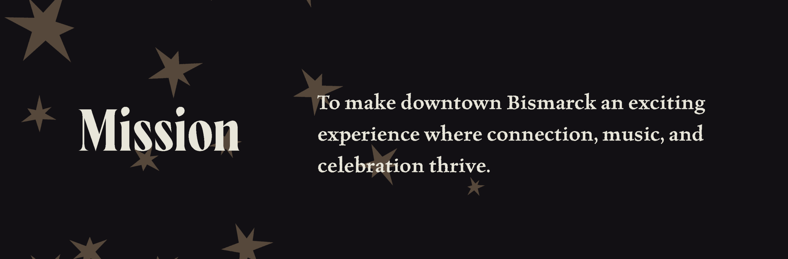
First, we defined the overarching mission of the company:
We clarified two target audiences as the key groups for the brand to engage with:


We built a positioning statement that captured the core essence of the brand:
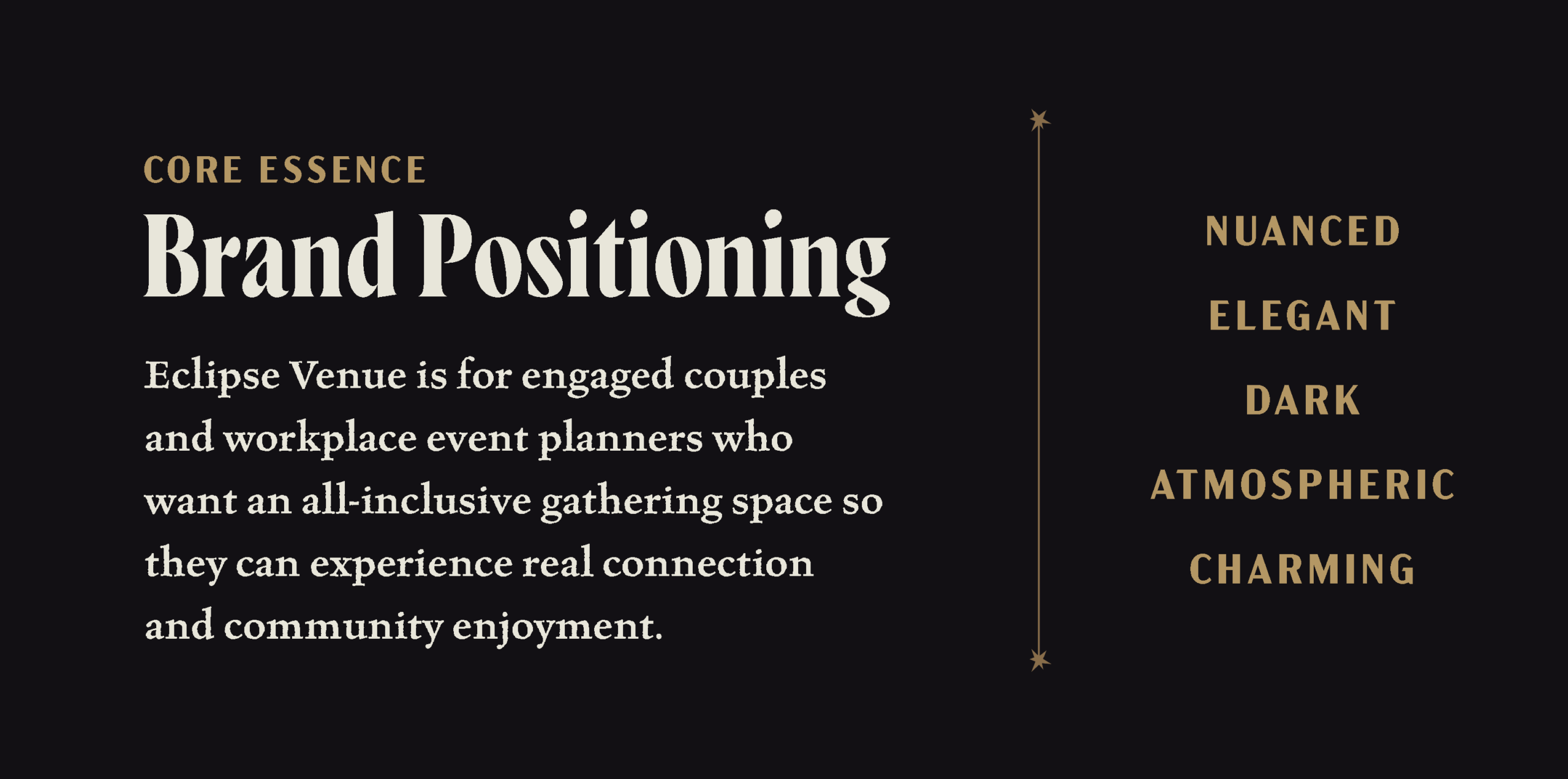
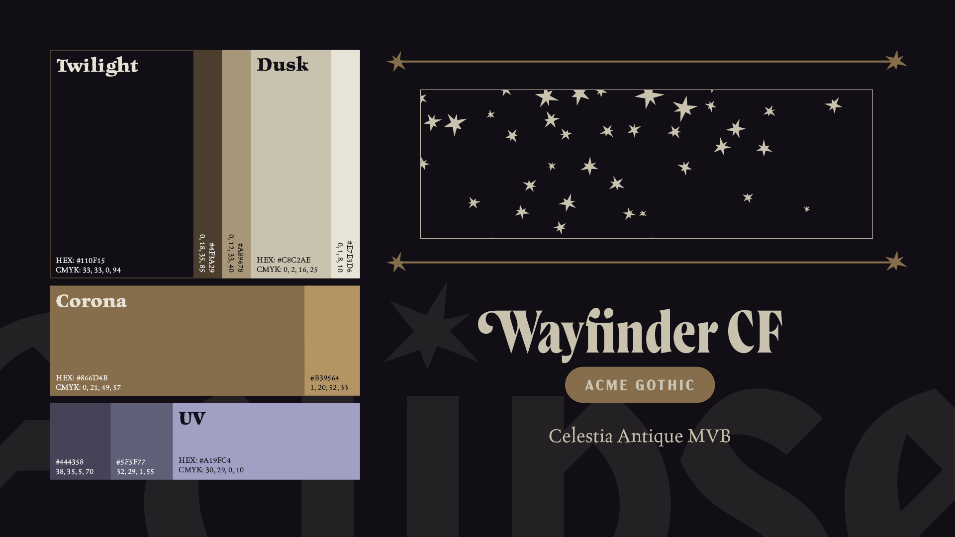
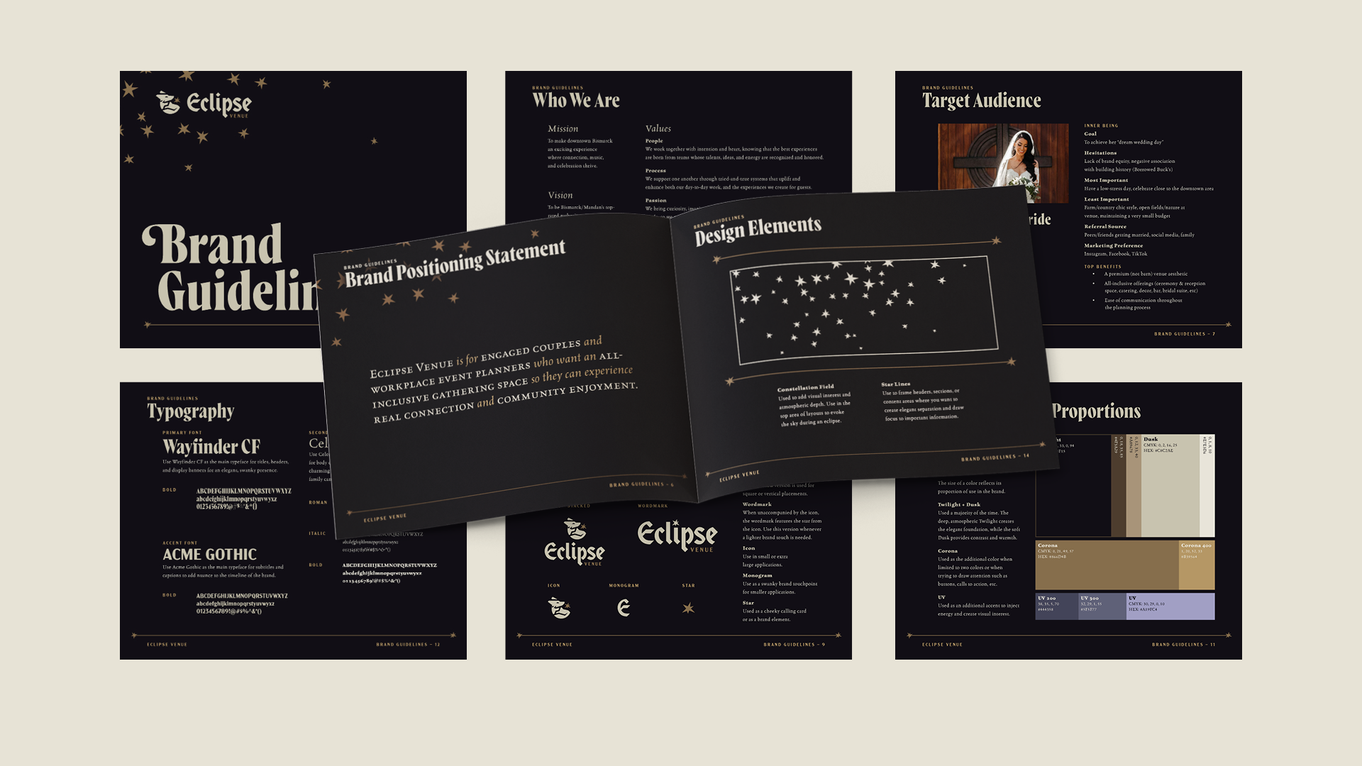
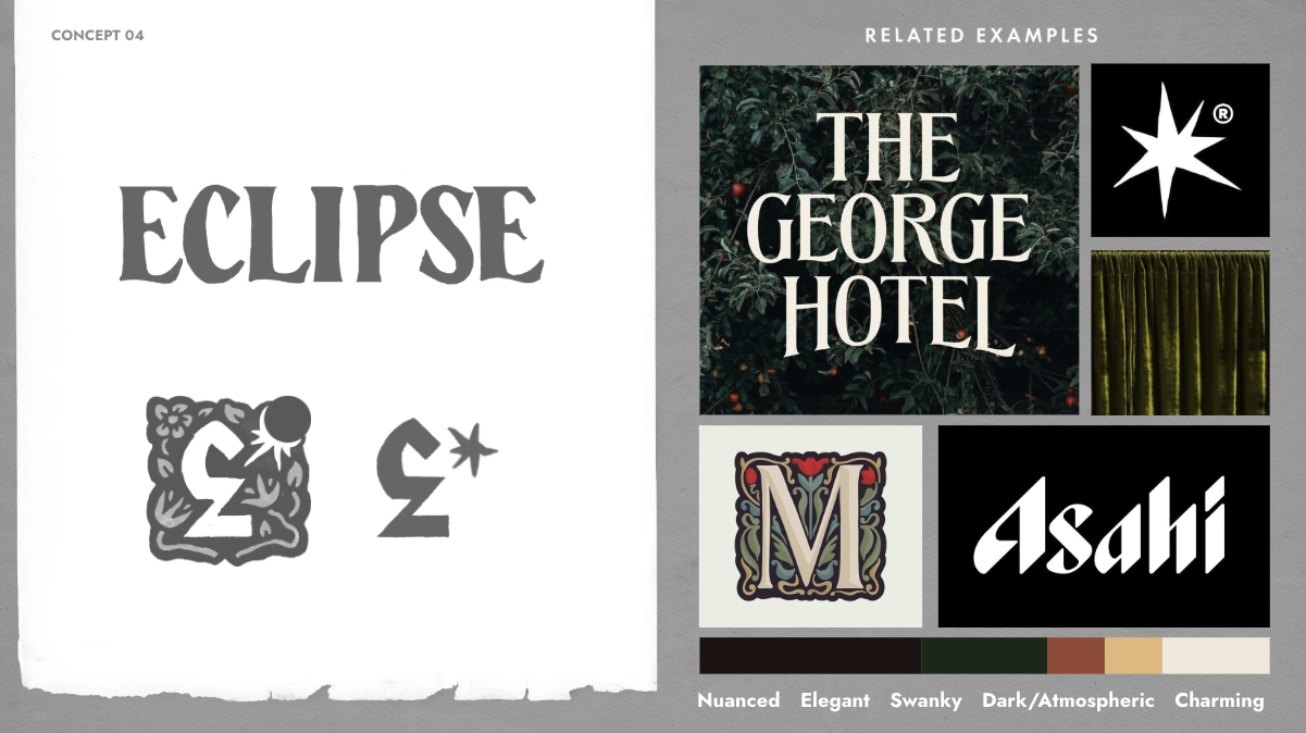
Finally, we landed on the core brand attributes that would guide all creative decisions: nuanced, elegant, swanky, dark and atmospheric, and charming. During the strategy, we realized that for Eclipse to truly stand out in the vast landscape of North Dakotan event spaces, the brand needed to embody these qualities in a way that makes a future bride or community event planner do a double-take.
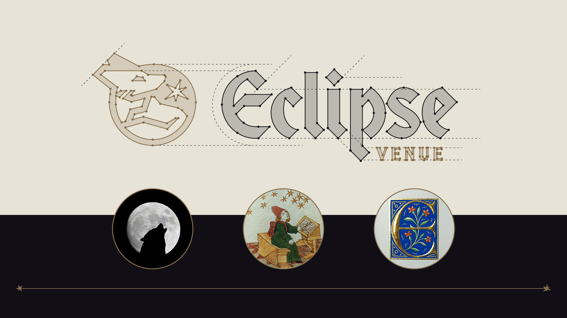
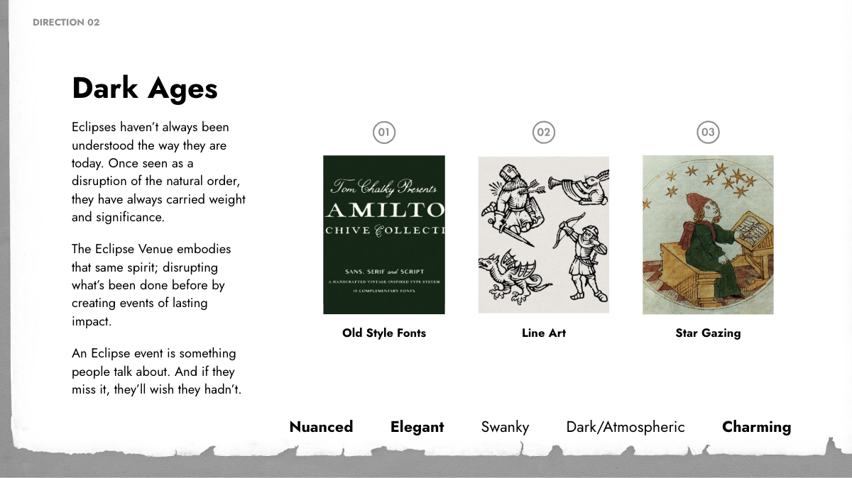
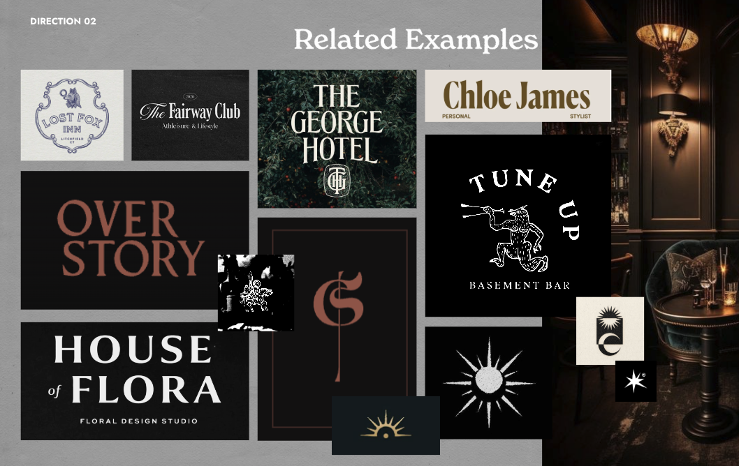
Next, we bridged the gap between strategy and brand with three high-level design directions. We presented three stylistic directions, and Eclipse fell in love with “Dark Ages”: complete with old-style fonts, intricate line art, and a star-gazing theme that captured the brand’s mysterious edge.
Sketched concepts followed, and a design featuring a wolf icon paired with an old-style wordmark stood out with its distinctive and classy charm.
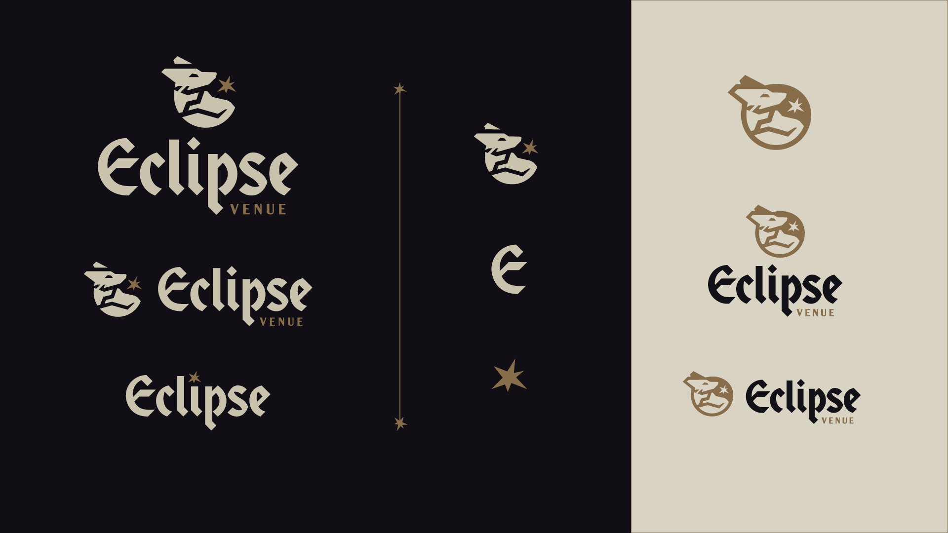
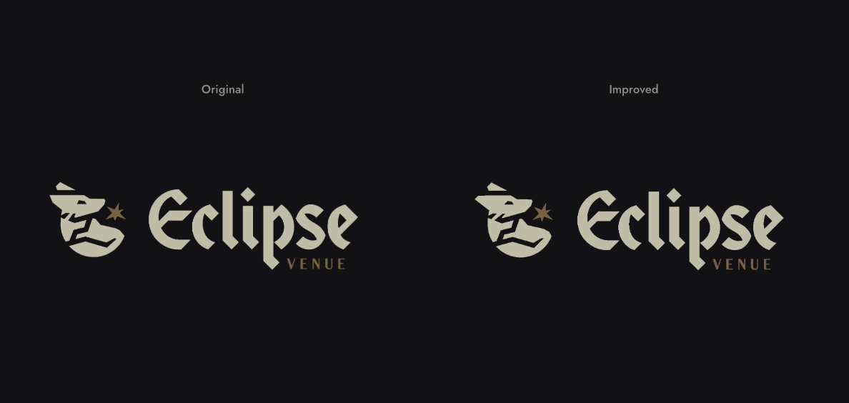
With the selected sketched concept in mind, we presented two refined options of the wordmark and wolf icon, keeping the old-style typography and the atmospheric color palette: deep neutrals that resemble evening hues, with warm bronze and lilac accents.
The chosen refined option is unmistakably Eclipse: unlike other venue brands, and perfectly tuned to the target audiences it serves.


The final step was perfecting. We ever-so-slightly adjusted the angles of the icon, and shortened the “E” in the wordmark. And viola!
The Results
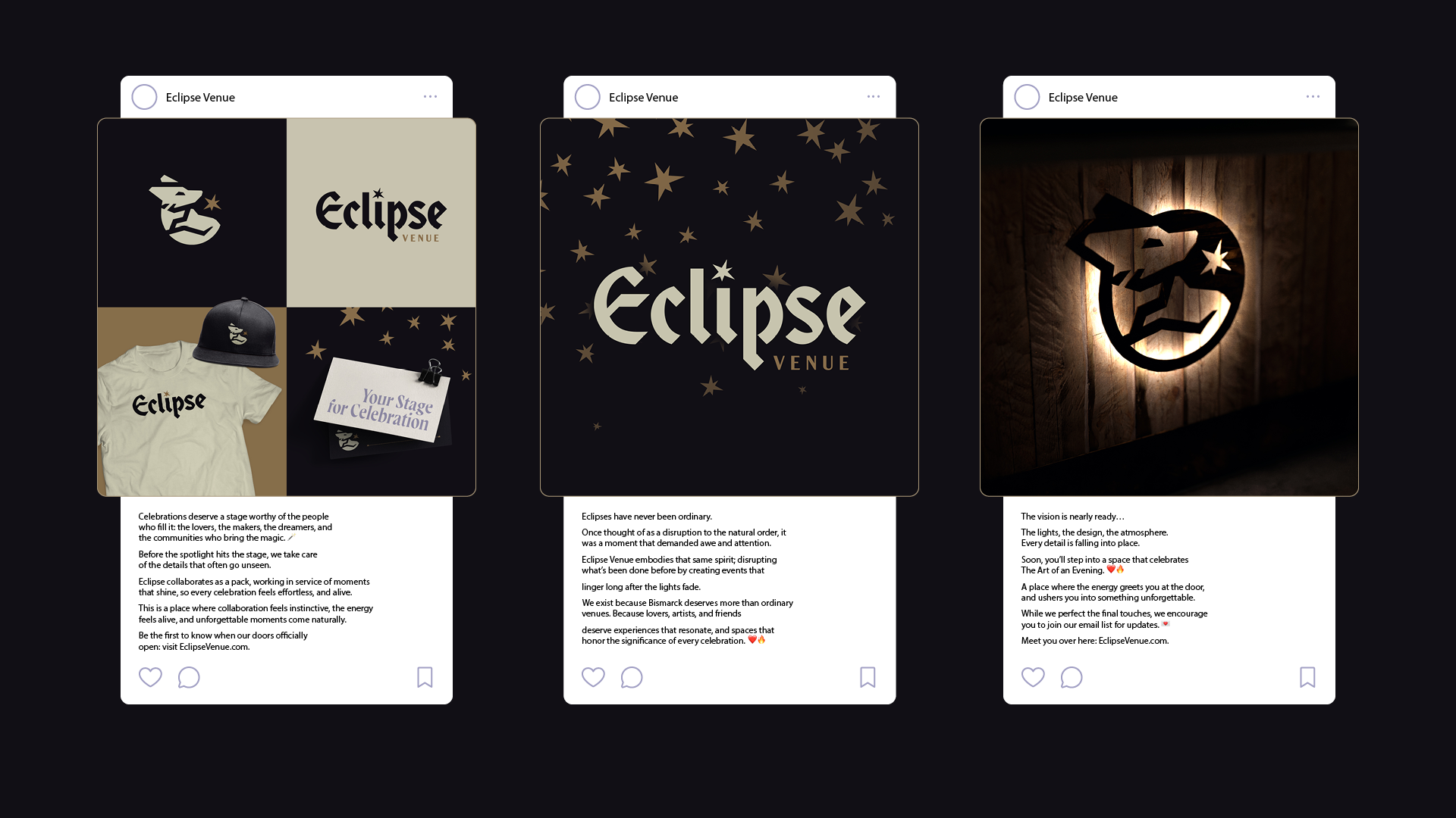
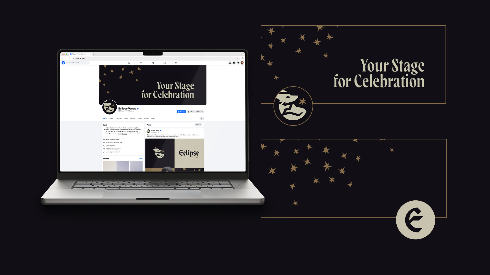
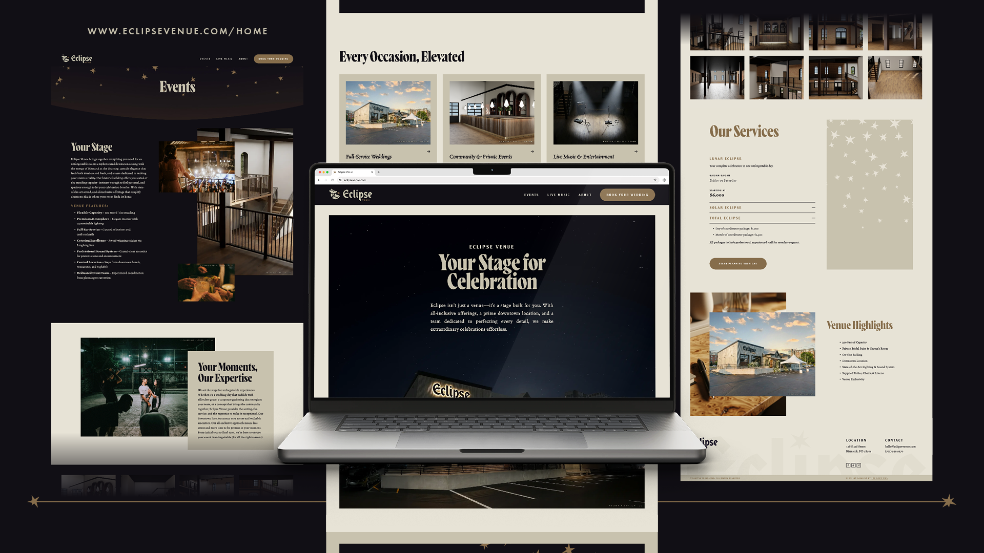
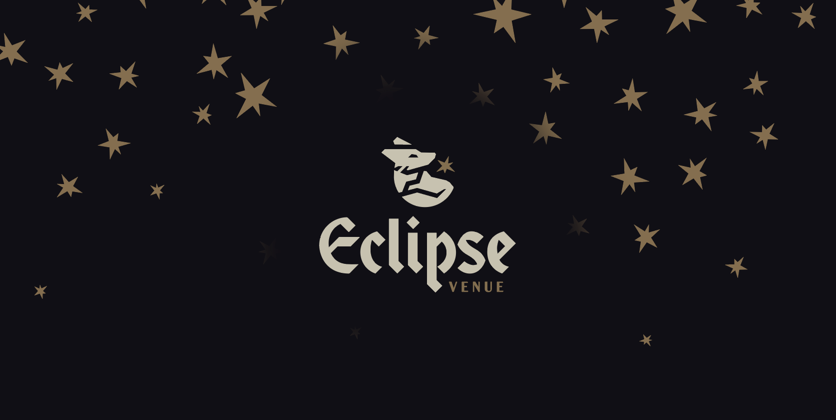
Eclipse now has a brand that matches its vision: to be Bismarck/Mandan’s top-rated gathering space. With the brand in place, the venue is ready to launch and make its mark on downtown Bismarck, and be Your Stage for Celebration.
The opening is on the horizon. Stay up to date by visiting EclipseVenue.com.