Introduction
Seven Stones, formerly Standing Rock Community Development Corporation (SRCDC), is a community development organization serving the Standing Rock reservation.
Its programs cover food sovereignty, community development, language and culture, and community events. The work is long-term and it is built around families and students, around the idea that a community should be able to sustain itself.
Two organizations sit underneath Seven Stones. Wité Development develops housing and infrastructure, building homes and community assets for local families and for professionals coming home. Witaya Financial Solutions handles the money side, offering micro-loans to people starting businesses and building things of their own. Together, they’re collectively working toward a more sustainable and fruitful community for Standing Rock.
The Challenge
Throughout the years, SRCDC and Wité had made an immeasurable impact, but something was missing: a financial organization to help fund the dreams of Standing Rock. As SRCDC began building Witaya in response to this need, they realized the importance of building the brands strategically to maximize each organization’s respective impact.
Their work within the community was strong, but distinctive branding would amplify the mission and significance.
That posed a challenge. Residents didn’t always know which door to walk through. Partners, including grant writers and reviewers, didn’t always understand what they were being asked to write about and support. And when it came time to apply for grants, there was no consistent set of materials to make the case with.
So the goal was a constellation of three brands that clearly stand apart yet belong together, and create a foundation for everything that comes next. To ensure cohesion and alignment, we decided to build all three brands simultaneously.

You Don’t Have to Figure It Out Alone

Free 30-Minute Brand Coaching Call
Book a free call to get unstuck and leave with clear next steps. No strings attached.
The Solution
Our first job was an internal one. The brands had to work together as a hybrid model: three distinct organizations with a connected mission.
So we built three blueprints instead of one.
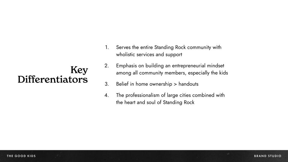
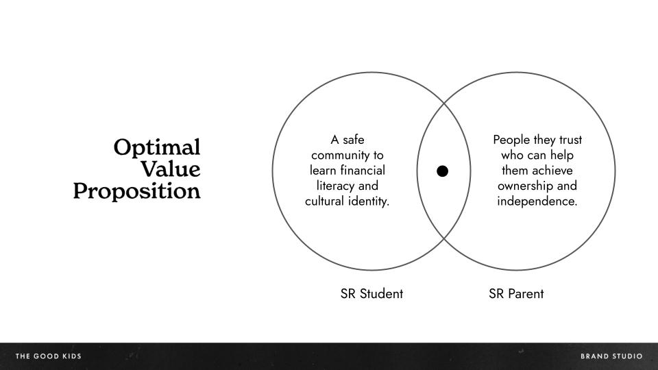
For each organization we defined the brand personality, mapped the market landscape, sized up the top competitors, ran a SWOT analysis, and pinned down what makes them different. We did that three times over.
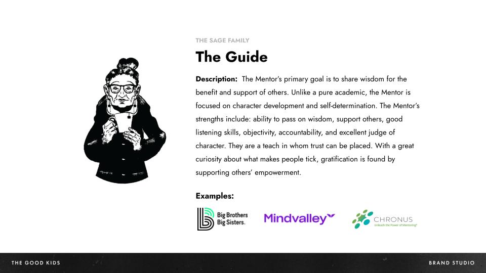


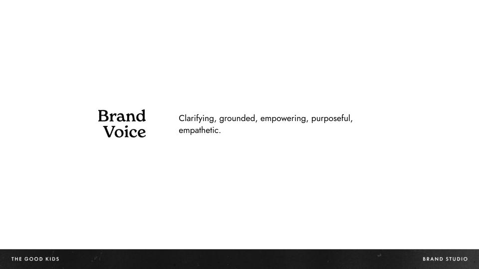
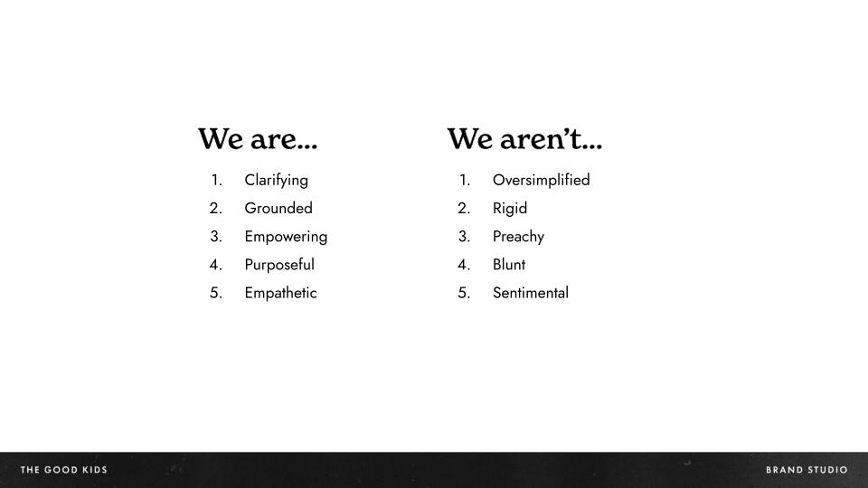
Seven Stones landed on The Sage and The Guide archetypes, which gave us a voice that is clarifying, grounded, empowering, purposeful, and empathetic. Its brand positioning statement followed from there. Seven Stones walks alongside families and students with the education and resources to build lasting prosperity for generations to come. Its brand idea is Catalyst for Indigenous Sovereignty.
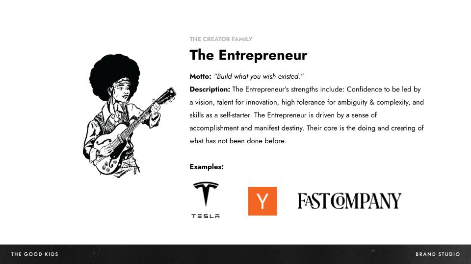
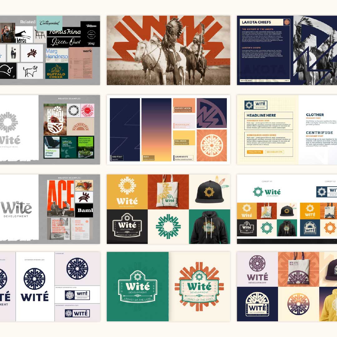
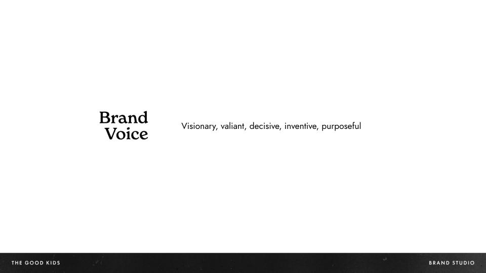
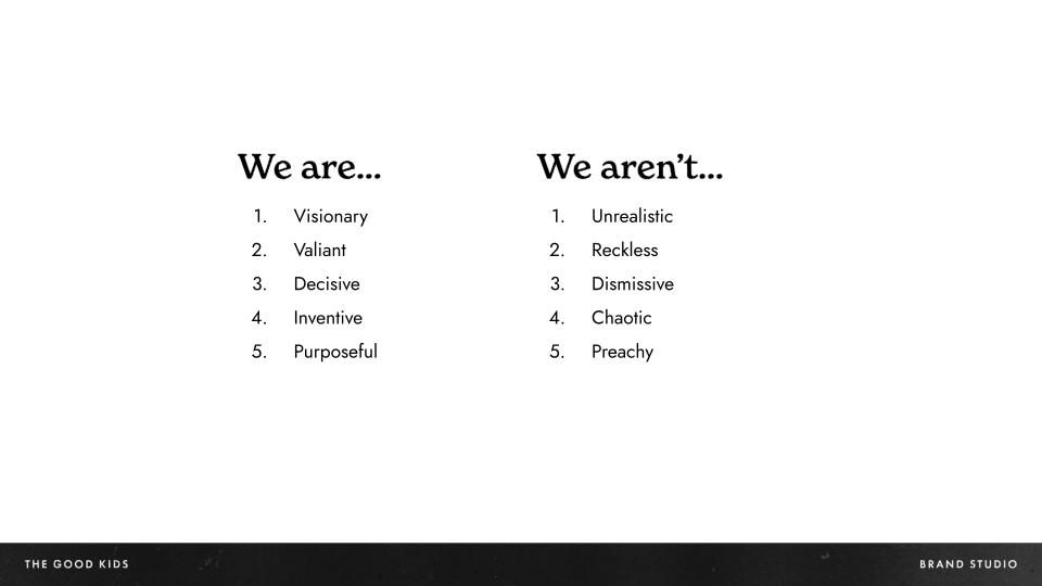
Wité is the builder of the family, so we prescribed The Creator and The Entrepreneur archetypes. We defined its voice as visionary, valiant, decisive, inventive, and purposeful. Its positioning statement puts the work plainly. Wité develops community infrastructure that creates lasting security and independence for local families and returning professionals, building housing that lets people stay and lets people come home. Its brand idea is Building Sovereign Communities.
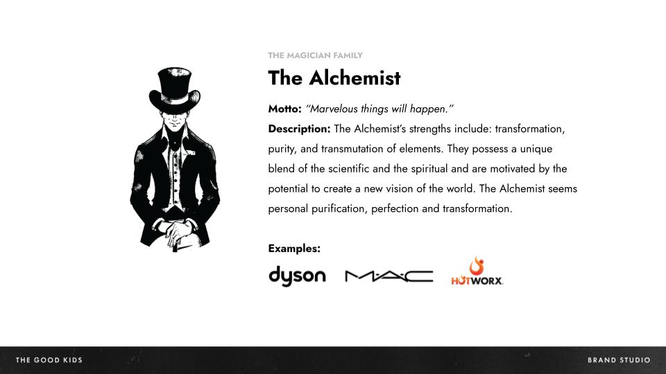
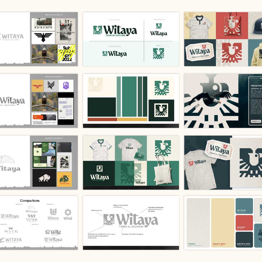
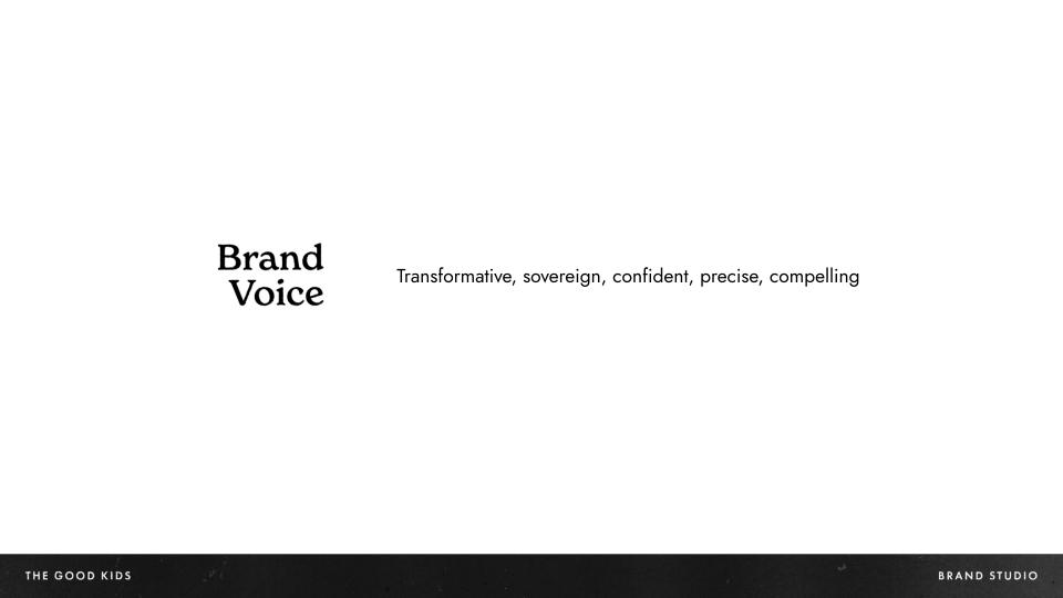
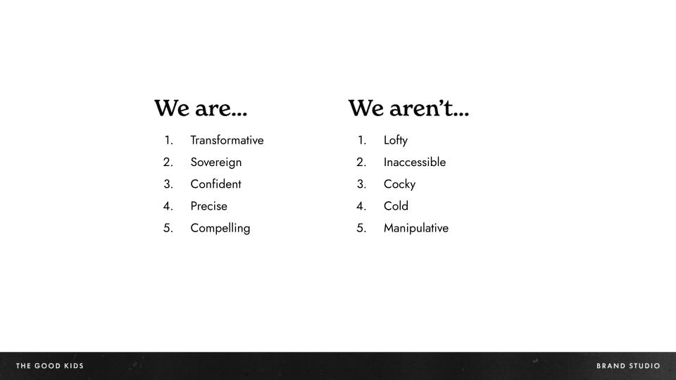
Witaya took on The Magician and The Alchemist archetypes. We defined its voice as transformative, sovereign, confident, precise, and compelling. Its positioning statement leans all the way into that transformation. Witaya turns determination into destiny, giving visionary builders the micro-loans that make a dream into something real, lasting, and wholly their own. Its brand idea is Ignition for the Sovereign Community.
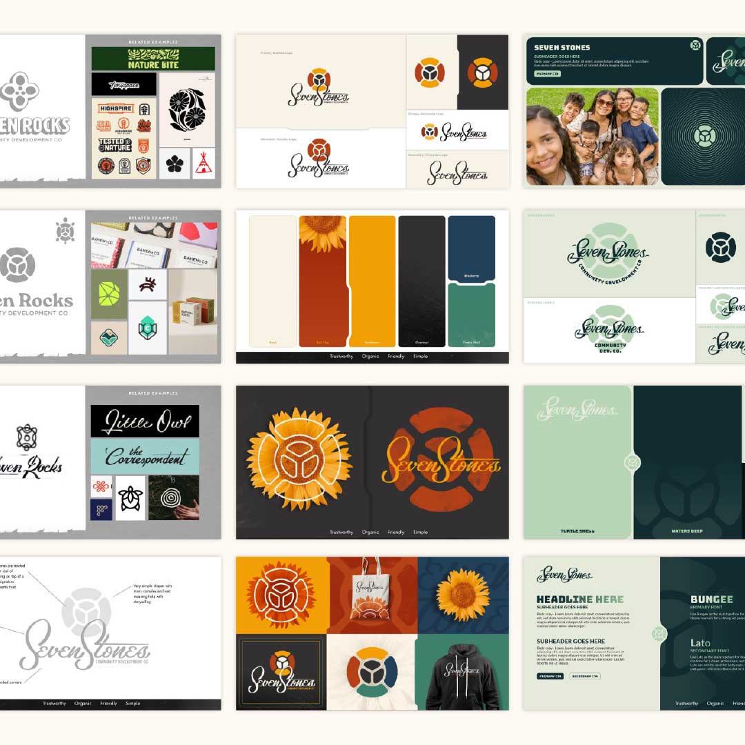
With strategy settled, we moved into visual direction. We presented three options, each one showing all three brands together so the team could see how the whole system would hold up. They chose The Art of Ledgers, built on ledger art graphics, a signature logo style, and overlapping art.
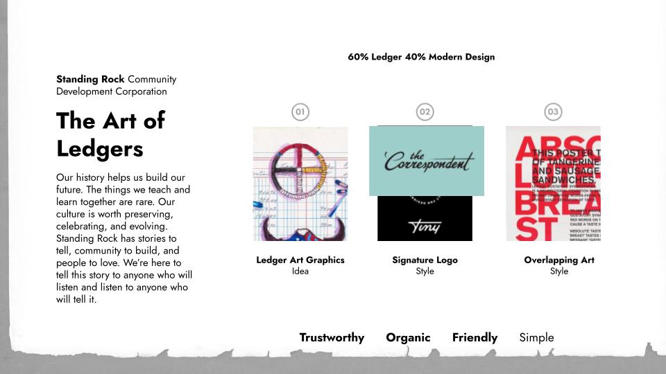
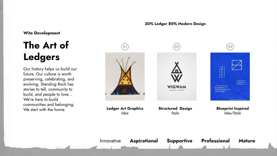
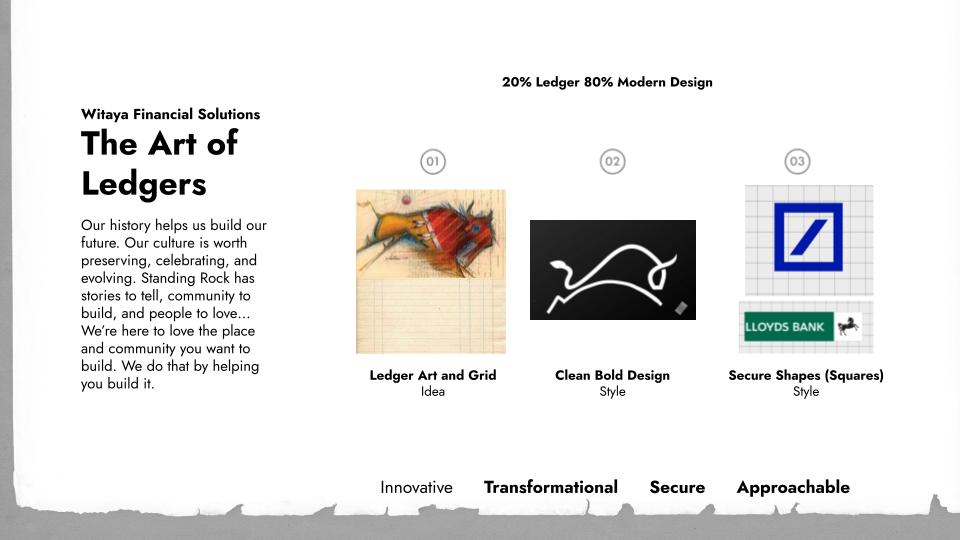
Then the board made a call that took the work somewhere new.
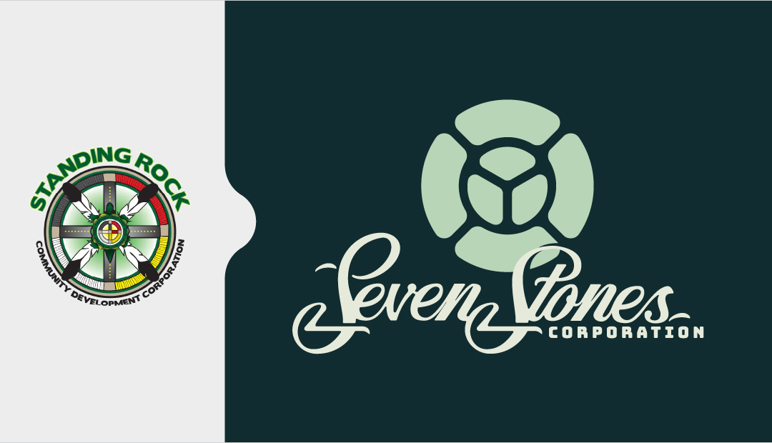
If the old branding was coming off, the name could come off with it. The mission and the offerings had grown, and the name had not grown with them. The board was clear this was not a move away from their identity. It was simply an evolution of it. Standing Rock CDC became Seven Stones, after the seven stones that mark the seasons of life. The new name ties back to the foundation the organization was built on, while making room for growth, direction, and the broader system they were building.
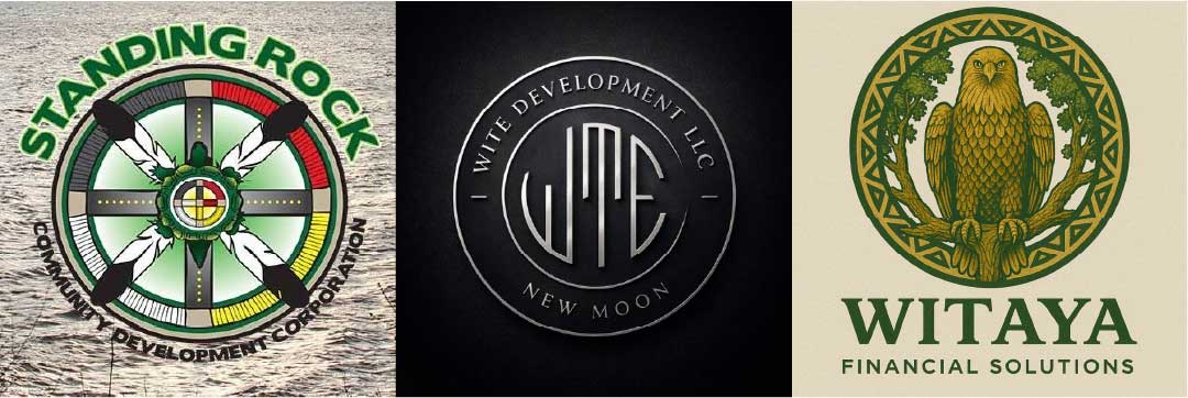
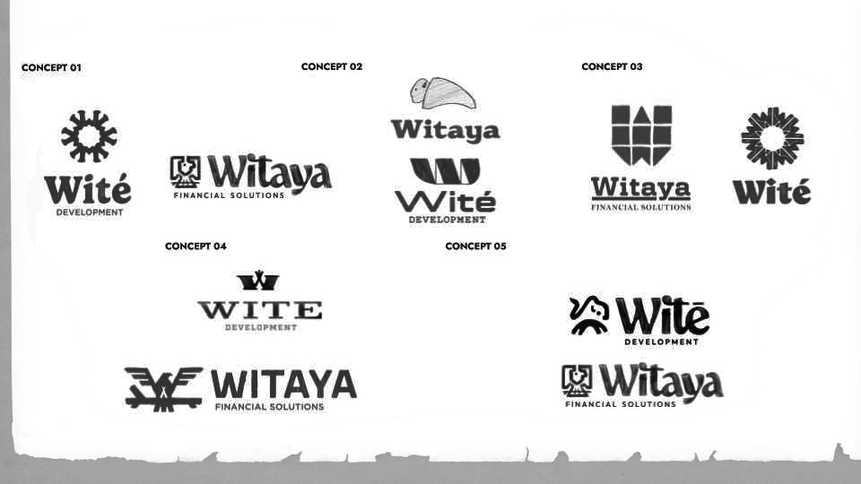
Then we started sketching. The goal was for all three marks to coincide, so that no brand looked borrowed from another and no brand looked like a stranger next to it. Fifteen sketches later, we had our three.
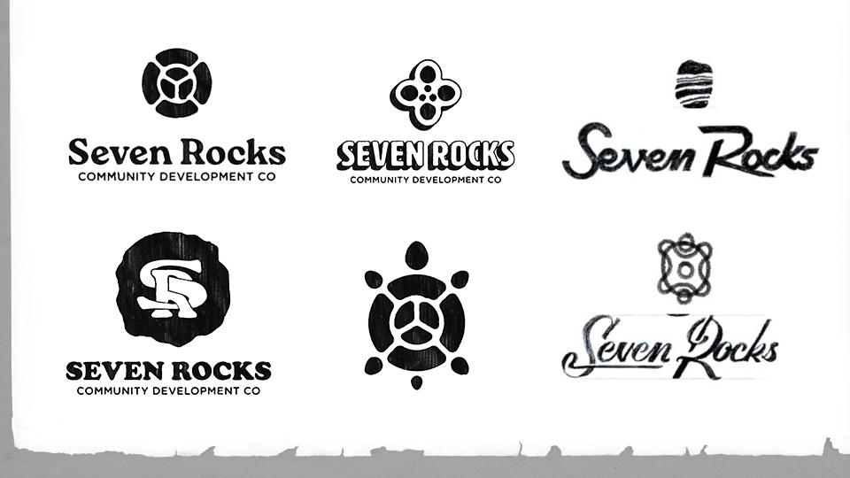
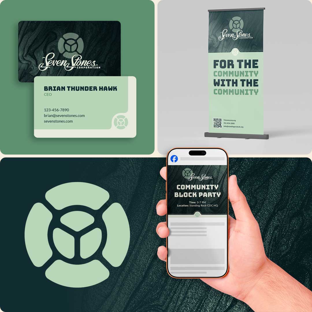
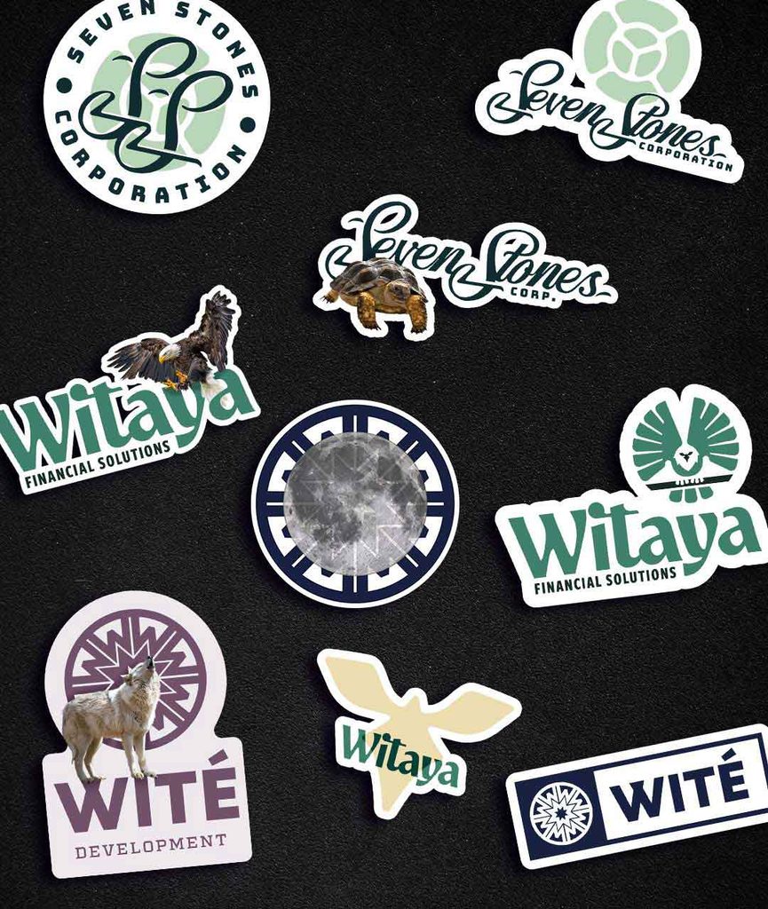
Seven Stones became an icon of seven stones with an approachable wordmark.
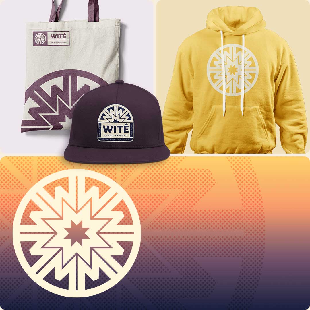
Wité became a moon with W’s hidden inside it, paired with a bold wordmark.
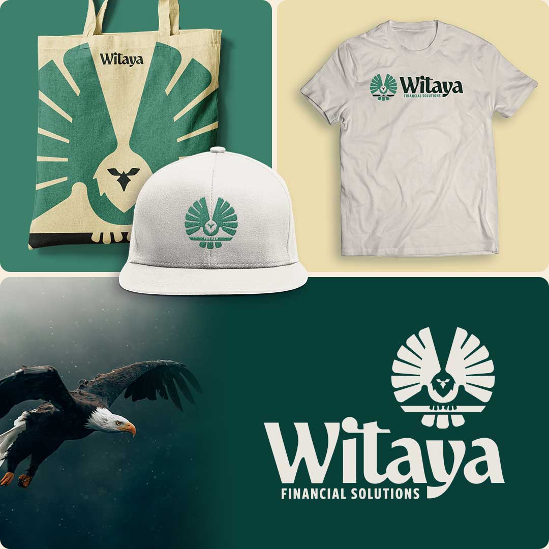
Witaya became an eagle, for the spiritual power the eagle carries in Native culture, paired with a commanding wordmark.
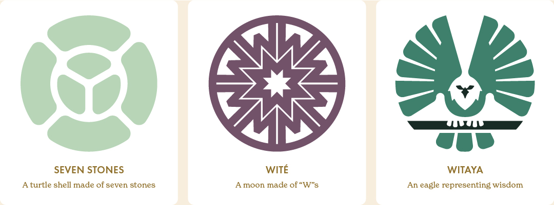
From there we moved into the brand presentation phase. We cleaned up the sketches, put the finishing details on everything, brought in color, and brought the brands to life.
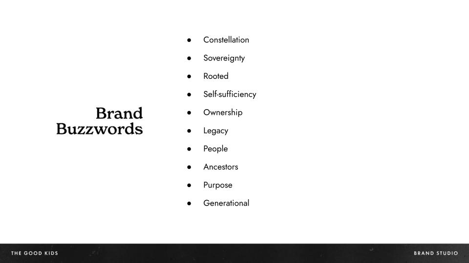
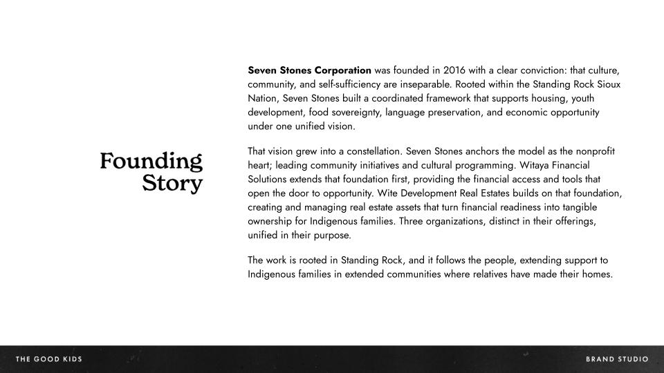
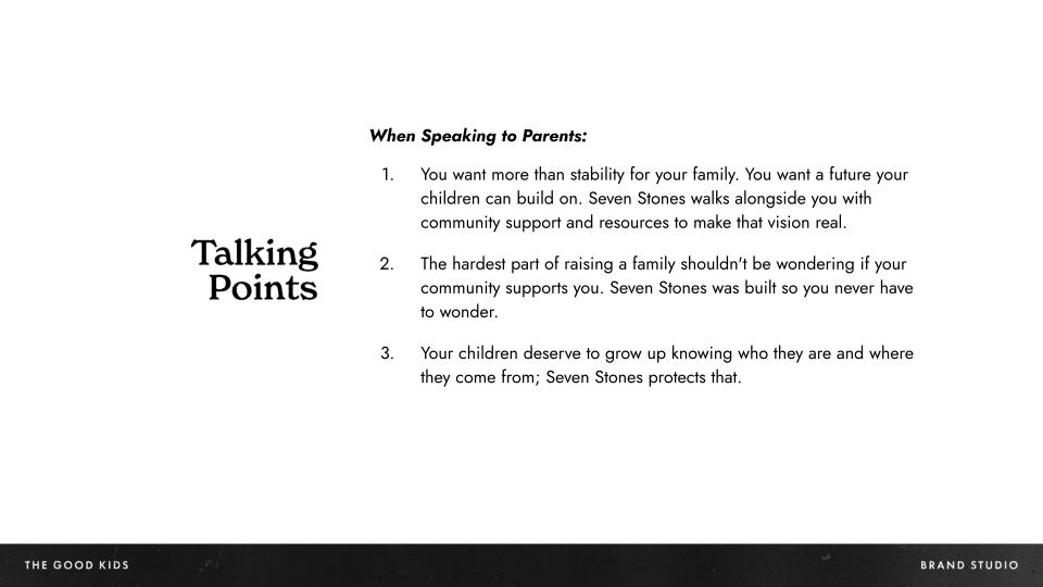
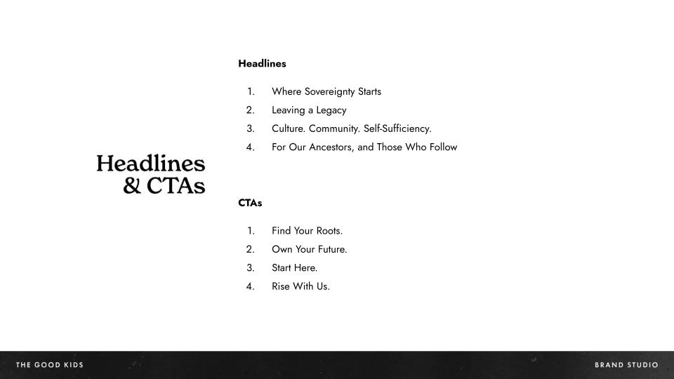
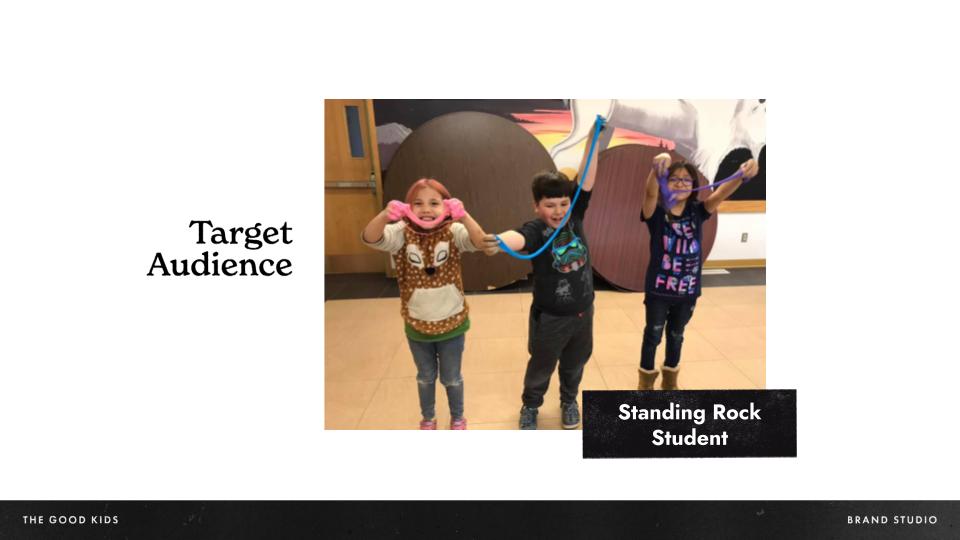
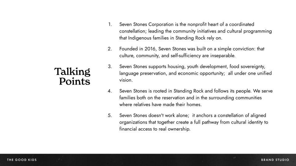
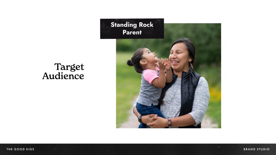
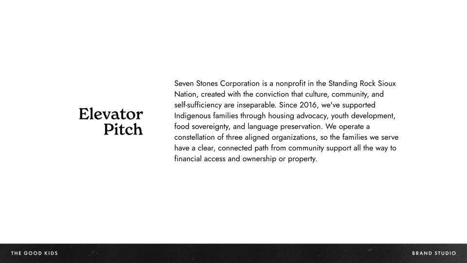
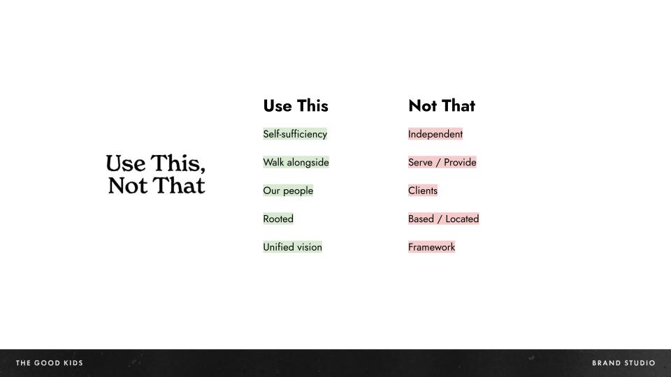
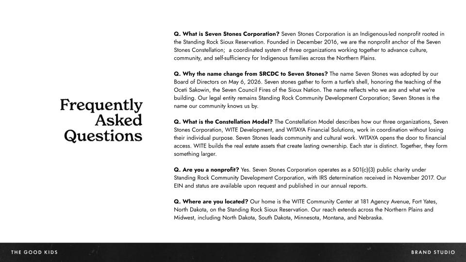
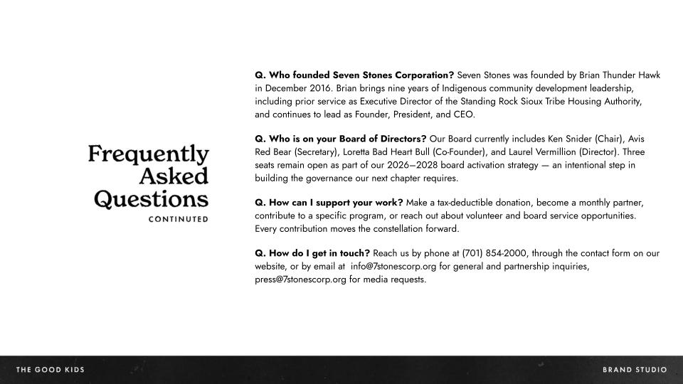
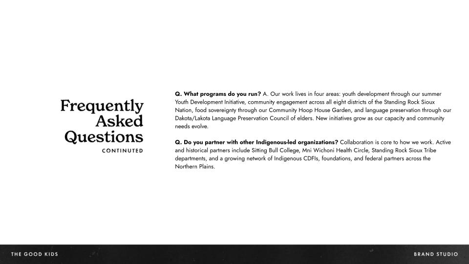
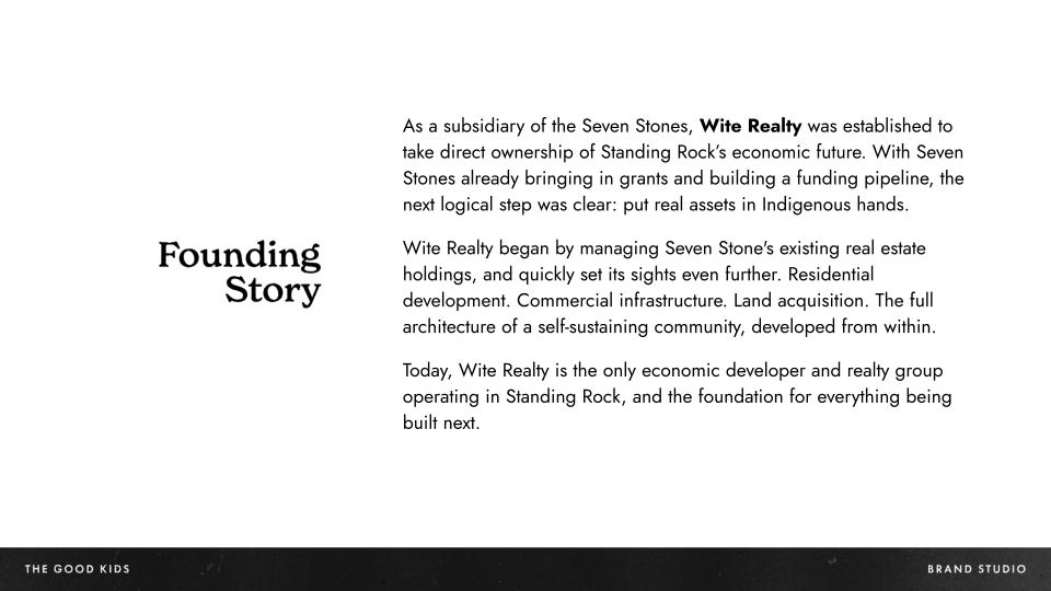
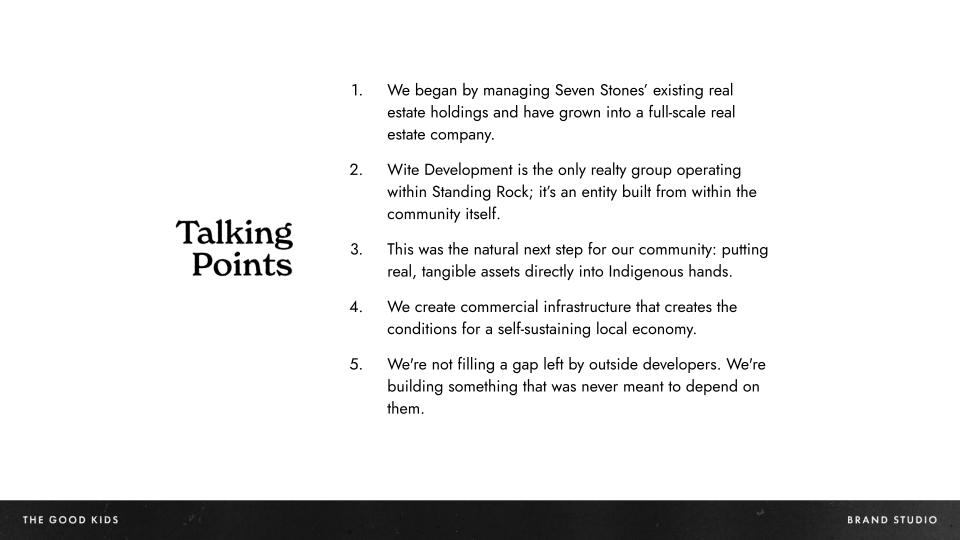
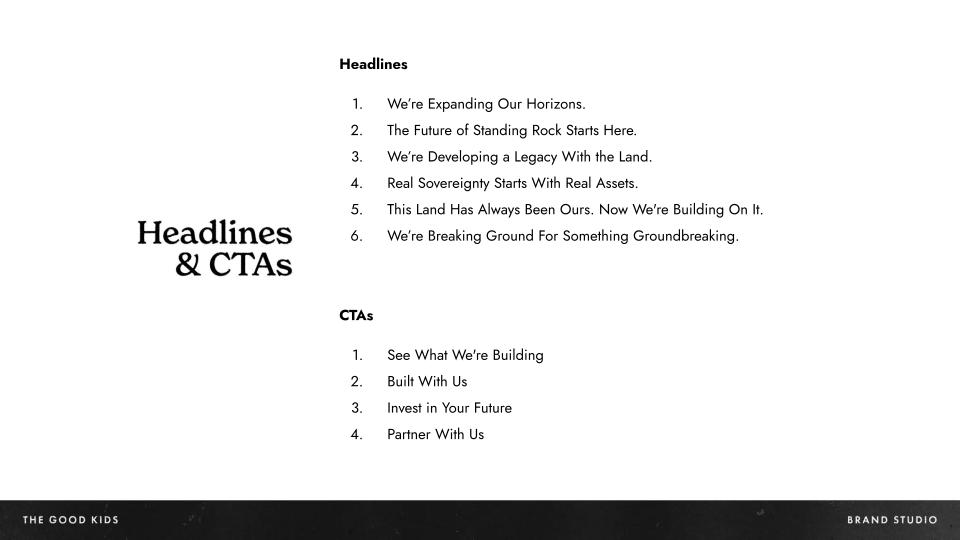
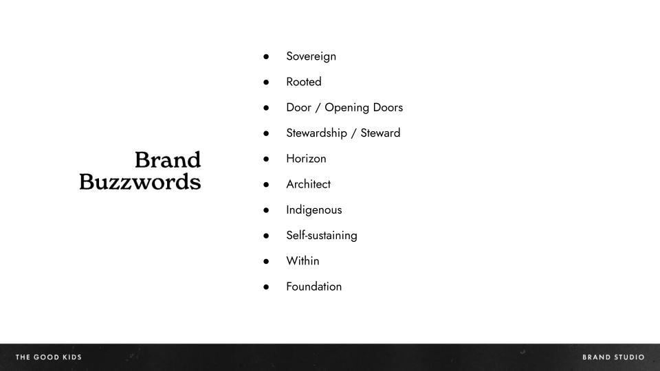
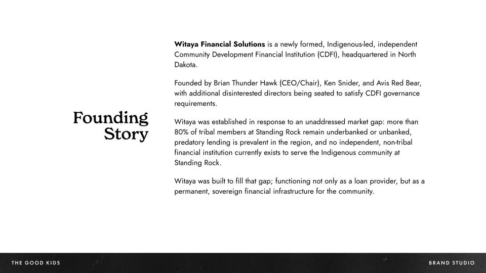
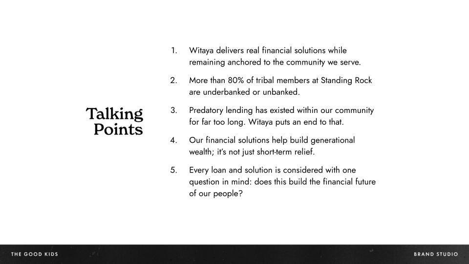
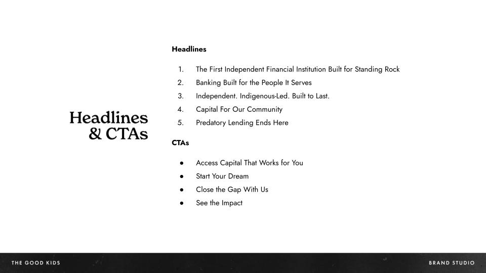
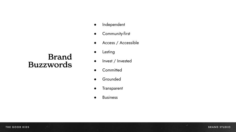
Last came the rollout kits, so each brand could launch into the world with momentum. Each brand received a verbal messaging kit with talking points, headlines, calls to action, and brand buzzwords, alongside the founding story, brand story, and voice characteristics we had presented. The goal of the messaging kits was to help clarify each organization’s positioning and discussion topics, allowing partners and staff to amplify their voices with confidence.
In addition, each brand received a brand guide, rollout social posts, and its full set of files so that each brand could consistently show up for years to come.
But we weren’t finished yet.
Seven Stones extended the relationship through a partnership for continued marketing support so we could help them widen their reach. We began with a customer journey and project roadmap, based on projects that would make the most immediate impact. for how the brand should show up in the world, and for which projects would carry the most weight.
Today we’re bringing those projects to life.
The Result
All three brands are live.
Seven Stones, Wité, and Witaya have launched into the world with their own names, their own marks, and their own voices, but most importantly, with the same heart. The community can see what each one does and where each one fits. The relationship between them reads clearly now: three organizations that look like three organizations, with one mission holding them together.
The foundation that was missing is there. Materials to bring to funders. A clear front door for residents. And a system built to hold whatever comes next.