Introduction
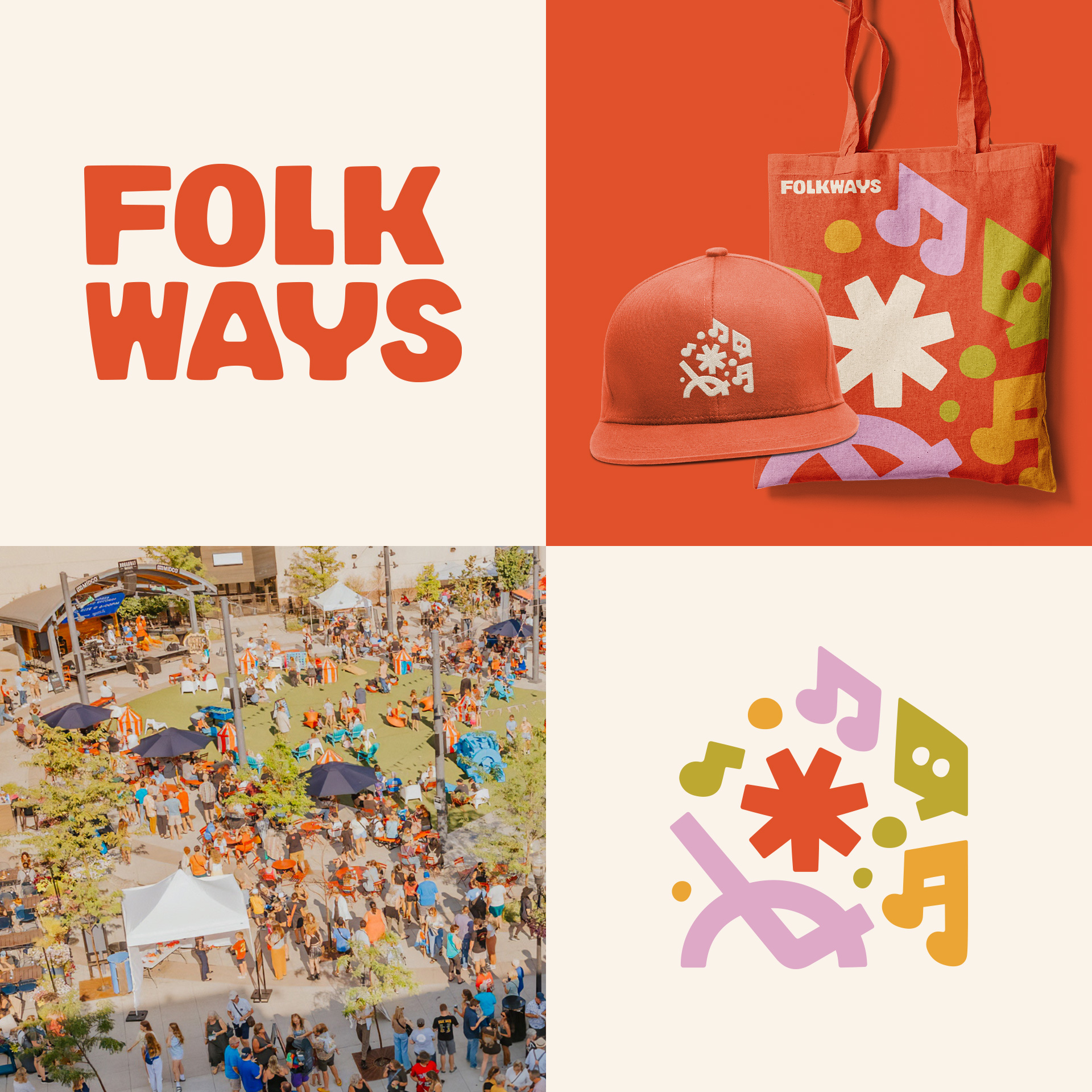
Folkways is Fargo-Moorhead’s placemaking nonprofit; the force behind the Red River Market, ChristkindlMarkt, Night Bazaar, Log the Sauna, and more community experiences that turn strangers into neighbors.
Founded by Joe Burgum and Simone Wai, Folkways was built on a simple question: what if Fargo could be the city we actually want to live in? From house concerts and community dinners, to city-wide murals and public squares, they’ve been shaping culture in the Red River Valley for years.
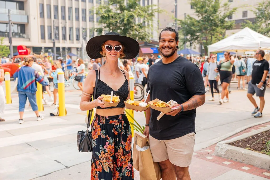
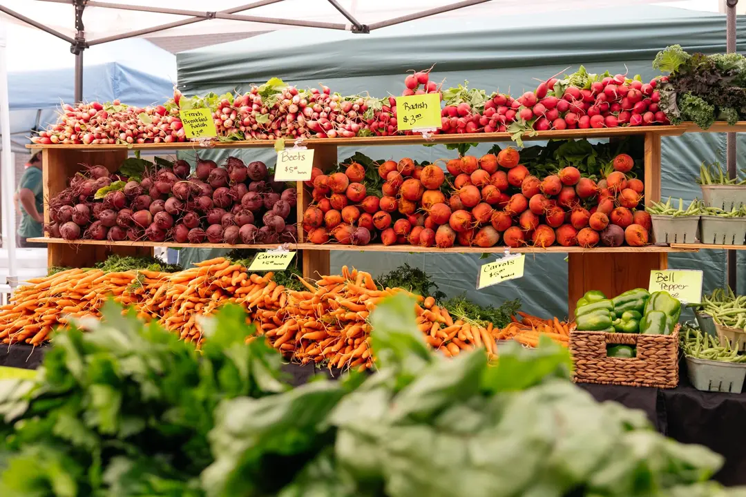
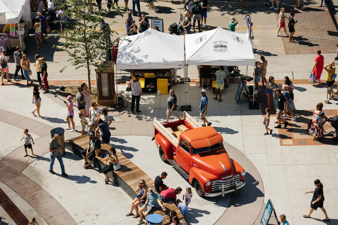
Folkways Events
The Challenge
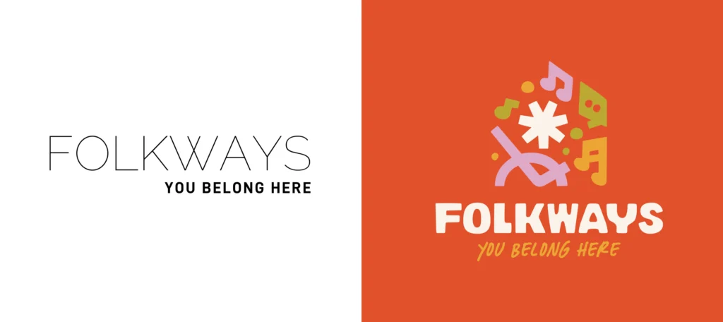
Folkways had world-class experiences, a passionate team, and an impressive list of sub-brands, but their visual identity hadn’t caught up to the organization they’d become. The brand felt cool and distant, almost corporate, which was the polar opposite of the warmth, whimsy, and magic their events delivered in real life.
Folkways’ parent brand lacked the recognition to unite their sub-brands under one roof, making it harder to build the donor trust needed to reach their revenue goal. They needed a brand that worked as hard as their team did: one warm enough to win over Millennial moms planning a magical weekend with their kids, and polished enough to earn a sponsorship from a hospital or bank.

You Don’t Have to Figure It Out Alone
Free 30-Minute Brand Coaching Call
Book a free call to get unstuck and leave with clear next steps. No strings attached.
The Solution
We kicked things off with a Discovery Workshop, then built a full Brand Blueprint; the strategic foundation that would guide everything creative. That meant deep dives into Folkways’ founding story, audience personas, competitor landscape, and cultural context. Through that process, one central brand idea emerged:
A Life Well Lingered.


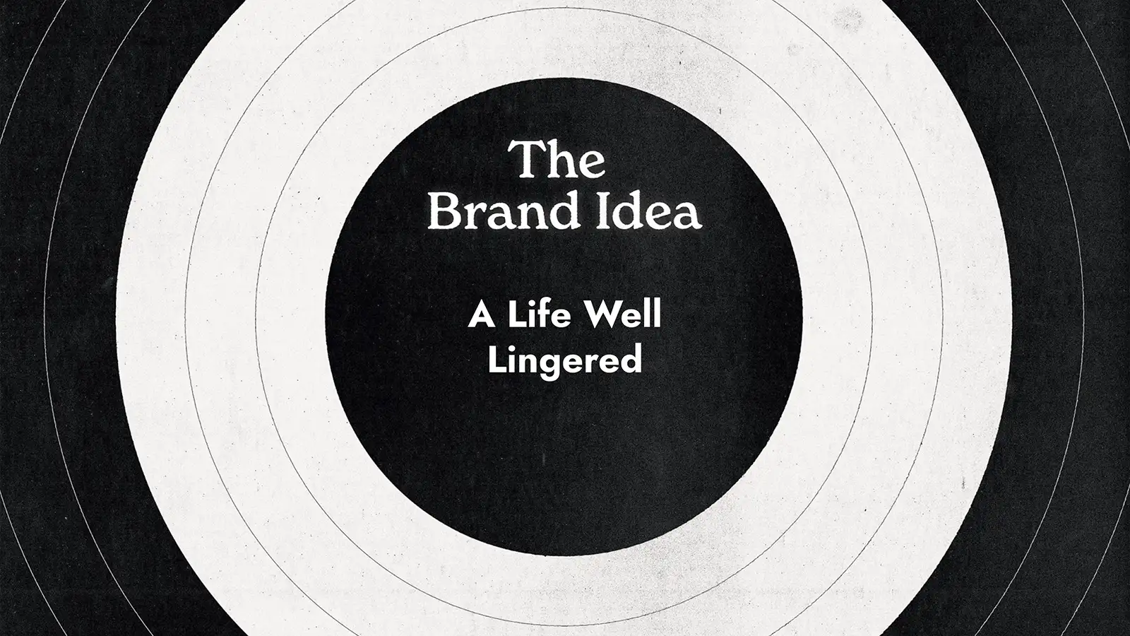
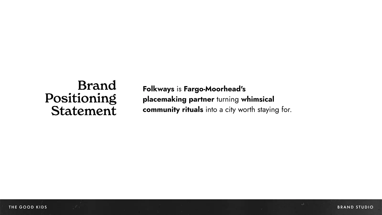
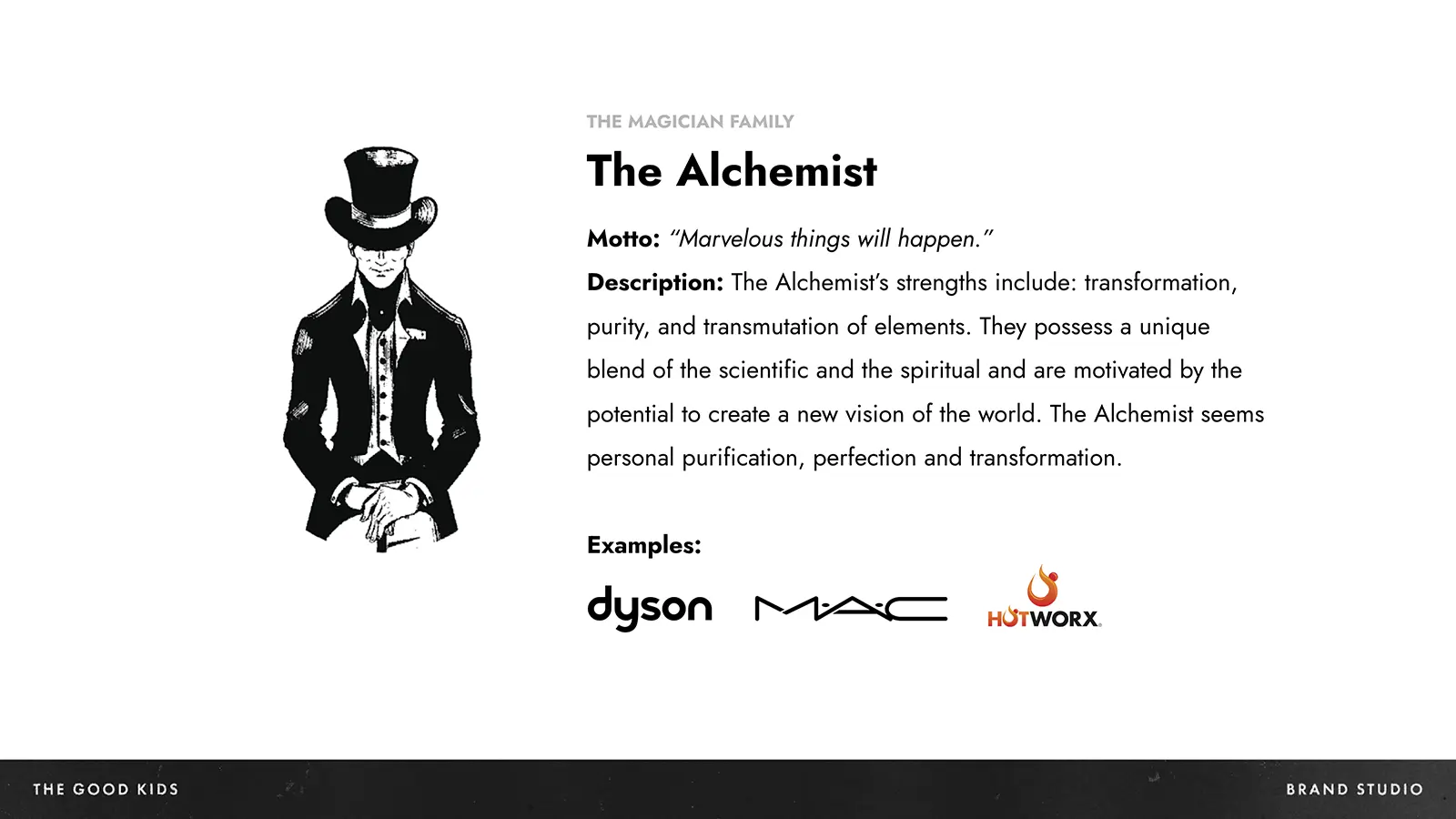
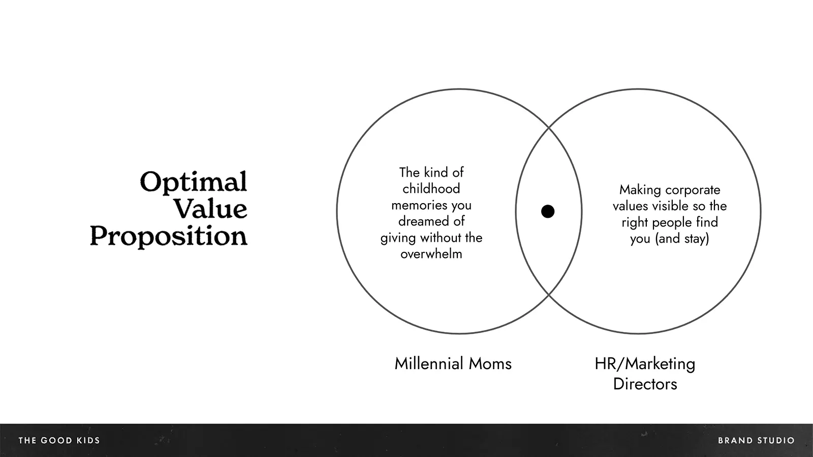
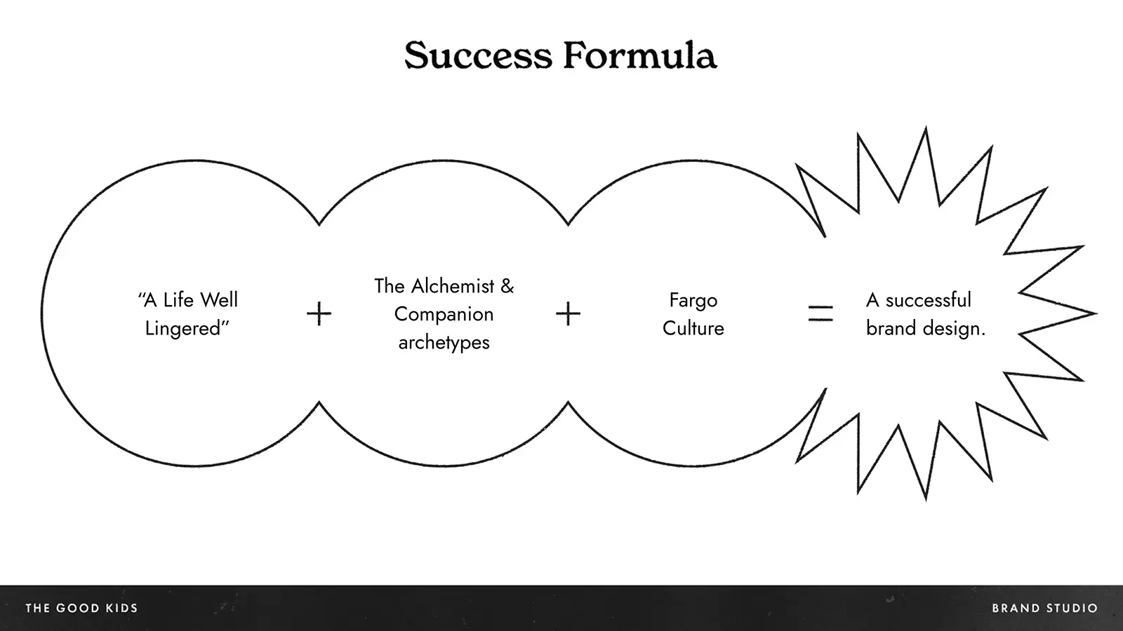


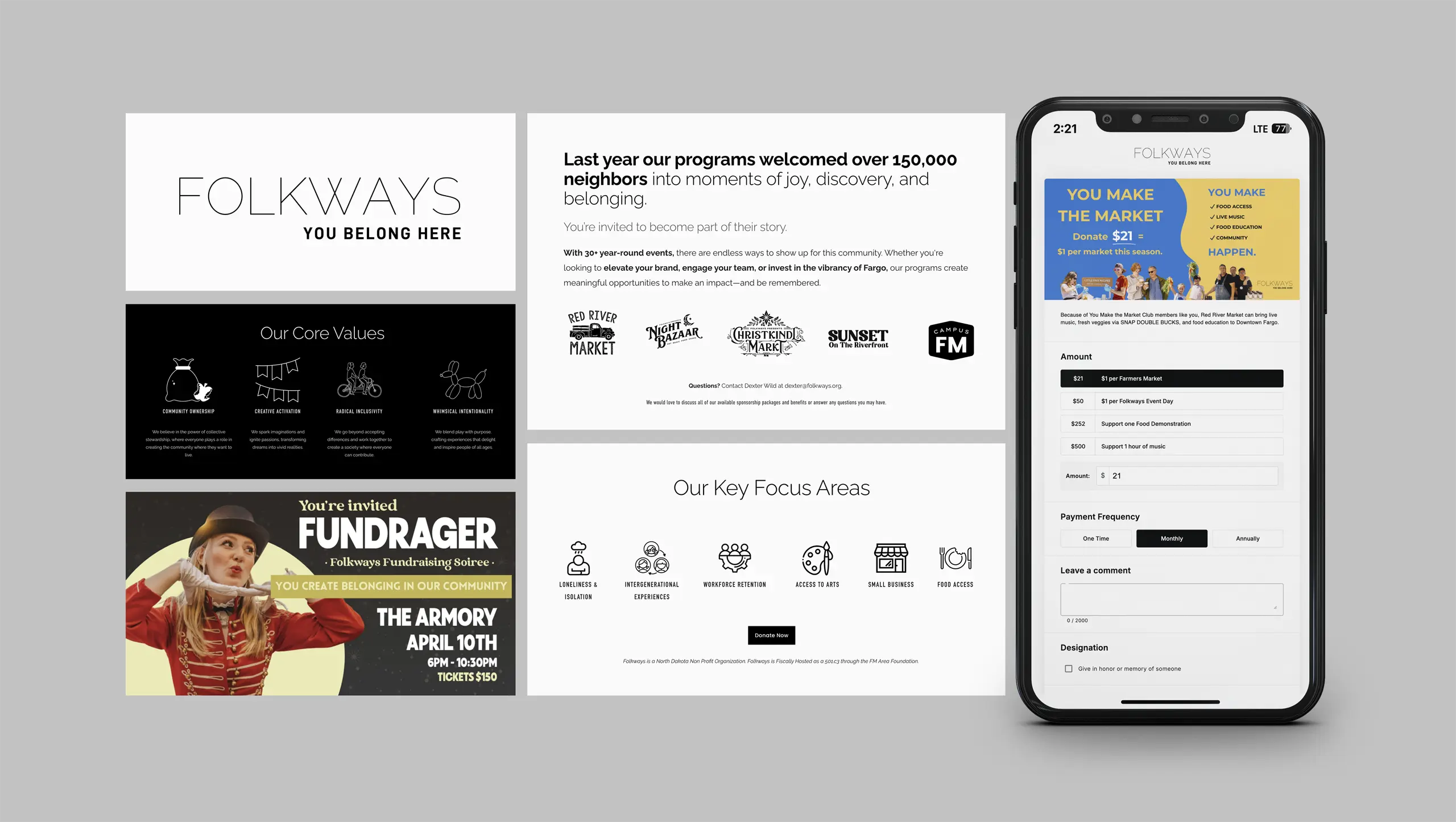
Selected slides from brand blueprint
In a world designed for speed, Folkways is the invitation to slow down on purpose. The brand idea captures the antidote to isolation; showing up to a market and savoring your time with those around you. It speaks to the Millennial mom trying to give her kids magical childhood memories, and to the HR director whose company wants to be the reason people stay in Fargo.
From there, we developed three distinct Visual Strategy directions, each interpreting the brand idea differently in color, typography, and texture.
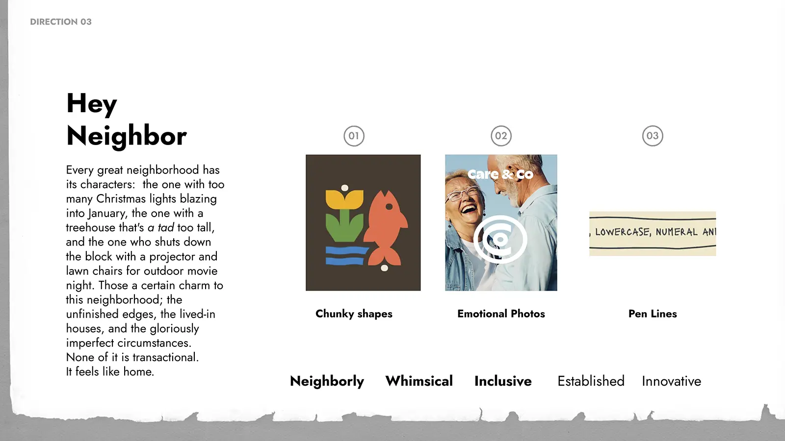
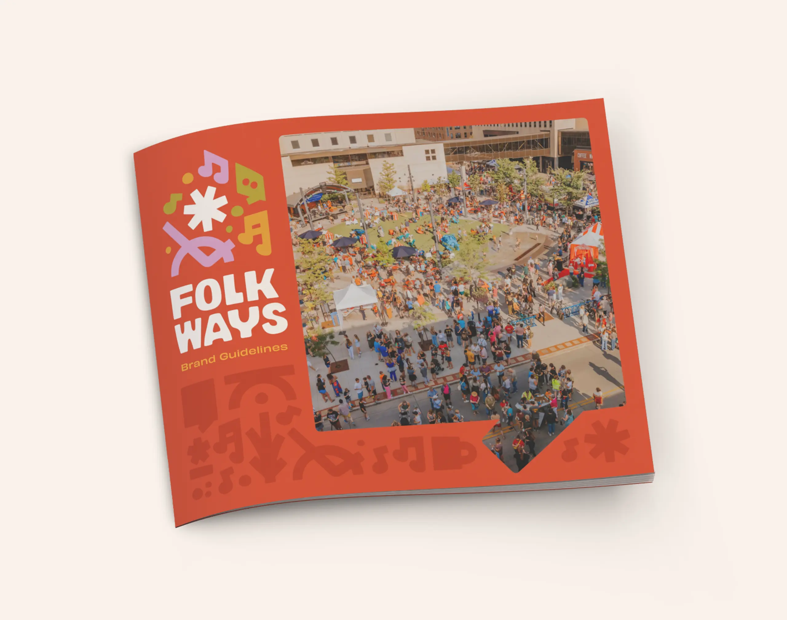
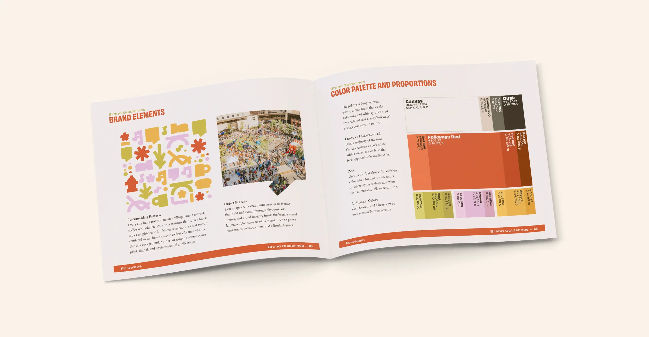
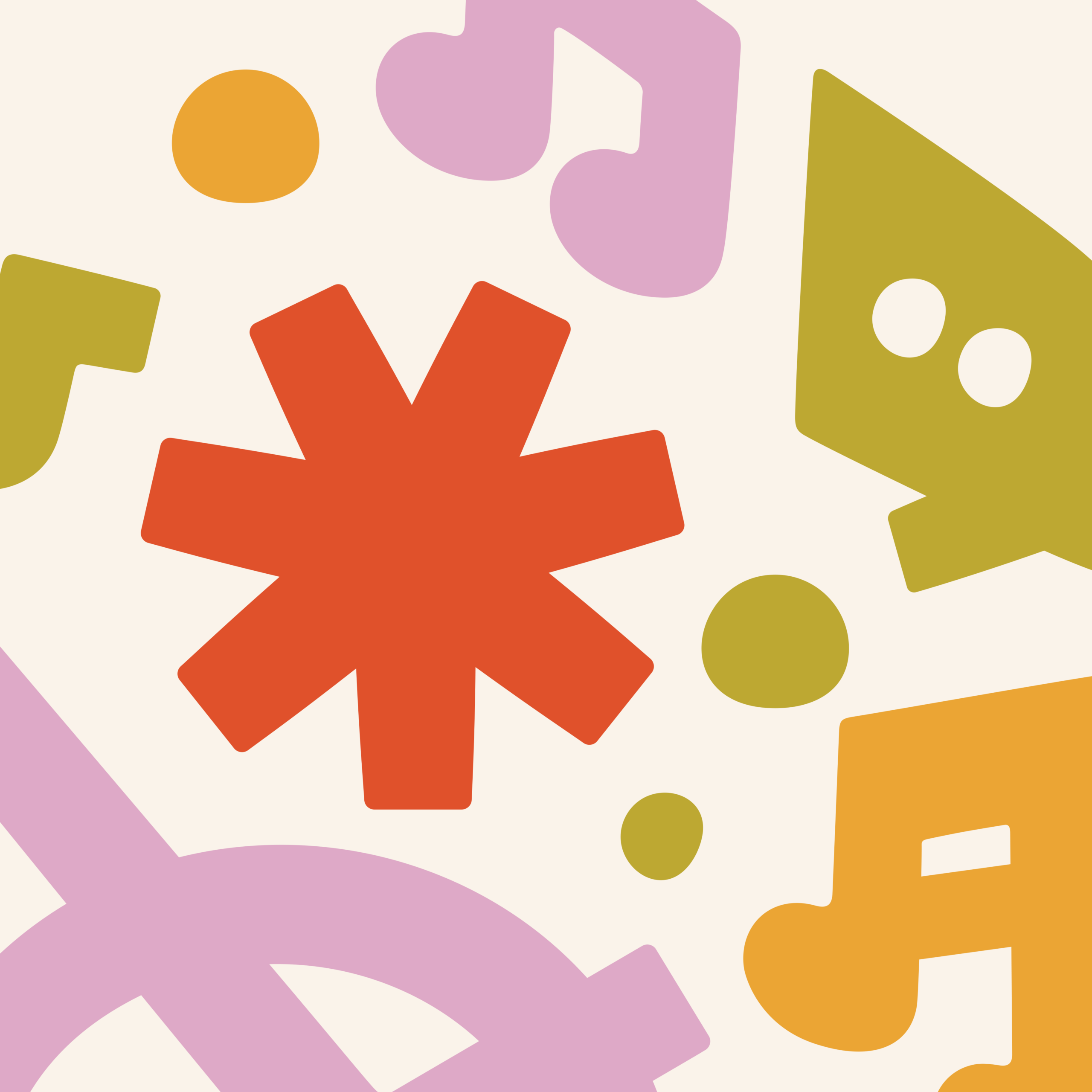
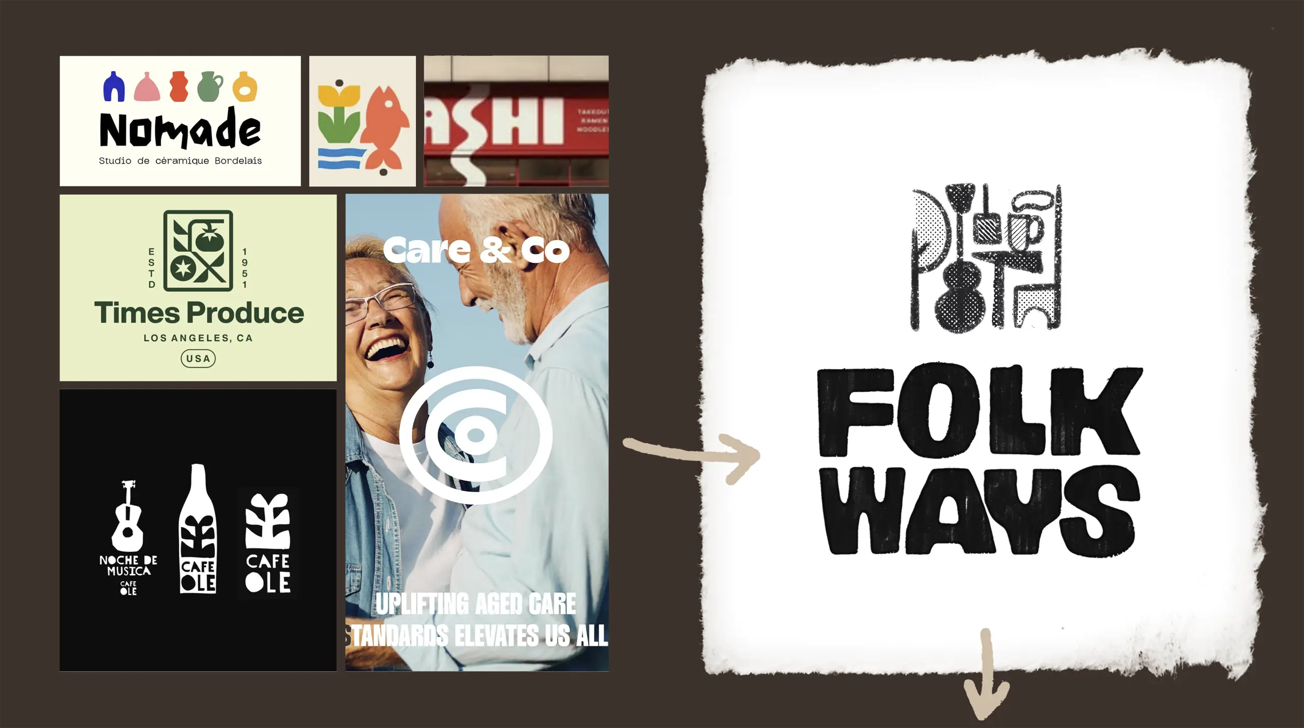
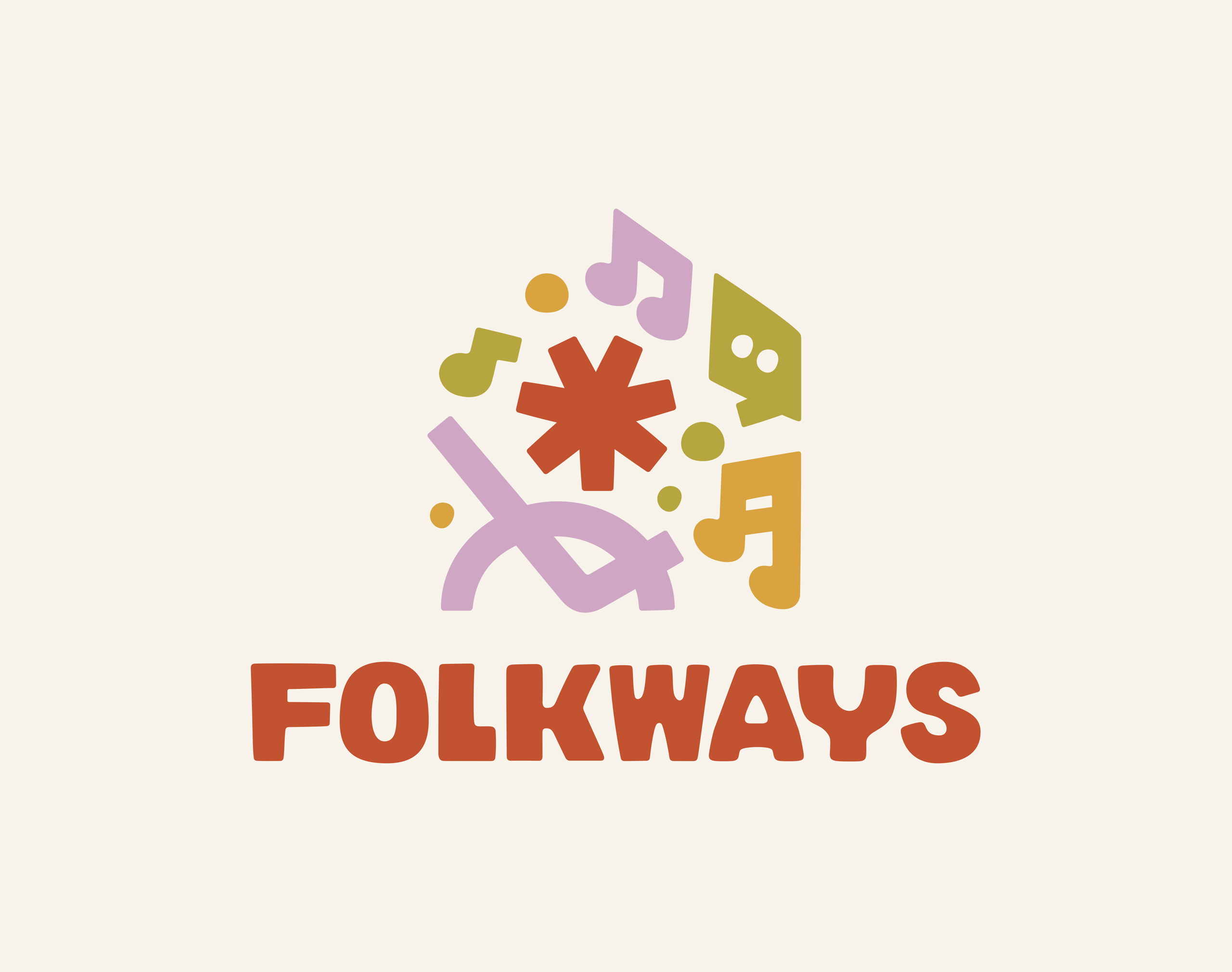
Folkways chose their direction, we refined it through sketched concepts, and landed on a final brand identity system that is neighborly, whimsical, inclusive, established, and innovative: everything the real-life experience already was, finally reflected in the brand.
The Result
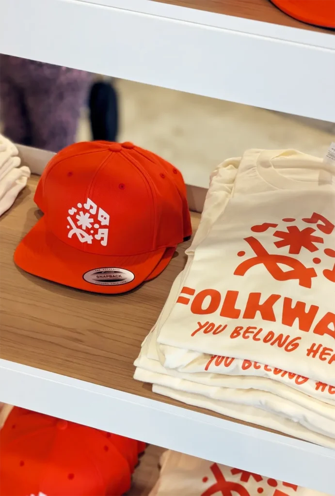
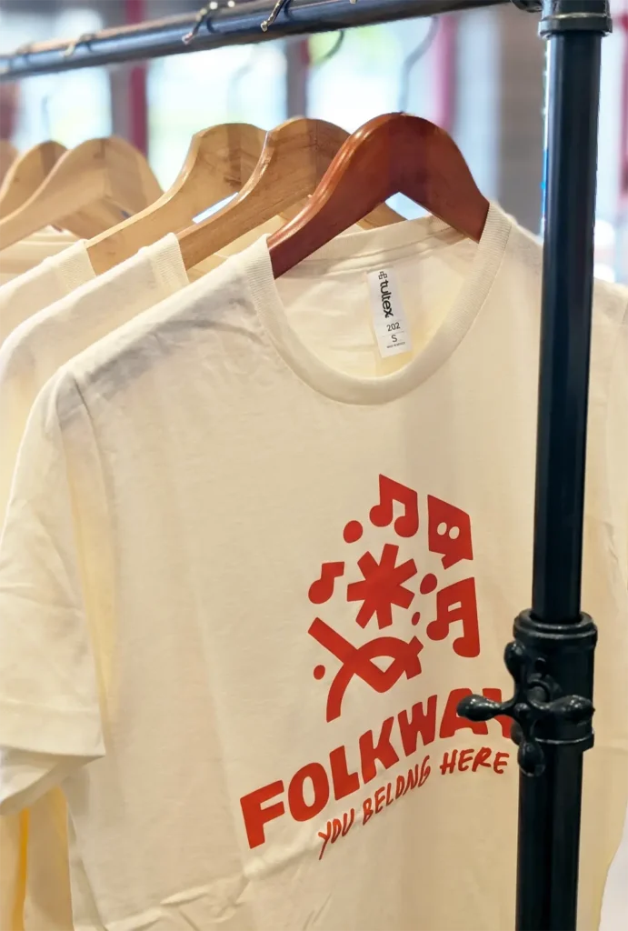
The new Folkways identity is warm where it once was cold, distinctive where the market was generic, and flexible enough to unite a growing portfolio of sub-brands under one beloved roof.
The rebrand is live today; see it for yourself at folkways.org.
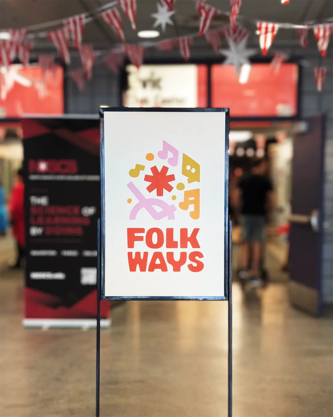
Better yet, experience the brand the way it was meant to be experienced: out in the world. Catch them at the Red River Market, Christkindlmarkt, Night Bazaar, Log the Sauna, Sunset on the Riverfront, and more throughout the year. When you see the new Folkways, you’ll know that Fargo is a city worth staying in.